The Valueline Geometric Index ($XVG) is approaching the previous high again. It has been up here before in 2014 only to slide back. We can see the two previous peaks in the zoom box on the right around 490. The two previous major peaks on $XVG of 1998 and 2007 are the month end closes. The Intra-month highs are slightly higher at 508 and 509. On the chart, the indicators are all based on the geometric index, not on the $SPX. The SP500 ($SPX) is shown in gray, the Value Line Index ($XVG) is shown in blue.

First of all, what is a geometric index? Why would we use the Geometric Index rather than the Arithmetic Index? The geometric index tracks the median index move if all stocks had an equal amount (say $100) invested in them. To understand the difference between a geometric versus an arithmetic mean, please go to the bottom of this article after my signature. I have included a quote there.
For StockCharts users, $VLE = Airthmetic Calculation, $XVG = Geometric Calculation.
The Arithmetic has been going to new highs as some stocks outperform and is currently at a new high based on Monday's close. The Geometric Index ($XVG) is trying to take out the highs of 1998 and 2007. Enough about the math.
There is lots of information on this chart.
1) The RSI. I have put the chart in here again, so you don't have to keep flipping up and down on your iPad. We can see the RSI for the Geometric Index is above 70 and has been up here almost a year as you can see in the zoom box. In 1995 to 1998, the market stayed at these levels for 4 years. However, in the other cases like 86-87 or 2006- 2007,one year was the total time. In 1989, 1994, 2011 it rolled over after a brief touch of the 70 level. In terms of time in an uptrend of the $XVG, we are at the second longest compared to the last 6. That should make us aware that huge euphoria or complacency may not last much longer.
2) The relative performance ($XVG:$SPX) in the shaded purple area chart behind the RSI has pulled back recently. So the median is not doing as well as the $SPX. Be careful when looking into the zoom box. It scales based on the last 18 periods so it can make a mountain out of a molehill. The RSI scale is not applicable to the purple shading in the zoom box.
3) The price plot study. The $SPX has clearly accelerated since the level of about 1400. This is also when the 4 central banks added stimulus while the market was near new highs. If the central banks had technical analysts as advisors (and I think they do), they would have been very conscious of a triple top scenario. Interestingly, we usually see central banks add at market lows, not highs as they did in 2012. Now major market participants expect the ECB to add more stimulus here while US and European markets are still at market highs.
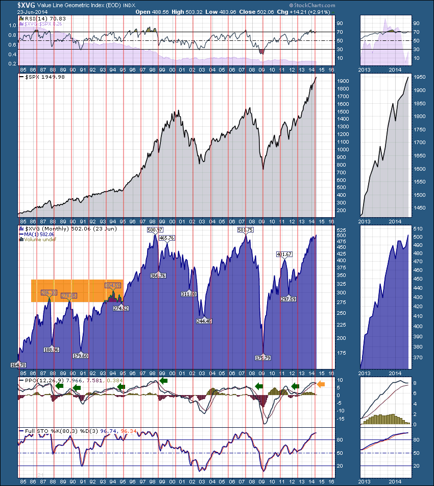
3) The price plot of the Value Line Geometric Index ($XVG). We can see the median price of $XVG went all the way back to the 1990 lows in 2009! Since then, we appear to have had 2 - 3 wave surges. The first 3 waves went from the 2009 lows of 175 to 401. Roughly 226 points. The second three wave move has gone from 297-502. About 205 points. Perfect symmetry would have it extend another 20 points. But this is based on month end closes. Absolute lows and highs would suggest the $XVG could rise all the way to 550 for an equal size move. When I look at the move in 1990-1998, it seems to be a giant two wave move from roughly the same base level to the same high as we are currently at. When I look at the 2003-2007 move it was roughly 150 points to the first high and then another 150 points to the final high. All that speculating to say the two monster bull markets of the 1990's run and 2003-2007 both had similar style moves with pauses near the halfway mark. There are a lot of other interpretations, but it may not be coincidental in my view that this chart is behaving so similarly to the previous runs.
4) The Percentage Price Oscillator (PPO) levels. I am interested on the PPO plot how levels above 5 behave when the signal line is eventually crossed. When we look at the 2003-2007 period it was a nice constant sideways move. The height and the near crossing of the PPO now tells us momentum is waning. But like world cup soccer, lots can happen before the final whistle. To me this adds another chart on the list of charts that we should think about when marking a market top. This chart would say the PPO, which is a momentum indicator, is rolling over which is slowing momentum of a momentum indicator. This is a monthly chart. It is a slow indicator. It can take months for any slowness to reflect in prices or the market can move fast obviously. I like to think about fund managers and their love for monthly and weekly charts. The 7 year timeline from low to high from late 1990 - early 1998 is interesting. Peak to peak from 1987 to 1994 was also 7 years. Peak to peak from 2000-2007 was 7 years 6 months. October 2007 to June 2014 is 6 years 9 months. There are also rough 10 year periods. 1987-1998, 1998-2007, 2007-2016 or 2017?

5) The Full Stochastics (80,3,3) indicator is still in full bull mode. It can stay up here for years. Moves back below 80 should be respected.
6) The Cycle information shown in red vertical lines is based on 21 month cycles. This catches most of the major reversal points and almost all of the trend change points. To my eye, 1986,1988, 1990, 1995,1998,2000 (lower lows),2002,2007, 2009 were all good signals. There were other trend change signals from up to flat , from flat to down that were also important. 1991,1993,1996 price levels were all important historically and into the future. 2002, 2003, 2010 and 2012 were all points in time near the 350 level that was set on the 1998 low. As we have just touched another red line around this 500 level, it seems to be telling us that a trend change to flat or down would be due. You can also see that the 1994-1995 period in the yellow box that the $XVG spent a year trying to break above the previous levels. This current median level of 500 seems to have a certain resistance. Back in 1986-1993, the market had trouble the 300 level. If you look down on the bottom of the chart around 1986 you can see the number of months is 21, between the red stripes.
All of this analysis to say, this is a critical place on the chart based on how important resistance levels have been in the past. Normally the Geometric will show some divergence before the $SPX cracks. The recent underperformance of the purple shaded area (relative strength of the $XVG to the $SPX) suggests that may be starting but it is too early to be considered a firm signal. I have other charts that are making me pause. Call it Greg's worry list. But until the 2nd quarter earnings come out, we'll just have to watch closely. The outside reversal on the charts Tuesday was a little bearish, immediately after the quarterly options expiration that I discussed in the Market Message on Thursday, June 19th. Nothing is negative yet many of my charts are sitting uncomfortably on the border. Things like the Baltic Dry Index could make a beautiful large scale Head/shoulders base here. But currently, It looks like global dry commodities are barely moving based on a 10 year chart. Another couple of charts are the limited % of stocks on the Nasdaq Composite ($BPCOMPQ) and the New York Composite ($BPNYA) on bull market signals after the long 4 month rally off February lows. I have many more that make me wonder. If everything rolled over, it would be so obvious. If everything powers higher, t was just a point a price has to pass through. These issues could all go away. They just haven't yet. As Arthur has pointed out, most of the sectors are powering to new highs with ok volume and breadth.
Good trading,
Greg Schnell, CMT
This is directly from the Valueline.com website on Geometric vs. Arithmetic Indexes.
"On June 30, 1961, we introduced the Value Line Composite Index. This market benchmark assumes equally weighted positions in every stock covered in The Value Line Investment Survey. That is, it is assumed that an equal dollar amount is invested in each and every stock. The returns from doing so are averaged geometrically every day across all the stocks inThe Survey and, consequently, this index is frequently referred to as the Value Line (Geometric) Average (VALUG). The VALUG was intended to provide a rough approximation of how the median stock in the Value Line universe performed.
On February 1, 1988, Value Line began publishing the Value Line (Arithmetic) Average (VALUA) to fill a need that had been conveyed to us by subscribers and investors. Like the VALUG, the VALUA is equally weighted. The difference is the mathematical technique used to calculate the daily change.
The VALUA provides an estimate of how an equal-dollar weighted portfolio of stocks will perform. Or, put another way, it tracks the performance of the average, rather than the median, stock in our universe. It can be shown mathematically, for all practical purposes, that the daily percentage price change of the VALUA will always be higher than the VALUG. The systematic understatement of returns of VALUG is a major reason that the VALUA was developed. Moreover, although the differences between daily price changes may seem small, the magnitude of the annual differential between the two averages can be very large. The greater the market volatility, the larger the spread between the geometric and arithmetic averages becomes.
In 1965, when The Value Line Ranking System for Timeliness began, our only market average was the VALUG, so we scored the ranks on a geometric basis. This allowed us to compare the performance of the ranks versus the market (as measured by the VALUG). After we started the VALUA, we began scoring the ranks both on a geometric and arithmetic basis."
For StockCharts users, $VLE = Airthmetic Calculation, $XVG = Geometric Calculation.
Arithmetic has been going to new highs and is currently at a new high based on Monday's close. The Geometric is trying to take out the highs of 1998 and 2007.
