Following on the back of Chapter 1, here are the charts for the Australian Dollar ($XAD).
Here is the Long Term Weekly first. We can see the RSI is demonstrating a bear market. While everything is obvious in hindsight, the RSI is at that critical level. More on that when we zoom in on the weekly. One thing to note, in 1999, the RSI broke through the red 60 level but never got into the 70 level but that would have been a difficult period using the RSI. Where did price stall? Previous support based on the 1993 and 1997 lows.
With regards to price, we can see the horizontal resistance at the 95-97 zone. Interestingly enough, the bear market for the Aussie Dollar in the "Eighties" also found that level as important as it paused the downtrend, then broke through downward, then found resistance trying to come back up and low and behold, it marked the final interim high in 1984 for a long time which was 26 years before it held meaningfully above that level. Notice the Commodities top of 2008 also found Aussie Dollar resistance at 97 and then that level came to be support for the topping structure in Commodities with the 2011 high. The Aussie is widely considered a commodity currency. Here were are again, testing that 95-97 level from below. We currently have a series of lower lows and lower highs which is the definition of a downtrend. I have drawn the dotted blue line as a parallel marker. It would also suggest the rally stalls at the 95-97 level.
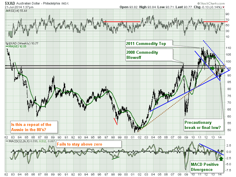
There are two uptrend lines that I have drawn through the gap in 2008. Gaps are caused by a sudden change in expectations. With 5 touches of the blue line that line seems strong like the black line on the Japanese Yen ($XJY) chart that was broken in March 2012 as well before resuming the trend. I have also drawn the brown dotted line which has touches on both sides meaning it has behaved as both support and resistance. It would appear to be a resistance line for the Australian dollar currently. Either way, both up sloping trend lines are broken with the January 2014 low. We can obviously draw another line that extrapolates to around 70 off the 2002 low to 2009 low. That line is really not of interest yet, but if this Aussie Chart lets go, that might be a new long term target which would be about 15 - 20 cents (price moving down while the line rises) from here! In general the up trend from 2004 - 2011 would be a weakening pattern where the lows and the highs get farther apart as the rise continues or the 'indecision' increases.
Lastly on Chart 1, we currently have positive divergence on the MACD as explained in the Japanese Yen discussion in Part 1. We also had it in 1998 on Chart 1 where we were in a bear (down) market, the price rallied in a bear market rally, but ultimately the MACD rolled over in 1999 just above zero and went on to make lower lows through 2001. So the divergence can indicate a short term momentum change but at each inflection point we still have to watch. The MACD zero line is usually identified as a zone of support or resistance by many technicians. Tom Bowley calls it a reset for the prior trend. Tom will be speaking at Chartcon 2014, which still has a few tickets left. Click here to find out more. The MACD was almost always above zero from 2002 to 2011 with the exception of the financial crisis. We can see since 2011, every time it gets above zero, it rolls over again.
Lets zoom in on the recent price action on the Weekly Chart 2. What is interesting is how little commodities showed any increase in demand through the 4 central banks applying Stimulus in September 2012. Notice how the Aussie Dollar rose with the commodities boom off the 2001 low to 2011. Sometimes its hard to believe that this is not a commodities chart. This Aussie Dollar broadly followed the Commodities like gold higher. While the RSI is still in trend, if there was to be a change, this is when we want to pay attention. We can see the price focus is currently at major long term support/resistance. The price is above Martin Prings 65 WMA, but we can see this MA has a lot of whipsaws (crossing down through and bouncing back above). I continue to fear the 95 -97 level as it seems to me, this level has historically marked major bear market levels. Living in commodityville, Canada, (AKA Calgary), I want to see this move well above!
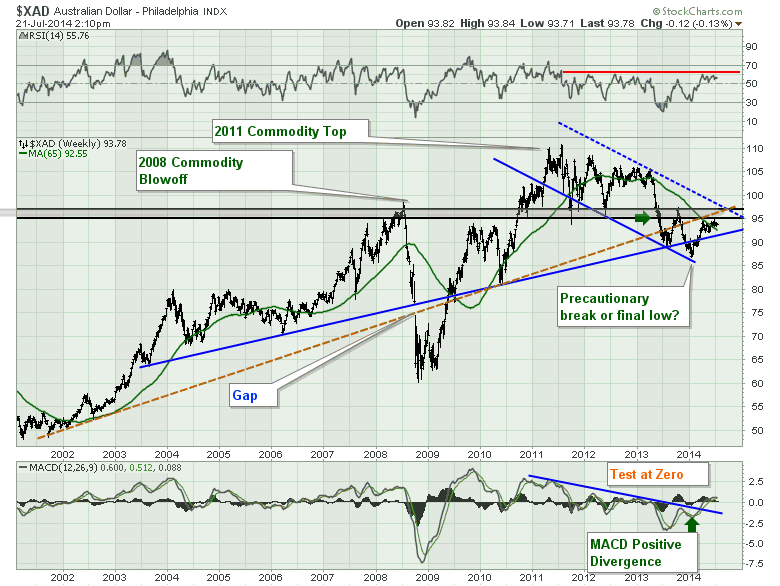
On the MACD, we can see the recent positive divergence with price making a lower low but the MACD making a higher low between the most recent lows. That has given us a push up, but we have not taken out the most recent high yet, so it is still too early to call any major change in trend. Lastly, the MACD is almost rolling over at zero as mentioned, but it is still above its signal line.
Lets move onto Chart 3 and the daily short term view.The RSI is still held up by support, but the lower highs over the last three months are suggesting further weakness. Moving to price. the false breakout on the price is a significant clue. Usually a failed breakout is a better clue than a breakout as it allows you to set your stop tighter if you are wrong on the direction. In this case, no support at the higher price, suggests lower prices are next. We can see clear resistance around 94.5. I have drawn a pink arrow at 93. This gapping behaviour at this level is important. Currently it would also be the level where stops are placed to support the price action over the last month. The price has moved sideways below the short term blue trend line. Currently the Australian dollar is sitting on the 50 DMA for support. A break below would suggest looking for new support at the 200 DMA and Martin Pring's 300 DMA down around 92.
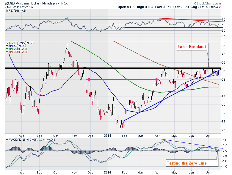
While the short term view is not clear, the failed breakout and the sideways move suggest to me things are losing upward momentum. The MACD could be coming down to 'reset' as Tom Bowley likes to say. A breakout to the upside would suggest to me that Asian demand for commodities is improving. A breakdown would suggest wider implications to me in the global demand for commodities. I like to watch Canada and Australia to see what is going on. It can also help to watch the Russian Ruble and the Brazilean Real but they won't be part of this currency series.
I want to add one thing. The Aussie dollar volatility. The Bollinger band width recently hit 1.36 cents. That is a rare level of calm. Below is a really interesting chart.
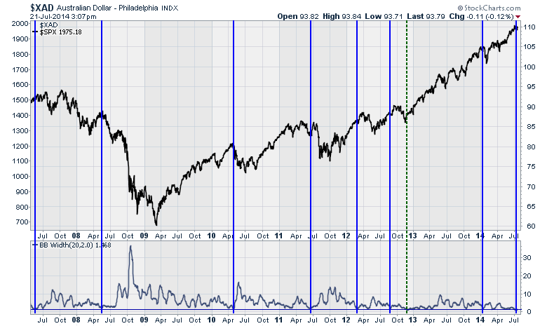
I drew a horizontal line on the Bollinger band width and looked for extreme lows. The level reached last week was the lowest I found going back to 2007. I drew a vertical line on the extremely low Aussie-Dollar-Bollinger-Band-Width readings. I made the Aussie Dollar price information invisible and overlaid the $SPX. I'll leave it to you to decide if the currency traders can smell fear or if there is a correlation to $SPX market tops. The exception of course is the 2013 low on Jan 1!
If you liked this article, feel free to forward it to investing friends and family. If you didn't like the blog, please send me a note on what I could do better. The charts are printable. They should also be clickable so that you can go look at the settings.
We try to keep our articles informative and entertaining. You can subscribe on the top right of the page by email or RSS. Make sure you check out the other blog writer articles in Mailbag, Chartwatchers, Traders Journal, DecisonPoint, Don't Ignore This Chart, Chip Anderson, Scanning Technically, and The Canadian Technician. Subscribers have access to blog articles by Arthur Hill, John Murphy, Martin Pring as well as the DecisionPoint Tracker and DecisonPoint Reports by Carl and Erin. Subscribers got a new tool this week with the launch of RRG (Relative Rotation Graphs) by Julius de Kempenaer! These charts take the identification of Sector Rotation to a whole new level. I absolutely love RRG.
Lastly, Chartcon 2014 in Seattle is only 2 weeks away. Click here for more information on Chartcon 2014. It is an unbelievable lineup. PS. Chip Anderson was able to get Julius De Kempenaer to come speak at Chartcon 2014! Really, another global superstar in Technical Analysis! Its crazy how many speakers will be available for working with 400 attendees over 2 days.
See you in Part 3. I think we'll go to the Canadian Dollar next and then do the European currencies one after the other.
Good trading,
Greg Schnell, CMT
