So, the US Dollar ($USD) is at the center of the currencies we covered. Lets look into the long term weekly to set the stage.
First of all, the Weekly RSI is in bull mode since 2011 ! That is a substantial change as most other currencies had an RSI trend from the end of 2012. We can see the tight compression for the last year on the RSI is unmatched going all the way back on the chart. That is 35 years. So while the RSI is in bull mode, the currency has been tightly coiling in a very, very narrow range.
The large view on the $USD suggests the red line from 1987-1997 is similar to the red line from 2004-2014. Notice the similarity in price pattern from mid 1995 to 1997 and compare it to the 2011-2014 period. While the coiling has gone on longer now, the tension on this coiling spring looks to be huge. We currently have a large pennant forming between the two red lines and you can see the blue arrow would be another long term support/resistance level that I did not draw through the price because it would make everything congested! The RSI suggests to stay bullish.
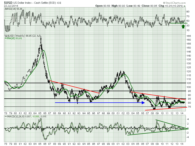
The MACD is coiling similar to price for the last 8 years and the MACD lower trend line actually extends all the way back to the 2003 low. Notice the 1995 low was at the start of the tech boom. The currency made a head/shoulders top from 2000-2002. It topped after the US equities topped, and started to decline before US equities started rising. The US dollar bottomed in early January 2008 as the US equities started to decline in earnest. The equities stayed below the 200 DMA for all of 2008. The $USD low in 2011 coincided with the equity market low. All that to say, the change in direction of the US Dollar is usually at a turning point for equities.
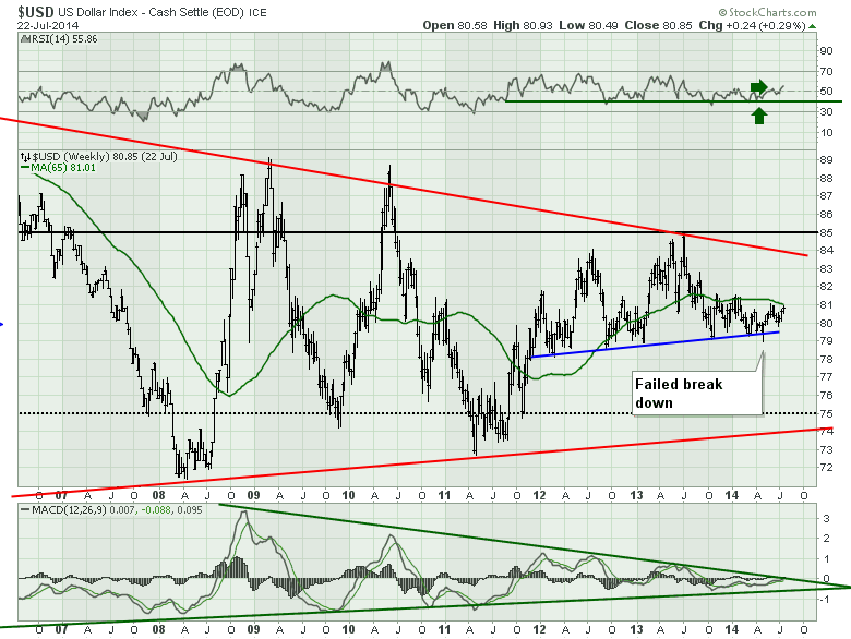
Zooming in on the last few years on the weekly data in Chart 2 now. We can see the bullish RSI at the top. This week it has moved to the highest level in a year. Something is changing. The price is trapped below the 65 week MA for the last 9 months and we are testing it again. Conversely, we recently broke below a major neckline for a week, then price reversed and pushed higher. With the close up view of the MACD, we can see the trend line is currently being tested. I have found that major MACD trend line breaks are usually valid. If we look across the chart at 81, there is a lot of resistance at this level.
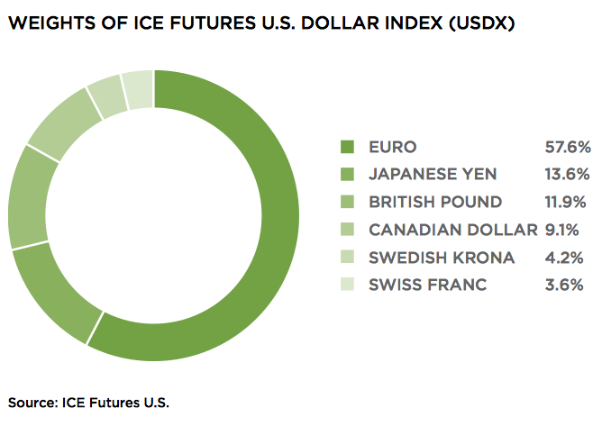
With the Yen moving higher and the Euro breaking down, these offsetting forces make the dollar direction more difficult. Although the yen moved a staggering 35 points from 130 to 95 in eight months from October 2012 to May 2013, the USD only moved $5 on this chart. During that same period the Euro only moved $5 on its chart. So a big swing in the Yen and the Euro can offset each other and the dollar remains little changed. The Euro has a weighting of more than 4 times the Yen. The table below shows the currency ratios for the Dollar index.
Source: theice.com
What I think is particularly compelling is the European currencies appear to be rolling over, with the exception of the British Pound ($XBP). This would support the case of a rising $USD index.
Let's move to the daily chart because it needs some discussion now that we have drawn out the longer view. First of all, the RSI is in a bearish posture, but we saw the wild swings on the RSI the last time it changed from bullish to bearish. If the RSI touches 70 here, we would confirm a new bull market on the daily and the weekly has been reading bullish for 18 months.
The price chart is confusing, so lets discuss the moving averages as the wavy lines are distracting. You can see I have marked where the 50 DMA has crossed the 200 DMA with green arrows. The 50 has now crossed the 200 DMA. Both those averages are below the 300 DMA so we are not in a bull trend on that premise but price rests above the 50 and 200, but below the 300. This would have some positions long and some positions short the $USD depending on the investor. stepping away from the moving averages, we have an orange resistance line that is trying to be broken. This line would be the opposite of the line we have on the Euro. The influence of the other currencies in the basket is why they do not cross simultaneously on both charts. The Head/shoulders basing pattern is drawn in but we could have an extended right shoulder that would match an extended left shoulder if we include the September/ October 2013 as part of the pattern. This would mean another few months of uncertainty. However, with the down sloping trend line in blue being broken already, it is clearly at a point where the USD could accelerate from here rather than waiting for a few months. This is especially true with the June 30/ July 1 low that backtested the trend line, found support and quickly pushed higher from there.
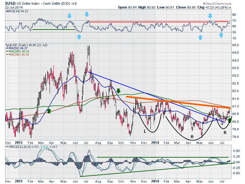
A move above 81 gets almost every form of resistance below the price and would probably create a strong move higher.
Lastly, the coiling MACD on the daily and the coiling on the weekly MACD suggest whatever move that comes will probably be very significant in size.
So with that we have wrapped up all the currencies in the Dollar Index as well as the Aussie Dollar.
I'll post a summary blog to put it all together. John Murphy, StockCharts.com Chief Technical Analyst uses inter market analysis including currencies to help him with the equity markets. I have used some of Martin Prings work here to discuss the 65 WMA and the longer moving average rather than using my regular 40 WMA just to demonstrate the difference. I have used Constance Browns work with the RSI and Gerald Appel's analysis on the MACD. I have discussed some of Tom Bowleys work. My technical analysis style uses a lot of these methodologies. Chartcon 2014 will present many methodologies to you. We hope to provide you with compelling new tools that we are adding to the site regularly and demonstrate their value as you develop your analytical style. If you have not registered for the Chartcon 2014 conference, it starts two weeks tomorrow. Click on this line to attend. my understanding is we are close to full but would like to max out the opportunity, so please join us. If you are an individual investor, a Portfolio manager, or a hedge fund manager, you will find immense value in both the discussion by the technicians as well as the website tools demonstrations that will enable you to move around the website quickly.
Good trading,
Greg Schnell, CMT
