The SCTR ranking system is by far my most powerful indicator. It got another boost this week and so did the Market Carpets. The SCTR got put on the Market Carpets as one of the drop downs.
So what does all that mean? First of all the market carpets are found here as demonstrated in Chart 1. On the home page, go to the golden line (my nickname for it because the links are so valuable!) and click on 'Market Carpets'.
Chart 1
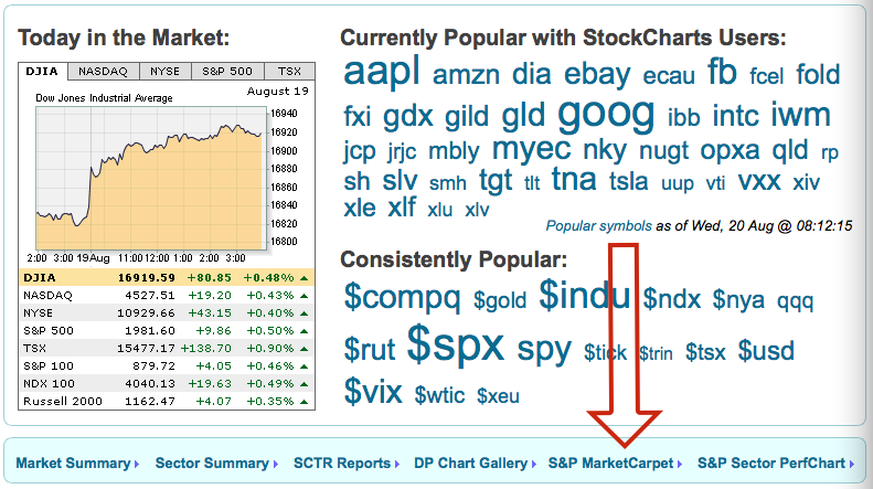
Chart 1
That should bring up a magical look at the US Market like Chart 2 which in this case means the S&P 500 ($SPX) with each box representing a stock. The size of each box represents its market capitalization (Total value of all shares added together), and the nine sectors have the various stocks placed within the sector frame. For today we'll focus on the sector that is top right. On the slider at the bottom, it is set to 2 days so we are looking for the change from day to day.
Chart 2
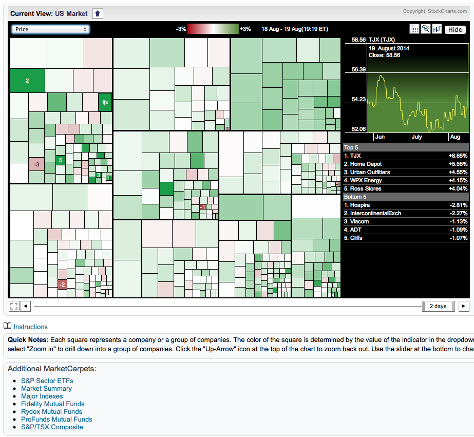
Chart 2
You can see at the bottom of Chart 2, there are different market carpets available. Market Summary, Major Indexes etc.
When I highlight a stock in the market carpets shown in Chart 3, say the largest box in the top right sector, It will show me an information box. In this example below it says DUK for Duke Energy and it also tells me that this sector in the top right is Utilities. This is subtly listed inside the information box. You can see the yellow frame around "duk" which is the stock I highlighted. So everything inside that black border where a lot of green is showing is in the Utilities sector. However, all most all the sectors have a lot of green showing.
Chart 3
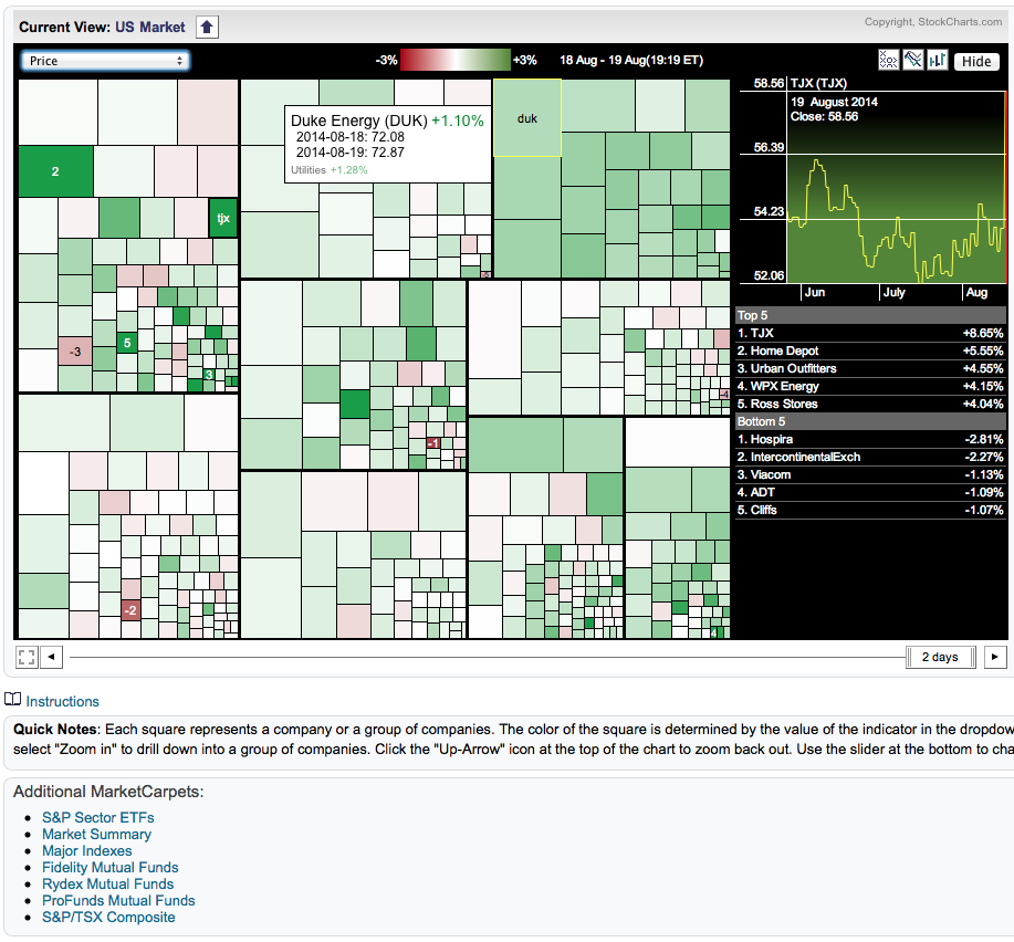
Chart 3
But there is another powerful menu on this market carpet that we can use. We have added the market carpet view with the SCTR as an option in the drop down menu as shown in Chart 4. In this case, I am looking at the 2 day (See slider on bottom) change in the SCTR ranking.
Chart 4
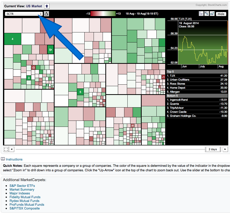
Chart 4
Below I have trimmed the information so hopefully you can see the two charts at once to compare easily. Chart 5 and 6. The difference is one is 'Price View', the other is "SCTR View." Notice the date is shown above the Utilities area.
Chart 5 and 6
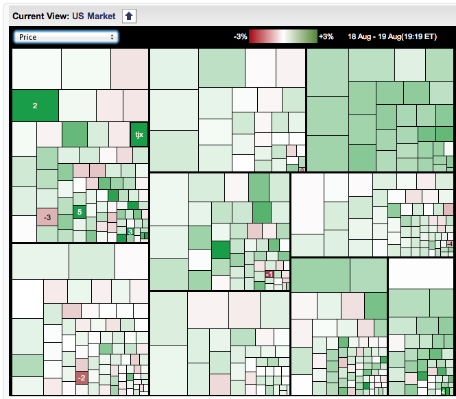
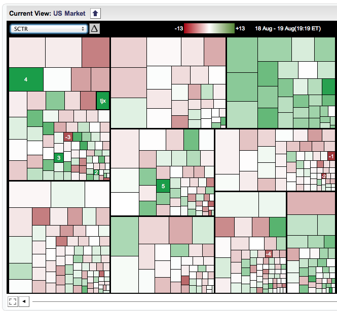
Chart 5 and 6.
So in this example shown above in Chart 5 and 6, even though the overall market was up yesterday, Utilities really seemed to dominate in terms of stocks improving in their relative ranking within the large caps, and it makes the market look less balanced in terms of what was really going on.
Lets focus on some of the dates of the market moves historically. Chart 7 is the $SPX for the last 2 months.
Chart 7
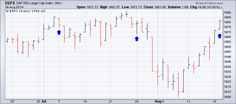
Chart 7
These are the days that the Utilities started to outperform the market in terms of the SCTR. I would encourage you to play with the slider and see for yourself.
The charts look similar. Here they are in sequence below.
Chart 8,9,10
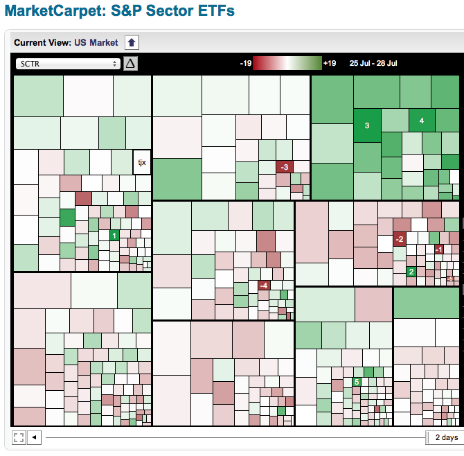
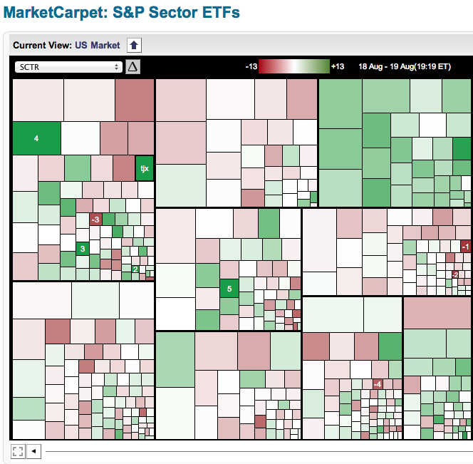
Chart 8,9,10
Now when the market is bullish, this is how it looks on Chart 11 for Monday August 18th as an example. So even though the $SPX had a big up day on Tuesday with all ten sectors moving higher, it was clear that Utilities were weaker in 'relative ranking' which is what the SCTR shows.
Chart 11
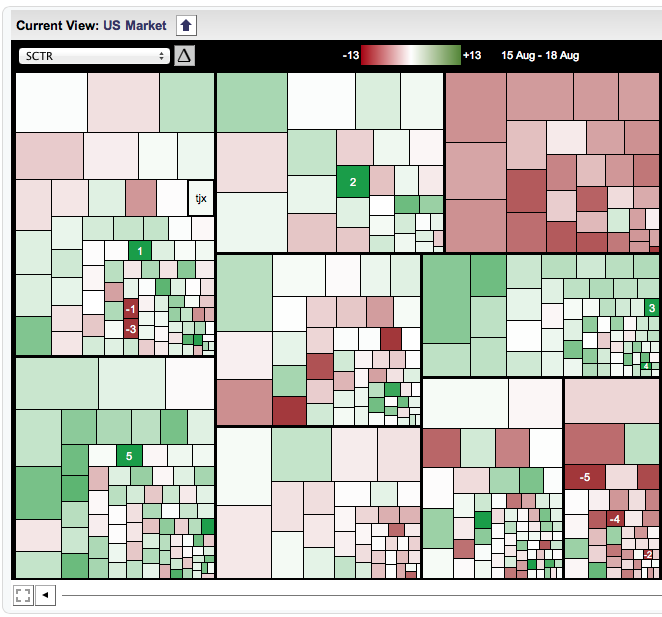
Chart 11
On Tuesday, the market was still up .5% but all the strength went to Utilities beneath the surface as the relative rankings of the SCTR points out as shown on Chart 10 dated August 19. Utilities are considered a defensive posture, so it is surprising to see Utilities excel while we are rising, based on the blue arrows. The $SPX is only 10 points from its high. This SCTR chart for Tuesday August 19th (chart 10) suggests we may struggle when we get there because Utilities are getting bid up and the other sectors were weak on a good up day.
One day does not make a trend. But if we continue to see strength in the defensive sectors through this SCTR view, it would probably help to think more defensively. I really like this view of the markets. It makes the "Golden Line" more golden and the SCTR more informative!
Good trading,
Greg Schnell, CMT
