The Canadian Dollar ($CDW) is considered a commodity currency. We all know that. Here is a current chart over a 15 year period. It would also indicate that the price of the Canadian currency leads/tracks/follows crude oil. In some instances like 2007, the currency topped first and the oil topped 6 months later. In 1999 oil bottomed before the currency made a final bottom in early January 2002. That period in 2002 also marked the top of the $USD back then.
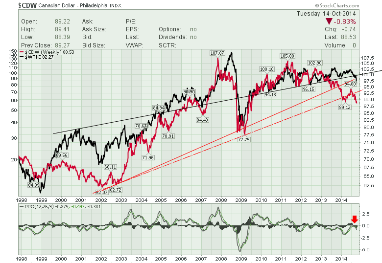
Chart 1
Lets look at the performance of the Canadian currency with other commodity currencies on chart 2. You may remember the commodity high in 2011. These currencies are all compared to the $USD which is greyed out in the top left of the screen. So the $USD is flat at 0%. But we can see the currencies have all fallen since 2011. The Kiwi shown in Kiwi green held up but recently plummeted losing 20% in the last 6 months! So this makes it pretty clear that the currencies are a reflection of commodity demand which has been tepid for almost 4 years.
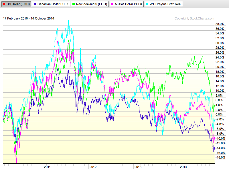
Chart 2
Let's bring in another copy of the top chart now so you don't have to flip around and study the larger implications of the Canadian Loonie diving. The major implications of this Canadian Dollar trend in Chart 3 are broad. The currency has been telling us for 2 years that all is not well in the commodity arena. Whether you pick the Canadian or one of the four shown above, they all look the same. So regardless of government policy taxing the mines in Australia, the Brazilian elections or the Canadian management of the current economy, they all point to the same result. Lower values.

Chart 3
But look how much oil has not dropped compared to the currency on the chart above. If we use the black line which just happens to line up with the currency on this chart it shows as an area of support for the currency scale as well. We can see the breakdown of that area (red crossing below the black trend line) in 2013. So 1.5 years later, the currency is still falling through more and more levels. The currency has broken a major solid red trend line and if you use the trend line of the 2009 extreme low it has snapped through that as well. I have used the lowest slope on the black line to show the trend in the price of $WTIC and it has broken down also. The price of crude has recently broken down through the long up trend from the 1999-2009 low as I have shown on the webinar series. I was really starting to wonder if the $TSX was calculating right in September when it kept climbing to higher highs and the oil and mining stocks were falling. It would appear everyone kept crowding into what was still working (Think the Canadian Banks) and kept a safe harbour there. Well not really. The Canadian stock market has lost 1700 points in 27 trading days as shown in Chart 4 below.
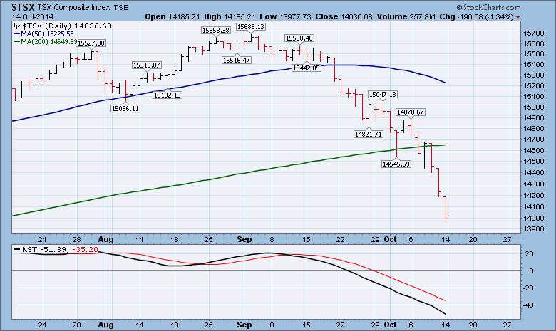
Chart 4
Trends usually stay in place for a while and this has just begun. The down momentum has to slow before it can reverse. We have not started to show positive divergences or any end of trend indicators. We'll probably hit a Demark Sequence count soon that says it is due for a bounce. I am now in the camp that so many things are structurally broken at the same time that we are in a whole new market and sideways or lower are the primary directions. I think bullish is off the table until some major trend setups start to show the potential for moves the other way. The currency charts tell me now, not to hope for much yet. Maybe the Canadian dollar can bounce off the 85 level. There was some support there in 2007 and resistance in 2008. It kept holding the dollar down there until it finally broke out. Then it popped like a balloon under water shooting up from the 85 level to 100 inside a year. If the dollar looks weak going past 85, it wouldn't take much imagination to see a move to 77.50.
Below is a weekly chart with the $TSX. The red vertical lines indicate some of the more major tops on the $TSX. Below the Index is a black histogram area that keeps track of the percentage (%) of stocks above the 200 DMA($TSXA200R) or 40 WMA. Today there is less than 30% of the $TSX composite above the long term average. Two thirds of the large Canadian companies are below the 200 DMA. This is the most sudden drop from 70 to 30 that we can see on the black histograms. It was almost instantaneous. If you think about the 2007 lows it took time to bottom ( ; | ok 2 years ) but there was a rally that went onto higher highs. In 2011, the pullback took months to base.
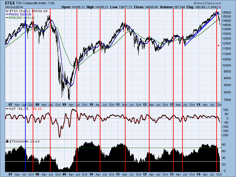
Chart 5
Whether you use the currency, the price of crude, the collapsing breadth of the bulls on the $TSX, the recent 10.8% pullback has been stifling in its quickness. None of us know the future, but a bounce here could probably be used to lighten long positions until we get some better overall picture. Globally, a list of stock indexes have crossed into major trouble areas. It is only mid month and the charts I use to gauge that are monthly so we will have to wait for month end. Who is on that list? Australia,Korea, Russia, United Kingdom, Germany, France and the Russell 2000 Index in the USA. Very close to the fine line is Spain, Italy, Japan, Hong Kong and Canada. When the world turns bearish as a unit, that created pretty clear signals in 2000, 2007 and 2011.
All that to say the market bed we slept in in August is different than the bed the market is currently making in my view. Canada has been pulling back for 6 weeks. I think the current chart climate could make trading range trades the way to keep long term capital if only 30% of the stocks are in bull trends (above the 200 DMA).
We will be doing the Canadian Technician Live Webinar, Thursday, October 16th at 4:30 PM EST . For attending the next webinar free, Please click here to register. The feedback from the last 2 have been great. Hope to see you there. They are filled with timely market information as well as helpful tips and steps to use the website. You can see the previous one here for about one week from the date (October 9, 2014).
Good trading,
Greg Schnell, CMT
