This will make sense to everyone who has read through and built a ChartList from Parts 1 to 6. If you have not, you can go to the Canadian Technician blog and scan through the December 2014 articles. They all have solar in the title.
So everyone should have a ChartList of the solar stocks above $5. I have titled my ChartList Solar Scanning List 2015. We have multiple ways to scan, but first we will start with the RRG view. This is new this year to StockCharts so I will work through it in major detail to make sure everyone understands. We will be using the Solar Scanning List 2015, but the RRG is almost like a Sonar Scanning system with a traditional radar sweep. It plots a coordinate for all the stocks around the centre. We can play with what the centre of the universe is (SPY, XLE, $SPX, TAN). We can also use shorter term charts (daily) or longer term charts (weekly). Only you can decide your trading timeline. Days, weeks, months, years. If we are using daily charts, these will be short term trades. Weekly charts will help identify longer swing trades and major trend developments. Because the solar stocks have been going down so long, we'll start with a weekly view. The big picture is often seen best through weekly, but I think we all understand these stocks have fallen by about 30% since September.
Diving in on the RRG, how do we get there?
The fastest way is to go to the Members tab, scroll down through the ChartLists, and click RRG on the Solar Scanning List 2015. That would be only 2 clicks.

How about from the homepage when we are hunting around some stocks?
First let's pull up any chart on the home page from the ticker cloud. Lets pick AAPL. Doesn't matter what stock.
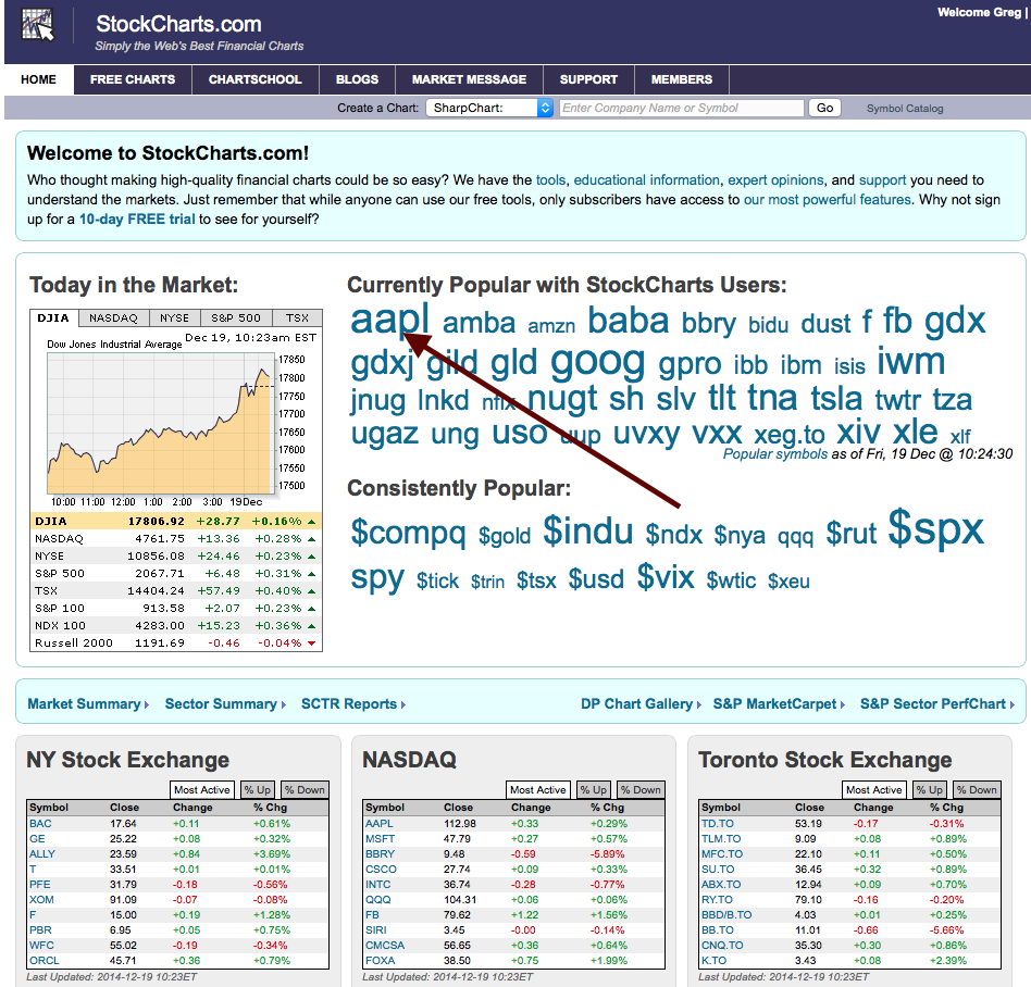
That will open the stock to your default chart settings. Now you are in the SharpCharts engine.
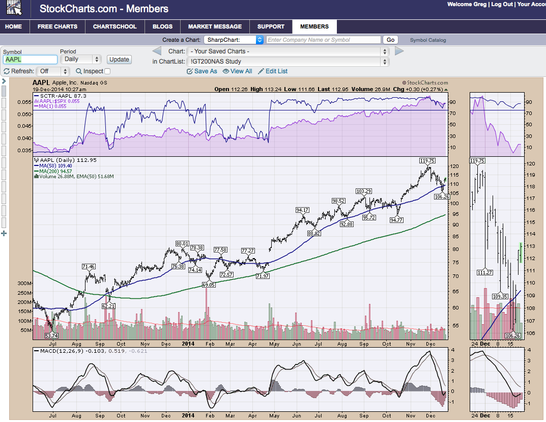
From there, we go to the top centre and click on the Solar Scanning List 2015 ChartList. That should open the first chart in your Solar Scanning List 2015.
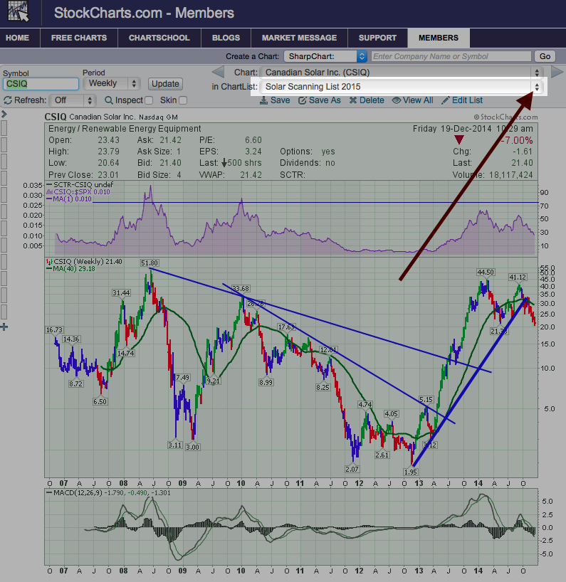
Then we are going to click below the chartlist box and click "Edit List'.
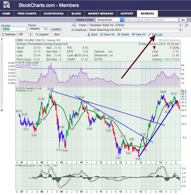
That should bring us to this screen. Click on the drop down menu at the top and select RRG.
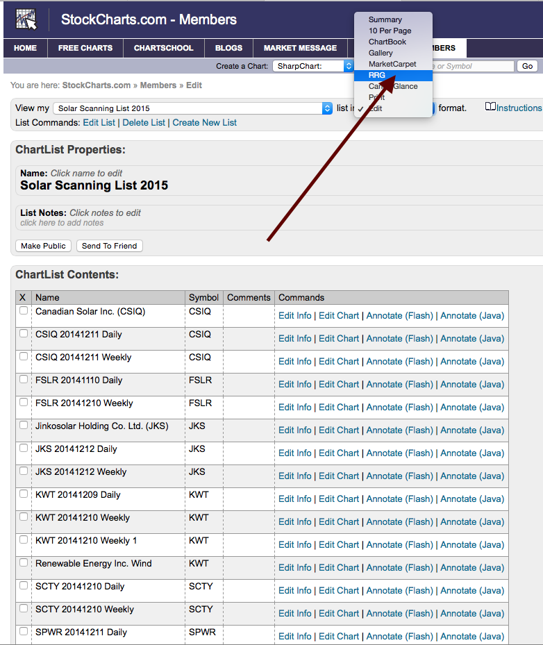
No big issue to go there either way. Depends where you are in the website. I wanted to show a quick couple of clicks from any chart. The real trick is getting the RRG of the entire ChartList without having to type them in. Once you are at the edit list/summary list/chart book area with the dropdown box, you are good to go. We are now in the RRG engine with our ChartList.
Welcome to RRG!
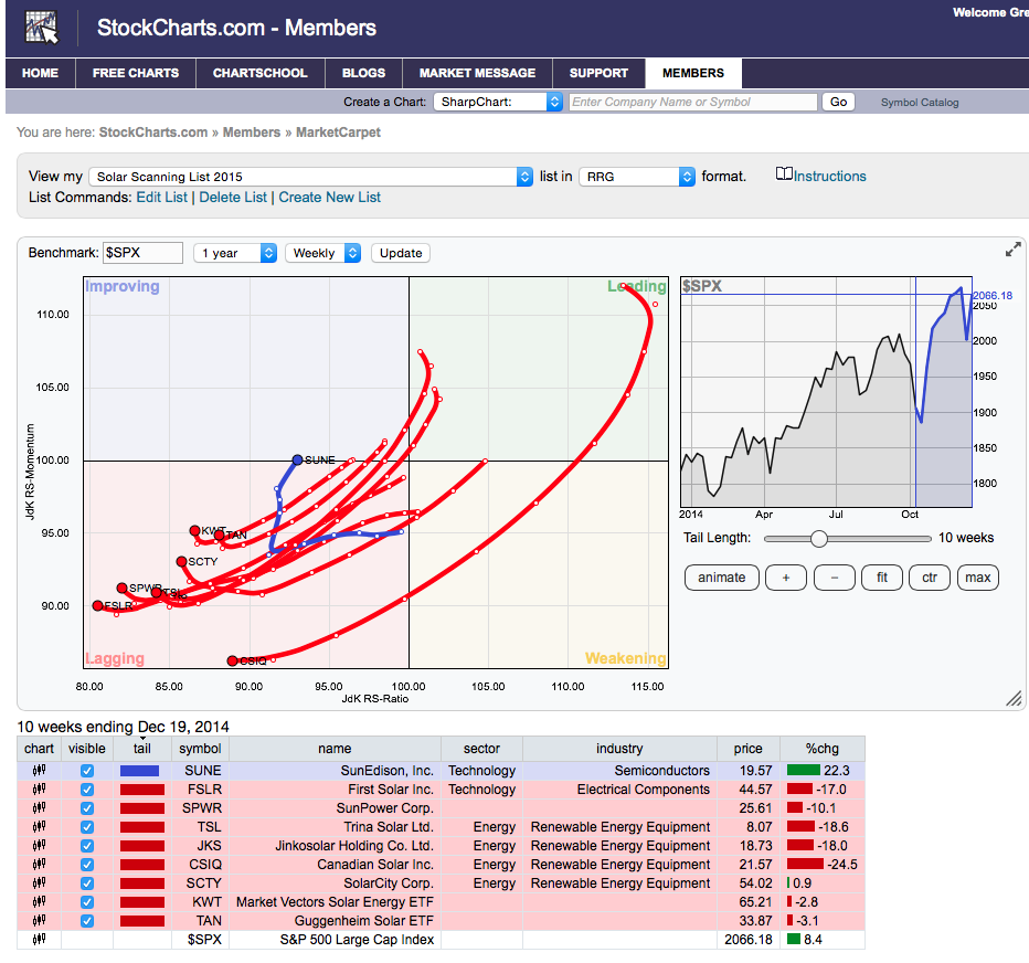
This system of analysis was created by Julius de Kempenaer. Let's talk about the three main sections of the RRG.
First is the Visual Rotation Graph on the left. Even though I have daily and weekly views of all these graphs stored, the engine is smart enough to only show me one chart of each! Nice!
Second is the small graph of the benchmark on the right. If you change the benchmark (Insert on top left), it will change what appears in the area style chart box on the right. Using the arrow keys on your keyboard, you can retrace history by moving backwards in time and it will show you how the stocks have evolved in price action over time. If you change the tail length, the blue highlighted area in the area chart box gets shorter or longer. You can't hurt anything here so play around with the controls.
Third is at the bottom in a tabular list of the stocks. Very important to note that the date of the last datapoint is shown at the top of this table. Currently reading December 19, 2014. It's the only place to see it.
So here I have made three changes. I have changed the benchmark in the top left box to $TSX. I have changed the tail length, and I have changed the date by clicking the blue area on the benchmark chart and moving it to the left.
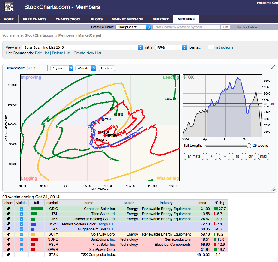
Why would I use the $TSX? No reason to. I wanted to point out that you can pick any benchmark. Then the stocks are compared in Momentum and Relative Strength to the benchmark. Notice how the blue area in the benchmark graph is no longer at the right edge but in the centre. It is also at the maximum tail length which makes the data look confusing on the visual rotation graph. You get to choose how much data you want displayed and then walk through time. Sometimes a stock will rotate to the left of centre or to the right of centre. Both of these conditions are valid which would show continued underperformance relative to the benchmark if they stayed left of the centre point of the chart. If they stayed on the right, that would be continued outperformance.
Notice where we change the Benchmark in the top left, that you can also do daily or weekly and change the length of time. That is what we are going to do next in this short video. Some of the features I discussed in text above, show up in this video.
So a couple of very powerful visuals there. One, when the stocks kept rotating left of centre they were in a consistent downtrend. Then when all of their vectors turned northeast, it was the start of a major uptrend. During that uptrend they rotated on the right hand side of the centre point. Very, very big move. I was hoping for more clarity on the recent selling point near September 1. Probably the best clue was some of the market leaders going into the red zone for the first time in a long time. It is very powerful to get on the right side of this trend.
The value in the RRG is the big picture. This week, the Solar Stocks started to turn Northwest!
Let's close off this part of the series and go into traditional scans next.
Good trading,
Greg Schnell, CMT
