The $TSX is at a very pivotal point on the chart. Why is this so pivotal? I laid out a scenario in the December 17th article, The $TSX Has A Huge Day. We have spent a few holiday weeks trying to change the view. Here is why this is so important.
.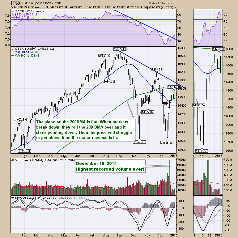
Chart 1
On Chart 1, we recorded a very strange volume candle since the December 17th article.
We had more volume on this particular "year end and quarter end and monthly" Options Expiration Day than any other day in history on the $TSX. More than the 2008 financial crisis, more than the selling that occurred when oil slammed from $149 to $32, more than the silver spike in 2011, more than the gold spike in 2011, Silver plummeting, gold dropping. What could possibly have driven the $TSX volume to an all time record before Christmas 2014? The volume calculation is pretty simple. So I don't think its a calculation problem. On the TMX homepage (Toronto Stock Exchange), the daily market report never even discussed the record volume. I have placed a black arrow on the chart showing the candle with the major volume. Nothing of significance. So why should we care? Let's do a little homework on that high volume. Where do high volume candles show up?
Here is the $TSX for 15 years, since StockCharts started carrying volume data on it.
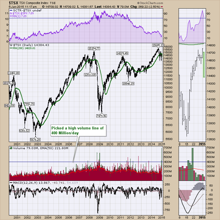
Chart 2
On Chart 2, we can see that not many 400 million share days have occurred on the $TSX. Secondly, the recent peak was a clear 100 million more than ever before! Notice the first time the volume ever hit 400 million shares was near the market top in 2007. However, the 50 Day average volume had also been climbing for years as shown with a red line on the volume chart. So 300 Million was big until multiple shots above that level in 2006. However, currently, we can see 700 Million is a stretch.
Let's zoom in on a few by looking down to Chart 3. Notice the November 1, 2007 surge after the US markets had marked their final top. Even into 2008 as the $TSX continued higher, the $SPX moved lower. But the final rally in the spring of 2008 for the US market saw the Canadian market push to new highs. However, on the retest there was no volume push with it. Look at the MACD as the market tested previous highs in June 2008. It was a weak candle on the retest, with a low MACD and volume which is an important signal. The $TSX spent November through April trying to push back above the 200 DMA and it also lost 2600 points in 75 days from the high volume of the November 1 high.
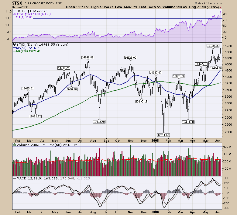
Chart 3
Here is the 2008 drop. Moment of Silence. Gulp! 50% in 6 Months!
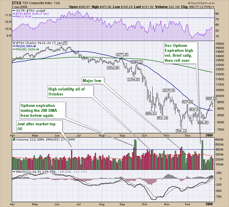
Chart 4
Huge lonely volume surge in June 2008 confirming the top on Chart 4? Looks like it to me but it was an Options Expiration day. It marked the breakdown of the 6 weeks sideways. The three back to back massive volume candles in 2008 meant what sudden volume usually means. A big break either way. After dropping 3400 points or 20%, we had significant volume. However, we just kept rolling over. Notice where that huge volume happened. On a rebound back up to the underside of the 200 DMA. Ralph Vince does some great work on volume. One of his key ideas is to watch for a very low or a very high volume day to mark a change in trend. 1/2 days are confusing, but the other 250 days are pretty normal. Notice how low the volume was trying to test the 200 DMA. Yecch! That was supposed to be a breakout 2 two month highs.
We had a very quiet market through to 2011. There were a few 300-350 Million plus days in the 2009 - 2010 period, but nothing crazy. Below is 2011 on Chart 5 which marks the commodity top.
The huge volume did not show up until below the 200 DMA. With 4, almost 5, 400 Million + days, there was definitely erratic trading. The August volume was fear, as the US markets fell on the response to the Greek situation. Spain and Italy were a mess as well. Notice the massive volume in September of 500 Million, just before the market dropped another 1250 points. The huge volume day in December 2011 was also December Options Expiration Day. It marked a major low. Look at the weak volume on the 200 day retests in July.
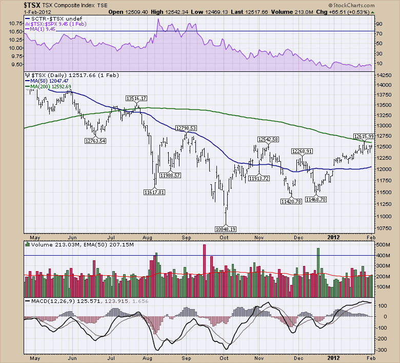
Chart 5
On Chart 6, we see the 2012 period where the $TSX spent a lot of time below the 200 DMA. The December 2011 volume spike was on the low. The March spike marked the test of the 200 DMA. Slight move up on a massive volume day. Quarterly Options Expiration as well. After that candle we only had 2 or 3 closes in the next 3 months above the 200 DMA. The June low was mixed in the bottom of the basing formation. Not very helpful as the market oscillated 500 points either way for 2 or 3 more times.
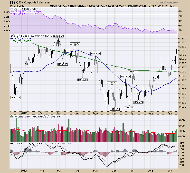
Chart 6
On Chart 7, we only had one high volume candle above 400 Million. It was also on Quarterly options expiration. It marked the start of a difficult few months. There were no other high volume candles above 400. The other 2 volumes around 350 million were both interesting. The December Options Expiration was just below the previous highs. A small pullback staying above the 50 DMA and off like a rocket. The March candle marked the end of the consolidation and another trip below the 200 DMA.
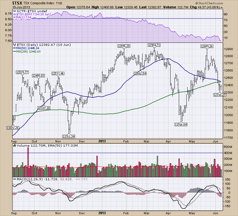
Chart 7
Chart 8 represents an interesting view of the $TSX through the latter half of 2013. If you don't remember where the $TSX topped, this is an interesting test. Are there any clues on the chart? 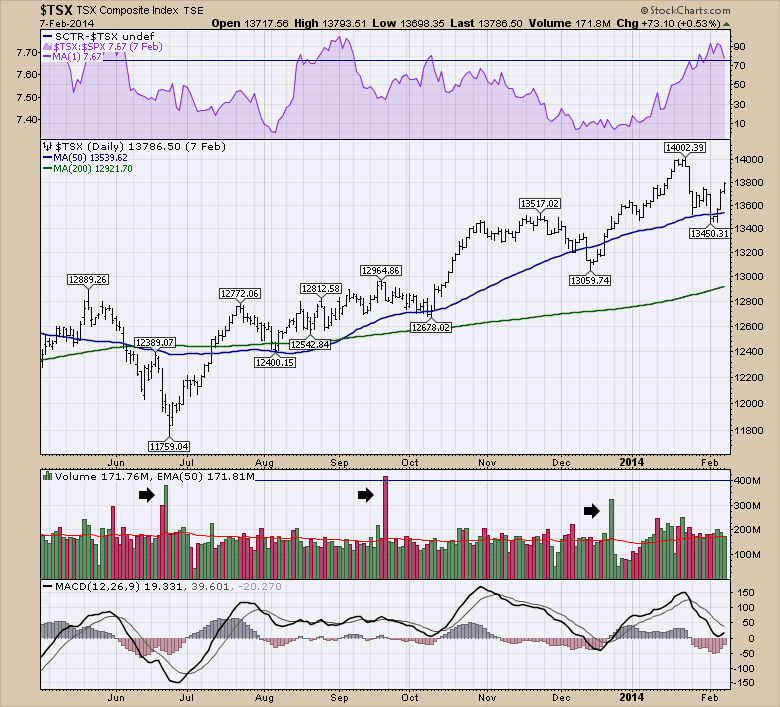
Chart 8
The answer to the question is, the MACD was performing fine and we kept making higher lows. Looks bullish. High volume on the June low and on the rebound on the next candle as shown in Chart 8 made a nice clue for a bottom. Notice all three black arrows point to a quarterly options expiration. One marked the low exactly, one marked the breakout level (A pullback for 2 weeks was hard) and the December candle marked a breakout to new highs. But notice how stable the volume was. Other than vacation days, the volume was good. Look at the late May volume where the volume dried up. Down we went into the June low. The volume is not always a signal, but usually, turning points start to show some volume trends as well.
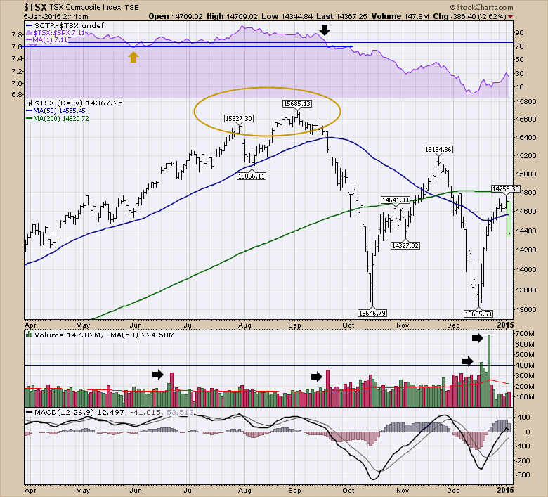
Chart 9
That 2013 chart was bullish and Chart 9 shows the run accelerating into the September 2014 time frame. The Quarterly options expirations were all big volume days. But recently there was a dramatic shift. Notice the pile of 300 Million candles and 2 over 400. Only one of those was options expiration. Would that mark a major change for 2015? lets review this chart starting in June.The volume was high, the MACD was high and everything looked ok. Interesting that that level (~15000) became the support level for the top. In September the high volume candle increased slightly over June, but the biggest change was the $TSX starting to under perform the $SPX shown on the SPURS in purple at the top. This is also while oil was letting go. Now we have bounced twice, and the rest of the world is making lower highs. We struggled to get back above the 200 DMA and stalled at the 2007 highs in November. The biggest clue to me is the huge volume accumulation in December which is normally quieter. Failing so significantly at the 200 DMA and falling hard today suggests more trouble ahead.
When I look around and see the global markets continuing to fall, it also suggests more weakness ahead. As I have mentioned in many of my articles, the MACD rolling over near zero is never a good thing.
The bottom line of this entire article is this. When volume is surging for no apparent reason, something is changing. When the volume goes unusually quiet, something is changing. The next few weeks following the big volume surges usually helps finalize the direction. But the volume can be an excellent clue to be an increasing skeptic. If you are a subscriber, I wrote a year end article on the Market Roundup blog about the massive volume candle on the $TSX. Hopefully these clues are helping you think about the markets differently.
I will be doing a webinar on Thursday at 4:30 PM EST. Hopefully you can join me for that.
PS. Chip prodded me to post some chart packs on the weekend ChartWatchers. I have not thought about the chart packs in some time. Send me a comment back detailing what I could include to make the chartlist valuable to you. The ChartPack will be free for members. In the article its Bullet point Number 6! Help, Bail me out on this one! Here is the article with a sizeable nudge! ChartWatchers. By the way, the ChartWatchers newsletter comes out every two weeks and it is free. On the bottom of the home page you can sign up for it.
Hang on, the volatility is starting to swirl!
Good trading,
Greg Schnell, CMT
