In the previous two articles, I covered off the value of the ticker cloud, the popular symbols link, the Market Summary and Sector Summary. Part 1 Link.
In the second article I covered off the SCTR ranking system and the Decision Point Links. Part 2 Link.
Now we are going to roll through the six pack grid that highlights what's moving. That section has the smell of money rolling through it! I will also finish the last two pieces on the Golden Line which are the MarketCarpet and the PerfCharts.
The grid on the home page has an immense amount of information hidden in it. This is not something to drive by. In just a few clicks you can see what is moving across the exchanges!
Let's compare the information below. In the first one, you can see the highlighted tabs on top of each grid. In the top row is the most active. That is particularly important as it is a volume analysis. In the NY Stock exchange box, you can see VALE, PBR, CHK, AA are on the list. They are the most active (note: This article was written on April 4th, so I am using April 2nd close). Who would put commodities at the top of the list after March was so horrible for those stocks? On the Nasdaq, a lot of the regular tech leaders are there. On Toronto, 6 are oil and gas related and are positive.
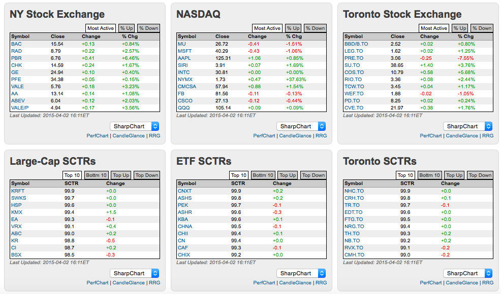
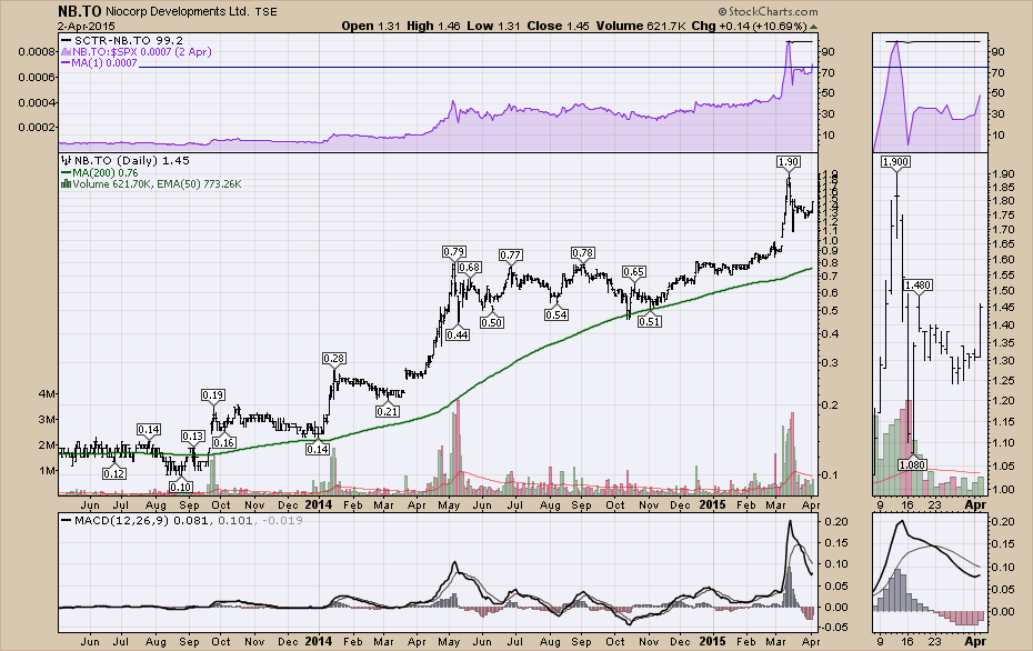
Staying on the picture above, The top 10 are pretty stable. These are the strongest stocks in their group. Look at the ETF SCTR. CNXT, ASHS, PEK, ASHR, KBA, CHNA, CHI, CN, CAF, and CHX are all China related. These are all performing fabulously! Is that a surprise to you? For Toronto, half are Pharma related. One is called NB.TO. Check out how nice this chart is starting to look. It just got enough volume and average price to get ranked in the SCTR. This points you to a relatively unknown stock. I agree, small cap and small volume, but the Canadian investor is used to small cap miners.
Now, I can change the active tab on top by clicking on it in each box on the grid. '% Up' is highlighted. Just change all six at once. It does not refresh the page so you can see them all at once. I will let you decipher each stock in the group. But it quickly alerts you to what is showing real moves in large percentage terms. Some will be mergers or acquisitions.
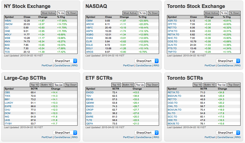
Looking at the SCTR's on the bottom of the picture above and starting in Toronto, RET.TO is a Canadian retailer in the bottom right. It has been tracking lower for a while. It is now starting to show some lift. At least it can go on your radar. How about CROP in the ETF SCTR? A small cap Ag related ETF and the SCTR has been trending higher lately. How about Expedia. The SCTR has pushed up to 88. Nice time to check into that one.
Now we can also do the negative to help trade symbols on pullbacks or that we expect to break down if the overall market softens. The top three boxes tell us they are having a bad day but that does not give us any position as to how they have been doing. Look at the information in the ETF boxes for that.
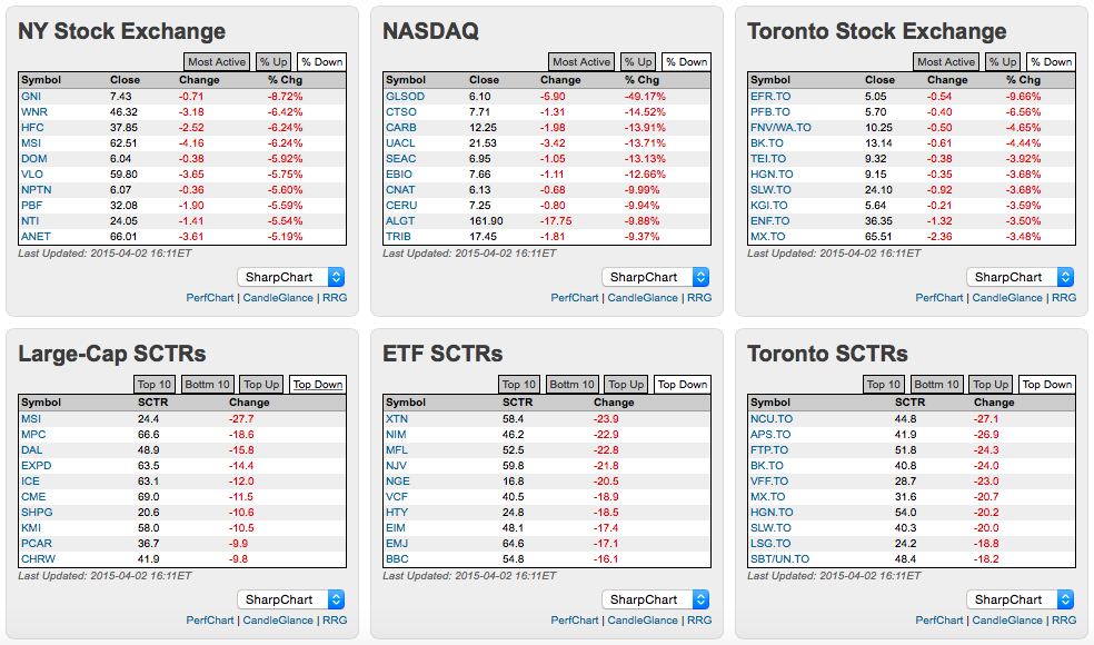
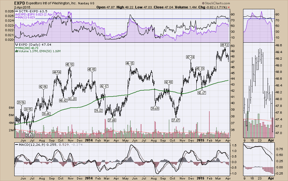
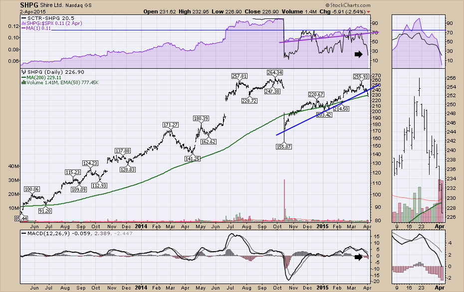
EXPD has an SCTR of 63.5 which means it was at 80 yesterday. This means it is a strong stock (at 80), but having a bad day. You can also see SHPG which has been strong, it recently failed a triple top breakout. The SCTR is now 30! Let's look at those two charts. Below is EXPD. This chart recently broke out and is pulling back. If 46 holds as support, this is a great place to get long!
Here is SHPG. This chart looks ready to break down in a big way. Perhaps the pharma group is being abandoned in favour of growth, especially emerging markets.
OK. You get the picture. By clicking through the tabs you can find hundreds of interesting stocks!
Let's briefIy finish the Golden Line with the MarketCarpet, which I explained a little about in one of the earlier articles. I use the MarketCarpet in the sectors I am not as familiar with because they also provide relative market cap data by sorting by size. I could write out more here, but I think Arthur Hill did such a great job covering off how to use the MarketCarpet tools in this video article, I will link you there for more information. Arthur Hill Video of MarketCarpets.
I use PerfCharts often and they just allow you to compare percentage moves over a period of time. They are very valuable. Click on the link on the Golden Line. One of the hidden gems is the drop down at the bottom.
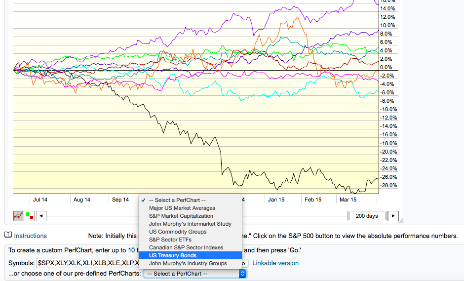
This quickly takes you to various links. The Toronto sectors are in here and so are the Treasuries! Very nice!
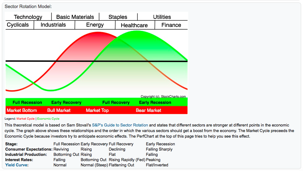
Lastly, one of the hidden guidance systems in StockCharts.com is the Sam Stovall Sector Rotation Model. To follow the order or typical sequence of market rotation, this is one of the best models.
Just scroll down below the actual Perf Chart. It looks like this.
Those are the highlights of how I use the home page. I hope you found some ideas there to help guide you. I should be back in the office soon!
Good trading,
Greg Schnell, CMT
