 I picked 10 Oil Majors to review this week as June 13 marks one year since the decline in oil prices started. I think these charts are important as they do a strong job of representing the oil industry and investor sentiment towards the group. The oil industry had been responsible for 1/3 of the capital spending in 2014 across the S&P 500 and the oil majors are obviously key in that. While many of the companies reduced their 2015 spending by 10-30%, the knock on effects of that slowdown rippled across transportation, utilities, steel, valve manufacturers, data control systems, pipe layers, engineering firms, construction companies, vehicle sales and equipment sales, just to name a few. I recently did a webinar on Thursday, that went into depth on some of the main commodities and the deflationary threats that appear to be showing up. That webinar can be found by clicking this link. 20150604 Market Round Up Live.
Following that webinar, I was updating the webinar charts on Friday as some broke through 6 year trend lines the next day. Click here for the Martin Pring Market Round Up blog for subscribers to see the changes. You can also click on the charts in the article and save them in your own ChartLists. On Friday, I tweeted out a few of the oil company majors' charts while diagnosing the industry trends. You can find my twitter account @schnellinvestor. I am working to get more active on the social media, where it is just a single interesting chart going out. On Saturday, I posted three charts in an article for the ChartWatchers newsletter about the oil industry. ChartWatchers is a free article with all the blog authors writing about important market developments twice a month. That newsletter can be emailed to you and represents a random look across the stocks, bonds, commodities and currencies through 7 authors in a snapshot of time. You'll find this link at the bottom of the StockCharts.com home page.

As an author, I find it very interesting to see what is the most compelling group of charts on each author's mind. Why did I explain all this? The authors are publishing work on various blogs for you to read and the stories may link from article to article. Each article stands on its own, but there are multiple points of engagement for you to get a broader story.
Back to 10 charts for the oil industry majors.
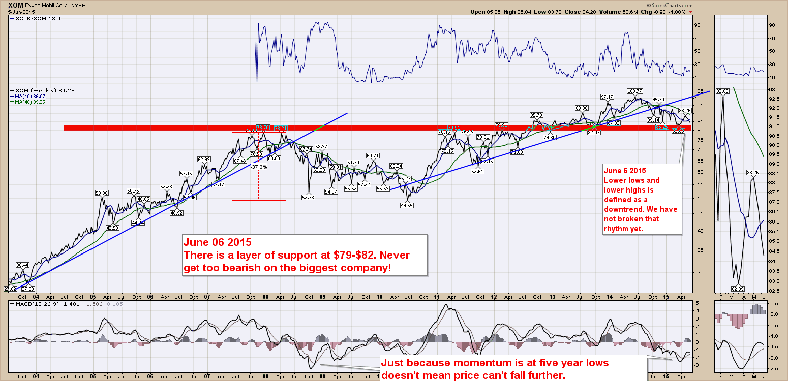
Let's kick it off with the granddaddy, ExxonMobil. (XOM). Exxon is very close to the previous highs of 2008. So far $82 has held but this is a major area of support. Should this fail, I would be very wary for other stocks in the sector to hold up. The low price in March generated a major low in momentum as seen on the MACD. Exxon produces enough cash that institutions will move into the majors even in a declining industry,y knowing they have the best chance of riding out the highs and lows. The SCTR has been trapped below 30 for 9 months and the 40 WMA looks like major resistance overhead.
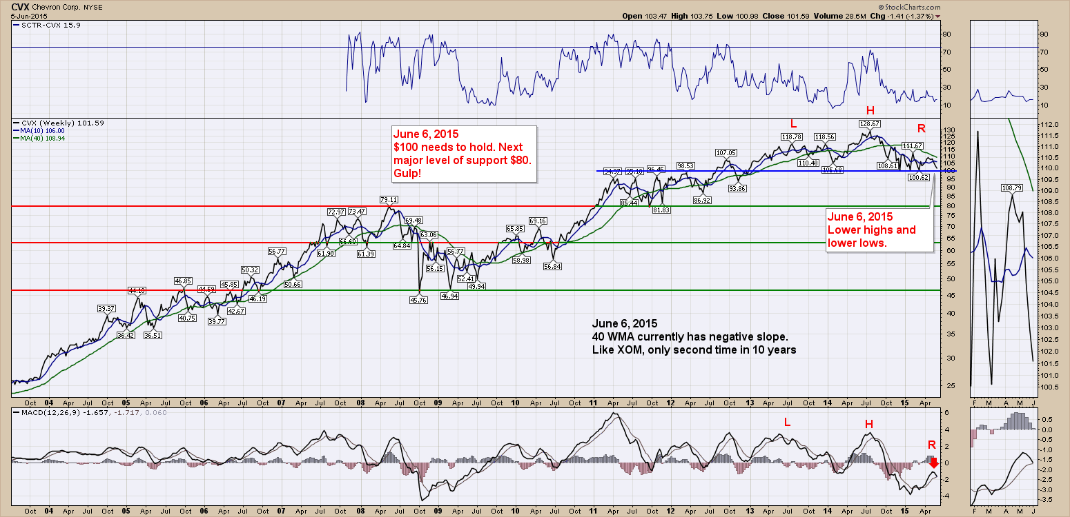
Next is Chevron (CVX). These are not in a particular order. $100 really needs to hold here. Traders and institutions will be looking for a support area to hold against. However, the MACD looks weak here and this is a typical pattern of a major top with matching momentum. Be careful on making correlations with the 2009 lows. That low was caused by a breakdown in housing which eventually led into the financial sector. When the banks started to collapse, everything fell. In 2014, this was the lead sector in a major collapse.
Next is ConocoPhillips. (COP). This chart displays clear support and resistance zones. If the $60 level can hold that would be great. If not, the next major support is at $52.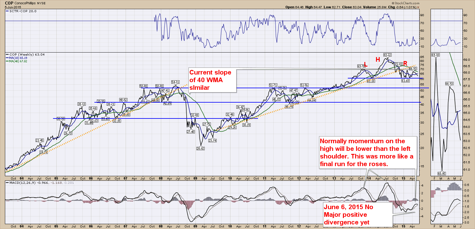
Next is Royal Dutch Shell (RDS/A). The chart below represents the classic technical analysis $62-$46 = $16. Adding that to the previous resistance, $62 + $16 = $78. Now that the last test of $62 failed, this chart looks like another test of $56. Should that fail to hold, there is some support level around $50. That would be another 10-15% to the downside. All of the charts have down sloping 40 WMA. The restructuring of Shell in 2005 created a new class of shares which is the reason the data starts in 2005.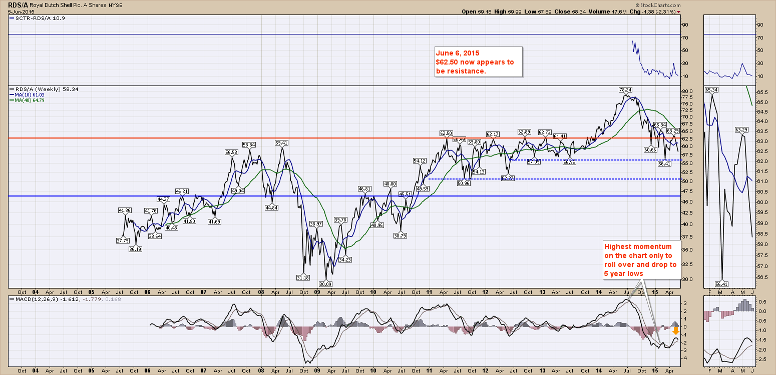
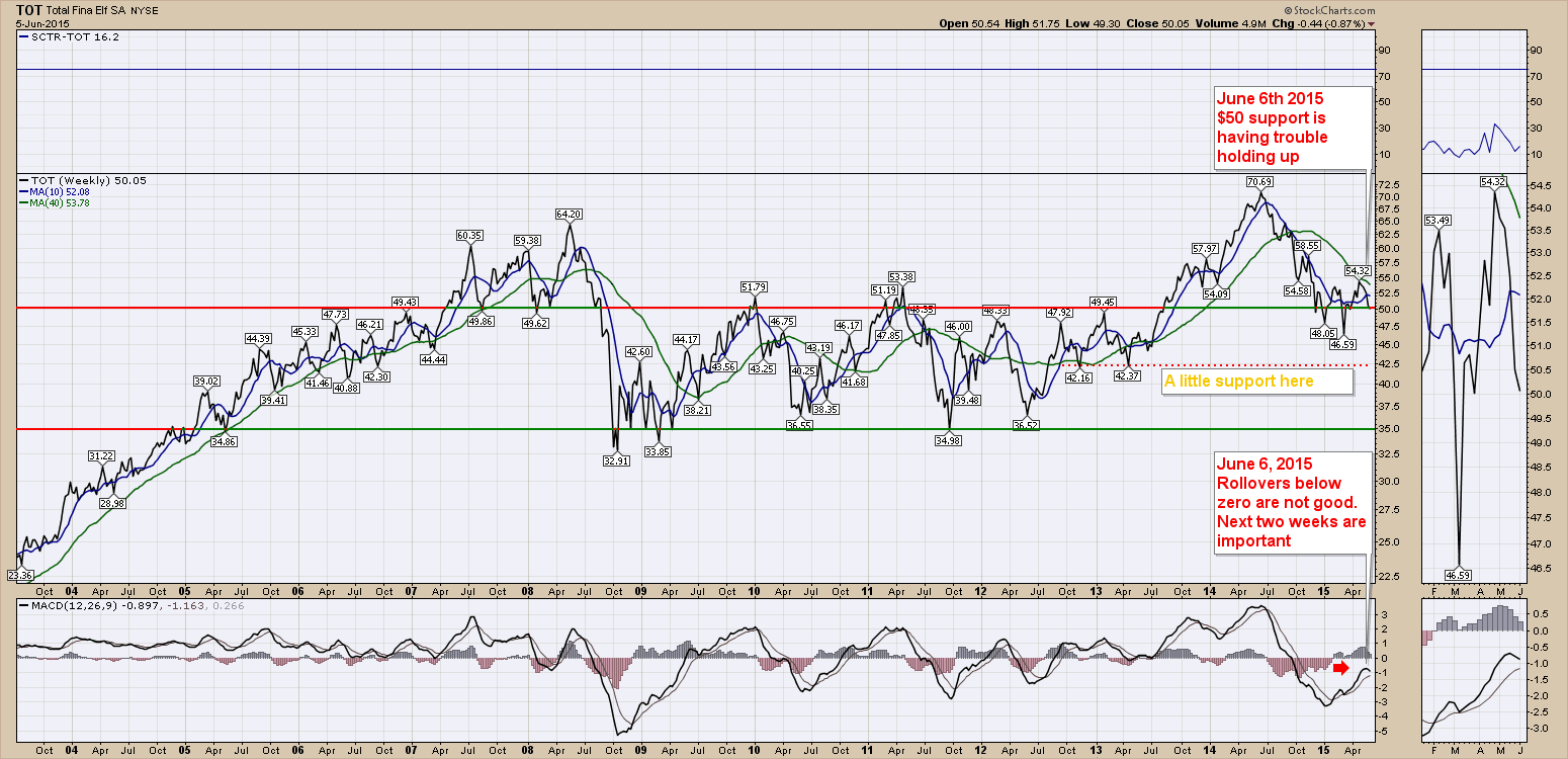
Total (TOT) is another chart that exceeded the 2008 highs. Once again, the momentum on the MACD soared to new highs only to roll over and make 5 year lows. This is one reason that this market breakdown was harder to diagnose. Usually a fresh run to new highs is not closely correlated with new 52 week lows next! However, the snapping of trend lines on all the charts was a pretty clear signal that things were unwinding. Total (TOT) is trying to hold $50 this week. The momentum is rolling over once again, so it would appear this might go test the intermediate support level around $42.50.
The charts below this never took out the 2008 highs.
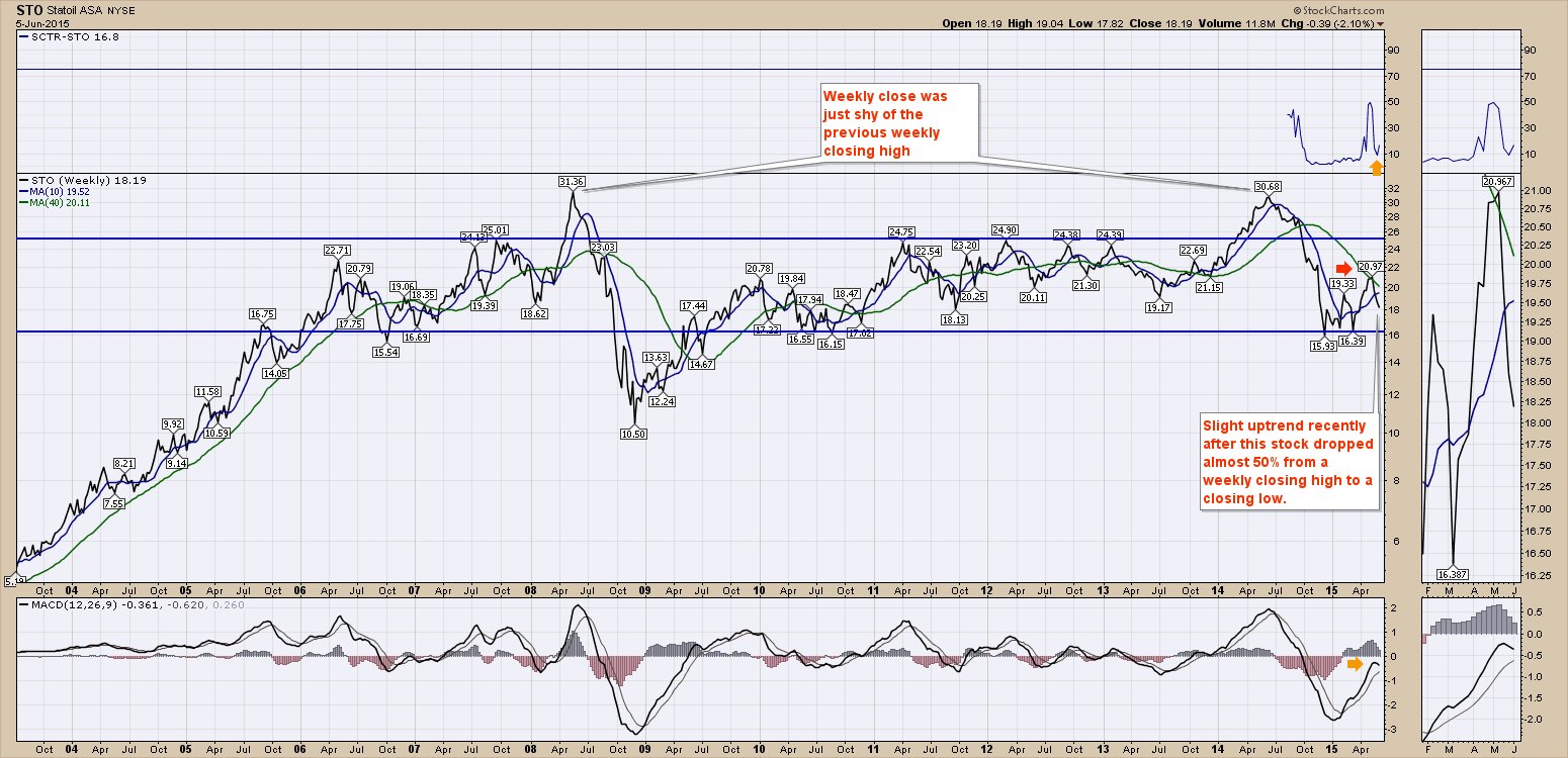
Let's start with Statoil (STO). The stock lost almost 50% of its value. It retraced back up to the 40 WMA and has since rolled over again. The MACD appears to be topping out below zero, so it looks like more tests of the lows are in order which is about 10% lower from here.
Next is BP Amoco (BP). BP's MACD actually got back above zero! It also has moved above the 40 WMA and appears to be testing it from the topside, looking for the 40 WMA to become support. The $35 had an interesting support/resistance role in the chart history. It was resistance in the 2008-2009 lows, it was resistance after Maconda, it oscillated between support and resistance through 2011, 2012, 2013 and 2015. I would expect $35 to be finding some buyers showing up for work if it pulls back to that level. 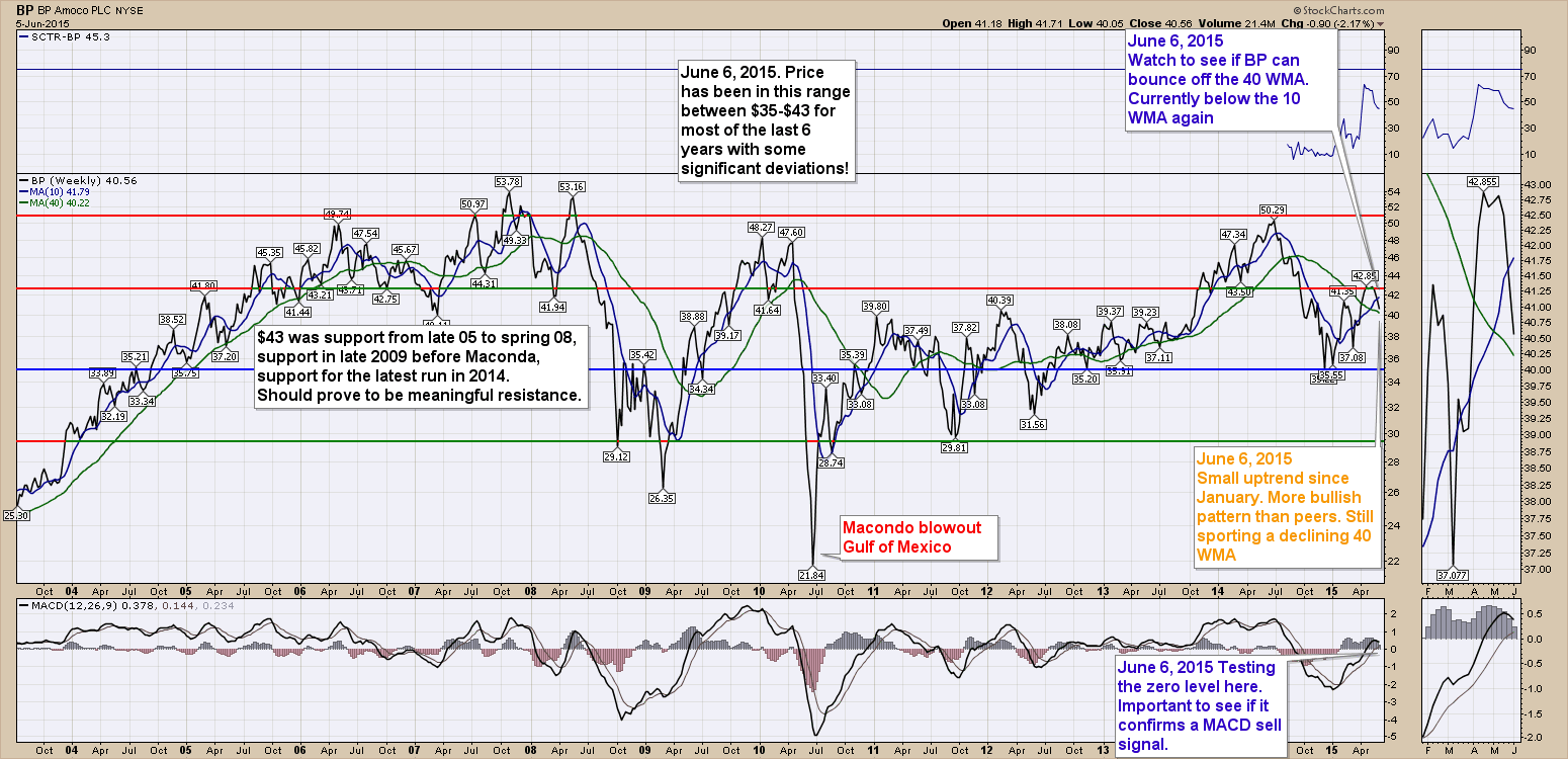
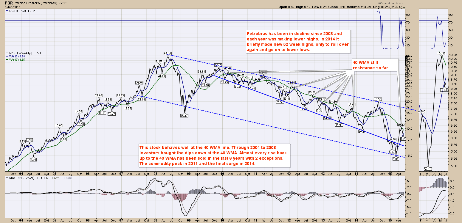
Petrobras (PBR) is the weakest of the 10 in the article. We can see it has declined substantially over the years. Recently it bounced back to new 52 week highs in 2014 but it went on to make lower lows. While it has doubled off the lows of $5, it is still difficult to see a reason for a long horizon investment in the stock.
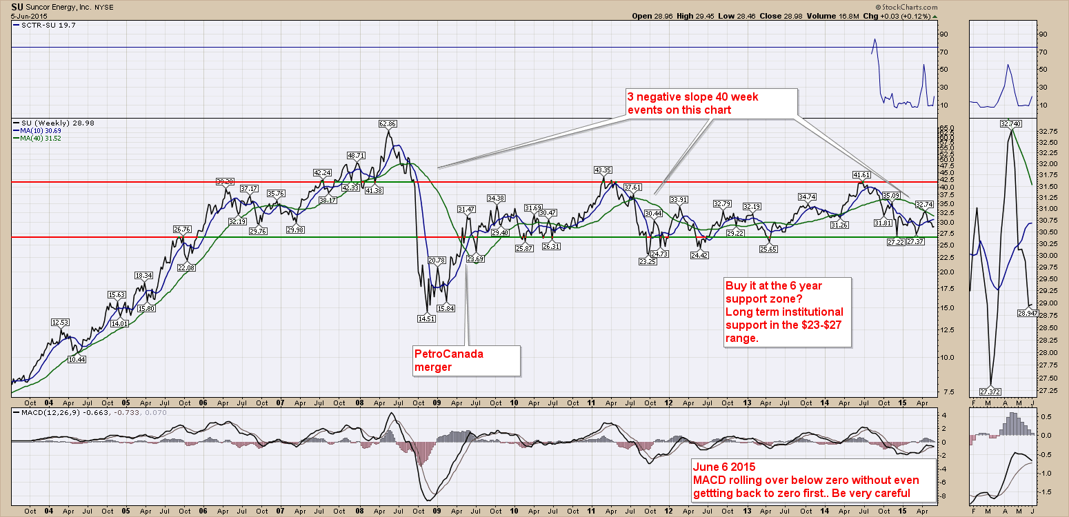
Lastly, I have 2 Canadian Stocks. Suncor (SU) is first. I have used the US listing for consistency as it is also listed in Canada. We can see Suncor has been trapped in a 6 year trading range since the merger with PetroCanada. The run up in the stock from 2013 to 2014 was a classic with Warren Buffett buying the stock after Bill Gates and Warren Buffett toured the oilsands.
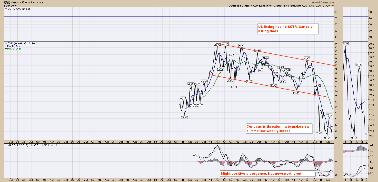
Lastly is the chart of Cenovus (CVE). Cenovus is almost exclusively an oil stock. I could have used CNRL(CNQ) but they don't have refining. In keeping with the major trends above I'll use the US Listing. For Cenovus, CVE this just keeps getting weaker. While they had some of the lowest cost production systems, the chart is still unable to get firm support. It was also unable to take out the 2011 highs on the 2014 energy sector run.
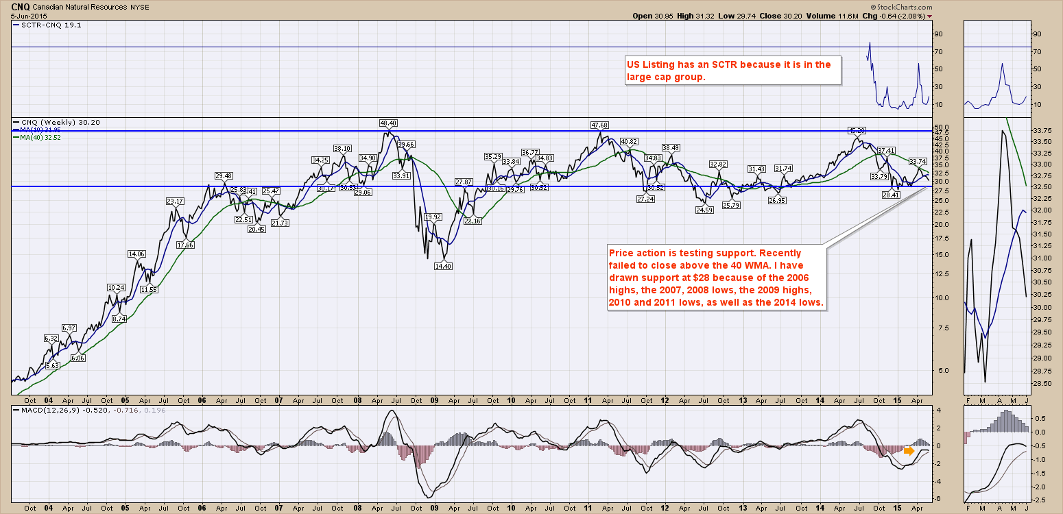
 OK the bonus chart. Canadian Natural Resources (CNQ). CNQ looks a lot like Suncor. I don't really have a name for the 2011 to 2014 peaks with a slow arc between the two. Perhaps we can call it the Golden Gate Bridge pattern. Failures at the 40 WMA usually mean lower prices. CNQ is currently within the trading range where price visited 9 times in the last 9 years. A move to $28 looks in the cards, but a look at 2011's failed test of the 40 WMA suggests this chart could test the $25 level.
 The bottom line of this review is that it does not look imminent for the industry to pick up. Maybe the summer will work out better, but none of the charts are writing about optimism at this point. A few strong weeks could change that but the last 4 have not been bullish on almost all of the charts.
Hopefully this big picture review identifies the major trends and the failing of the 40 WMA in almost all cases suggests lower prices with the potential to break below support on some of the charts. If this group takes another leg lower, I think it could be significant to the overall market strength.
Good trading,
Greg Schnell, CMT
