For those who missed it, there is a part one to this article covered in the article linked here. The Full Monty On The Weeks Meltdown.
With the same chart style and the global review, I would like to continue to go around the globe and look at each chart on a monthly chart. Notice how important closes below the 20 month moving average (MMA) are, so I marked the low closes with arrows on the price chart. It is also very important when charts around the world break below this level as a group. RSI falling below 50 on monthly charts and staying below 60 is important as that typically marks a bear market. The monthly MACD with a negative slope is usually a big problem and a rising average true range is a big deal to me. Sometimes the narrowing of the Bollinger Bands can be a big clue. Arthur Hill and I have been writing about this and it is usually reflective of a change in trend but not always. The Bollinger Band pinch has been very notable on the weekly charts but I want to run with monthly here. Keep in mind that we still have a few trading days to rebound. These charts show the monthly close and the close below the 20 month MA (MMA) is what I want to focus on.
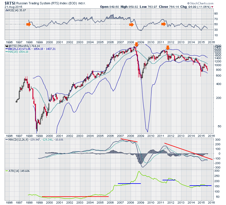
We can start in Russia ($RTSI). The data around 2000 is a little spotty (multiple months missing) so we'll leave that top out. The RSI, MACD and ATR all provided a nice long term signal that all was not well at the 2007 top and currently conveys the same message since 2011.
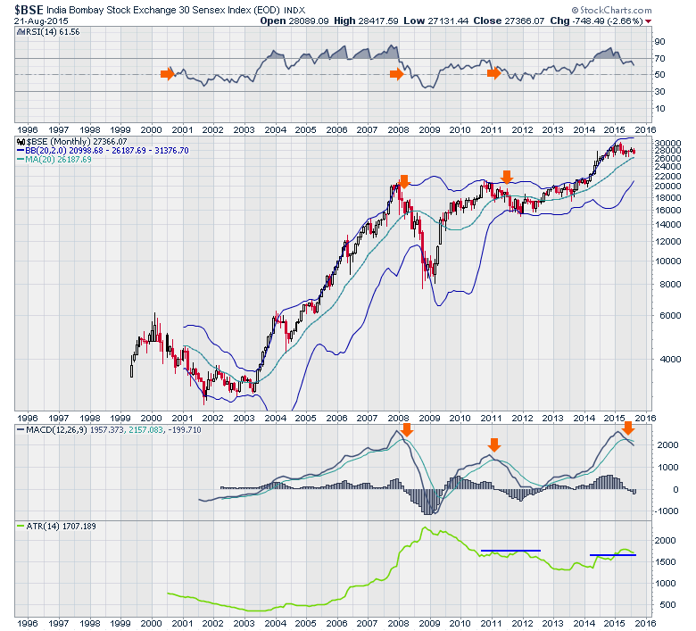
Moving to the Bombay Stock Exchange in India ($BSE), we can see one of the strongest charts recently. India has the best demographics in the world. While we have a MACD and an ATR signal, we don't have an RSI signal or a price move below the 20 MMA.
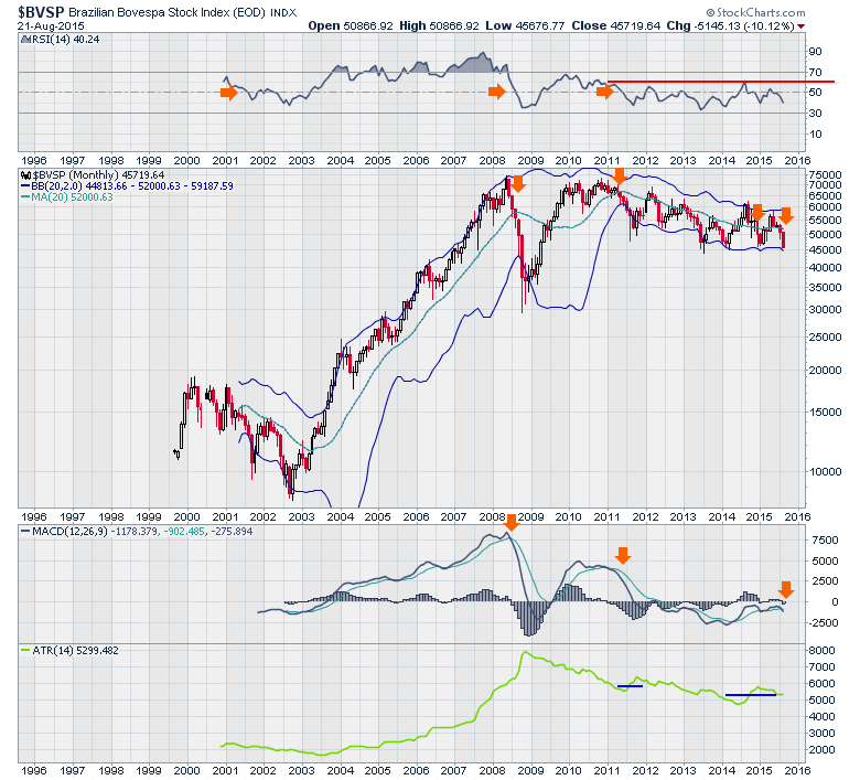
Brazil ($BVSP) is a major market reflective of most of South America as well. The market sits near 6 year lows. If it closed the month here, it would be the lowest close since 2009.
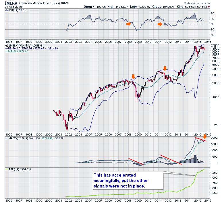
Perhaps one more market in South America would be valuable. The Argentinian Market ($MERV). This one holds a sharp contrast to Brazil. While it recently tried to take out its 2014 highs, it made it 2 points above on an intraday basis and rolled over. As you can see, it has not triggered the other signals like the RSI and the ATR but the MACD is quite negative here.
Let's wrap up the global parade in Europe. Why Europe last? Well there are a few things that make Europe particularly sensitive for bankers and investors.
First of all it is home to the Greek Debt crisis. Second of all, it has a few more nations with debt problems. Spain, Italy and Greece are the ones we hear about and France, Ireland, Portugal and Belgium are also sporting high debt levels. But the Monetary Union also launched QE in January, so the equity markets globally surged in January. Here are a few of the heavily indebted nations.
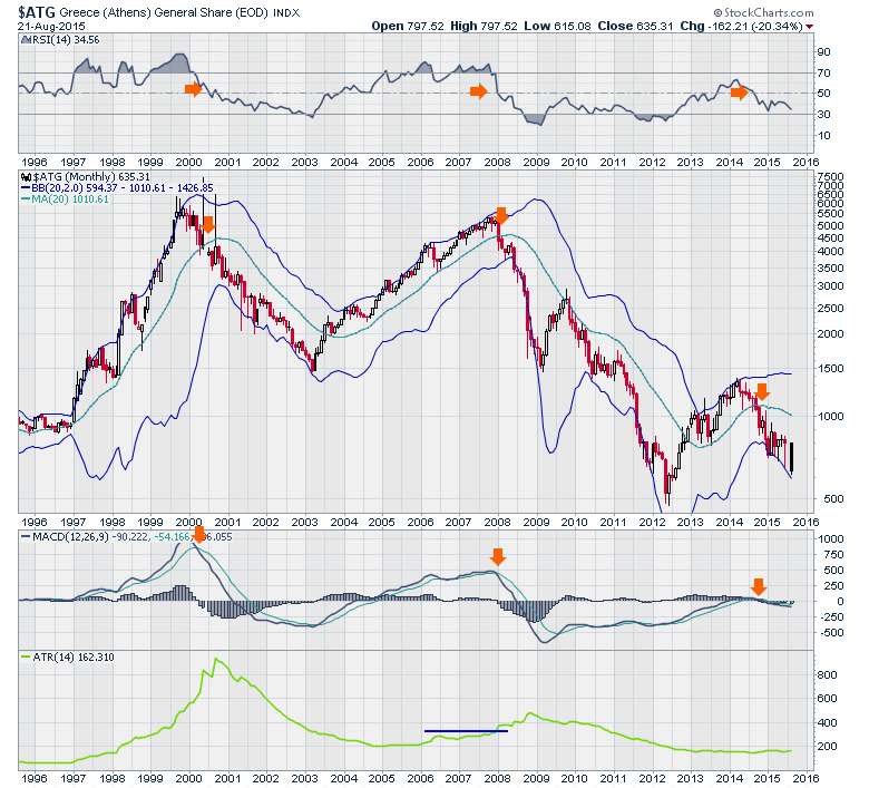
No surprise about Greece ($ATG). It's a little bit ugly but it is a small market.
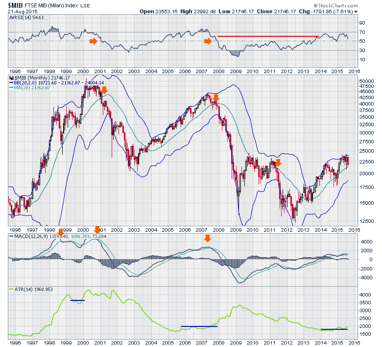
Here is Italy. ($MIB). This chart is surprisingly good considering they have one of the highest debt levels in the developed world. It has been rallying from 2012 but you can see it appears to be stuck at resistance near the 2009 highs.
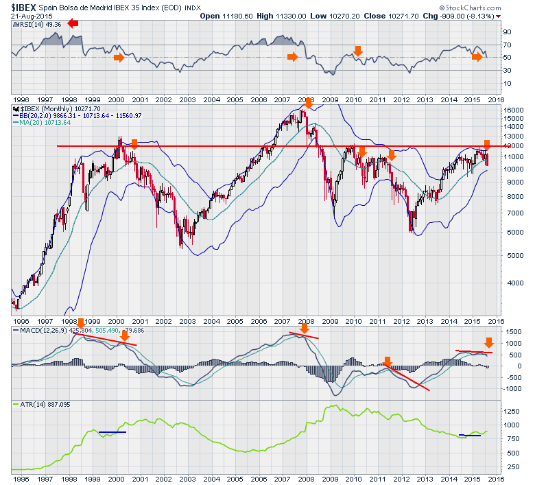
Spain ($IBEX) is a great country but what do investors think of Spain's economics currently? The chart tells a story of weakness since shortly after the 2015 QE started. We can also see a dramatic support/resistance line in red running through the 20 year history on the chart. Friday's close pushed the RSI below 50 but we still need to wait for August's month end level to confirm it. So as we look at these charts, we can see the European QE has not really been supportive of these markets since March but they have also had the Greek situation affecting them as well.
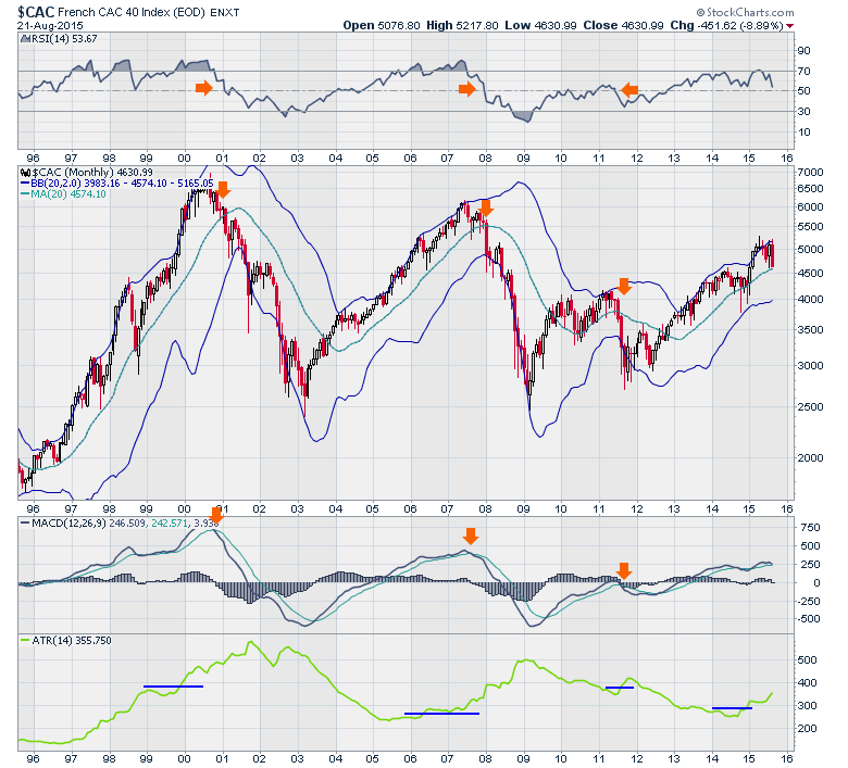
Let's look at some of the other countries. I have a rule of thumb that France, Italy, Spain, Germany and the UK each have around 60+ Million in population. They should be the dominant economies in Europe. France ($CAC) has not broken down yet but you can see the MACD is close to rolling over, the RSI is near 50 and the price is just above the 20 MMA.
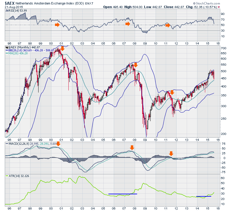
The Amsterdam Exchange ($AEX) is unique. I have a particular interest as I used to live in the Netherlands. The series of lower peaks 2000-2007-2015 is not comforting. Unfortunately that is duplicated on the $CAC above so that is not a positive trend if these markets reverse here. Looking at the legend on the MACD we can see that it is just barely positive at this point but nonetheless, still positive.
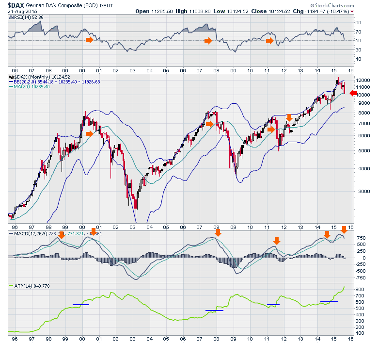
The biggest influence in the Monetary Union is Germany ($DAX). The $DAX closed Friday below the centre of the Bollinger Bands or the 20 MMA. The MACD has confirmed the rollover but the RSI is still holding above 50. The ATR has been rising steadily so no new signal there.
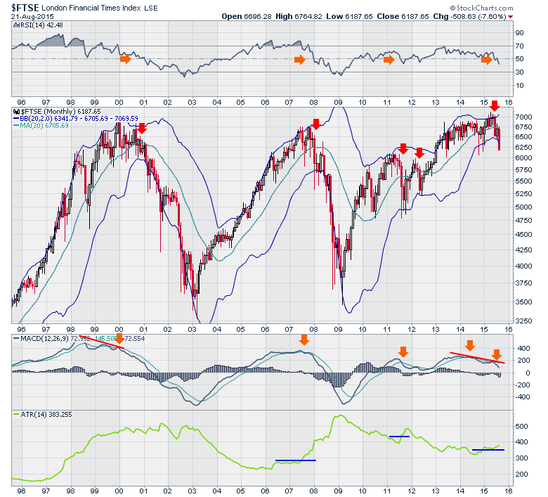
Going outside the European Monetary Union and looking in London we find the $FTSE. The RSI, ATR and MACD are all confirming the price weakness below the 20 MMA. What I find incredible about this chart is this market broke down in June below its 20 MMA and the price recorded a failed breakout above the 6900 level which has been resistance for 15 years. How does that compare with the Bank of England's outlook on Monetary Policy? They think everything is in place to start raising interest rates. Click on this link. Mark Carney. The technical signals for the British market have been in place on this chart for a few months. I don't expect the Bank of England to rely on technicals, but ignoring them would be important if they raised rates in the face of what this chart is saying and has been saying.
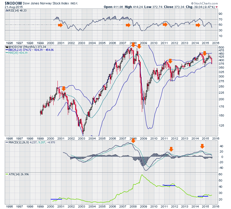
One more European country that is not part of the European Monetary Union is Norway. Norway ($NODOW) is an oil country with the North Sea assets. The Norwegian market made highs in June of 2014 and has been unable to surpass them since. Friday's close marked a close below the bottom Bollinger Band which usually implies a bounce but it doesn't have to as the 2008 drop shows.
OK, that is a pile of charts. What do your eyes tell you about the global market condition? What to make of it all is the question. My view is that numerous charts have been weakening for a while. Some of them started to reverse when the Chinese market started to roll over months ago. Others have been rolling over since oil rolled over. This global lack of commodity absorption takes time to ripple through the economies of the world much like the effects of the US Dollar takes time to slow business for major US companies. It does show up as a blanket slowly limiting world markets. The real question of global growth becomes a knife edge at this point in time with Japan and Europe in the middle of their QE program and China directly investing to try and hold their stock market up. The charts are rolling over significantly and now they are rolling over globally together. The cliff drop globally last week was not weeks in the making but at least a year of compounding weakening has taken place in different corners of the globe. Now this global pressure is starting to roll through to the large caps around the world.
While we don't have a month end close at these levels, it's timely to look around and decide what you will do with your portfolios if we do get a month end world wide that closes below support at the 20 MMA and cracking all of the trend lines that I covered in my Thursday webinar. Greg Market Roundup Live 20150821.
"No one rings a bell at the top" is a common phrase. The technicals have been telling us about this market's damaged condition for months. I read a tweet about how all the technicians will be saying that when the market bottoms it was a classic pattern. Actually, we would like to be a little earlier than that. We are calling this a topping pattern with declining breadth locally and world markets breaking down. This is complete with long multi-year trendline breaks in every area of stocks, bonds, commodities and currencies suggesting the macro picture is changing. Governments try to prevent global markets from breaking down and we currently have China, Japan, and Europe doing local initiatives. The charts are still suggesting the markets are breaking down. There is nothing to say that other governments won't realize this and do more. We do have another 6 trading days to see if we get confirming signals on all of these charts that hold above the 20 MMA. Jim Cramer is already tweeting over the weekend, asking the Federal Reserve to step in.
Right now there are enough markets globally for me to be bearish with the $SPX, $INDU, $RUT and $WLSH all below the 20 MMA. The Canadian market, the Hong Kong market, Australia, South Korea, Russia, Brazil, Greece, Spain, Germany and London are all below this level at the 20 MMA already. The Shanghai market, Japan, India, France, Amsterdam, Italy and Argentina are not. So for long term investors, this is a decision point. We have some lines in the sand that are important historically and I think these charts laid out good long term levels. Measure the charts you think are important against some sort of backstop and if those markets don't hold above those levels, you'll have a reason for moving to safety within 10% of the highs.
Good trading,
Greg Schnell, CMT
