Two weeks ago, the $TSX made a big push up to new 52 week highs. The intraday high was 15621. The candles around the high have some interesting traits that should be noted as this might mark a more meaningful top for the next few weeks or months. The market surged above the previous levels of 15400 shown with a red line. The original breakout day saw the $TSX close near the highs of the candle. The final high candle I am referring to has an orange arrow next to it. We can see it pushed higher and closed in the middle of the range which is perfectly normal. The next day, the market fell away all day, and the same on the following day. This makes the high look unsupported as the market quickly retreated from those levels. While a fundamental analyst might place little weight on this particular group of candles, more information makes this failure to hold the highs significant.
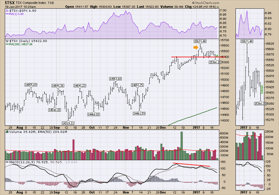
Rolling this out to a 2-year view, we can see the $TSX has been rising since the January lows, which also coincides with the commodity lows from January 2016. That should not be a surprise to Canadian investors. The next big piece of information on the chart is that this price high was a 2-day surge above 15400 that immediately retraced right back. Looking left on the chart, we can see the previous high of 15524 was also a surge that failed to hold. Returning to chart 1, we can see the candle the day before the high got up near the 15524 level in the zoom box. Any time you test the previous high, you want to watch the market reaction. The surge on January 5th, 2017, the following day, was intriguing but failed to hold above the 2-year old highs. That is technically significant for technicians.
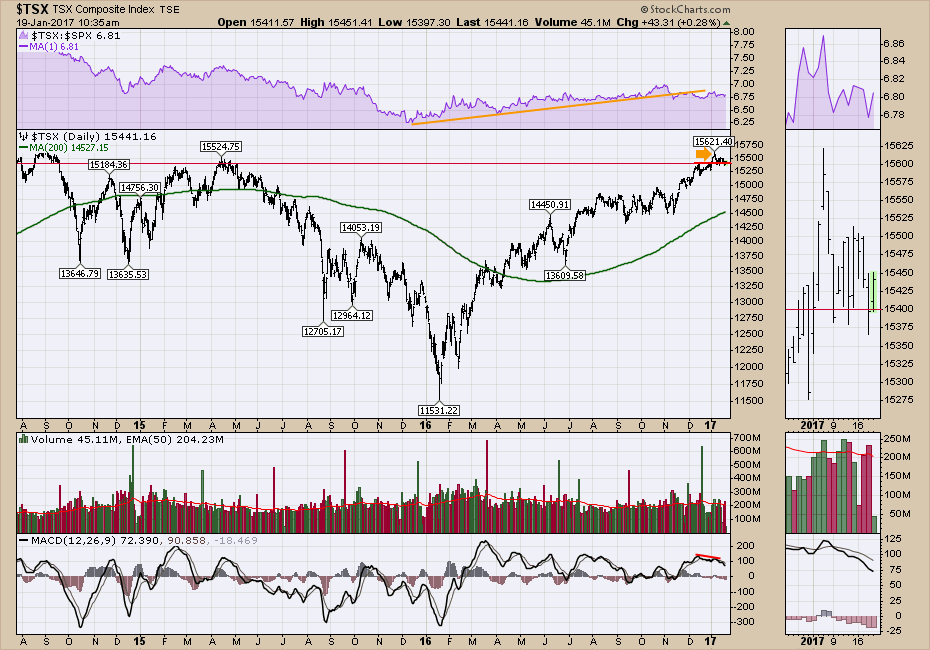 So while the market has not crashed down, it is still struggling to break through the former highs and hold there.
One of the benefits of being a StockCharts member is the ability to look back at historical levels. Rolling back the same chart to 10 years of information shows the problem. This level over 15000 has been very difficult to break through for years. The 2008 high surged above the 2007 high for a few months and couldn't hold it. The 2011 high got stuck around 14300 which had been a tough level on multiple occasions. The 2014 high was 500 points above the previous high (3%) but stalled there. The 2015 high stalled below the previous highs. Now in 2017, we have this stalling action once again at previous highs.
As a footnote, this link shows how the different StockCharts membership levels allow you to look back for more information if your membership level does not go back that far. Extra members can look back more than 5 years and Pro level gives you 50 years of data on most ticker symbols. StockCharts Tools.
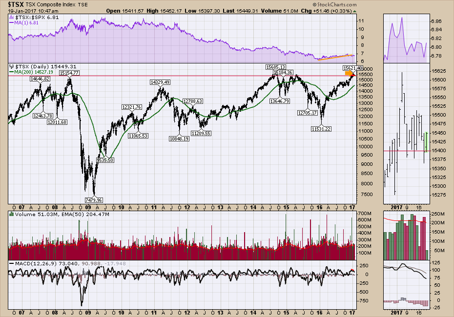 It is important to understand that this level of 15000 - 15500 has been meaningful resistance for the last 10 years. Whether it is the total price/earnings ratio for fundamental investors, or the technical levels for chartists, this level is difficult to overcome. I wrote an article on this just before the end of 2016. $TSX Struggles At Old Highs. So far, there has been another struggle at the old highs as we might have expected.
So while this year may eventually break through the highs, swing traders should remain diligent as we approach these old highs. A meaningful breakdown from here could mean we don't revisit these levels for months. A successful breakout through this level would be just as significant.
Wednesdays breakdown to three week lows is not fatal, but it does put another bruise in the markets strength to get through these highs at this time. Caution is warranted if you are trying to hold the gains you closed out the 2016 calendar year with.
Over the last weekend, Tom Bowley and I put together a webinar with a series of charts outlining some longer views for 2017. While they don't make a case for near term market action, they do suggest leaning into some sectors that might make your year-end results just a little bit better. Tom Bowley and Greg Schnell 2017-01-14 Market Outlook 2017.
StockCharts.com received an award last year for the Best Techncial Analysis team in 2016. A lot of work goes into writing the blogs each week. If you have not clicked on John Murphy's work, he has his own special tab at the top called the Market Message. It is the single most visited blog on the site. Here is a link to John's work. John is a veteran of the Technical world and did a lot of work on television as a technical analyst. Newsletters are all over the web for $100's or $1000's of dollars per year. With a top Technical Analysis team here, I would encourage you to follow some excellent commentary, starting with John Murphy's work at no additional cost above the charting tools.
My Quick Education Segment
We have a lot of members who use the site frequently every day. However, it is easy to get in a rythym and not use many of the benefits to being a StockCharts member. So I want to use part of my blog to help make people aware of the additional tools and symbols on StockCharts so they get the maximum from their membership each and every month to help them make money in the market.
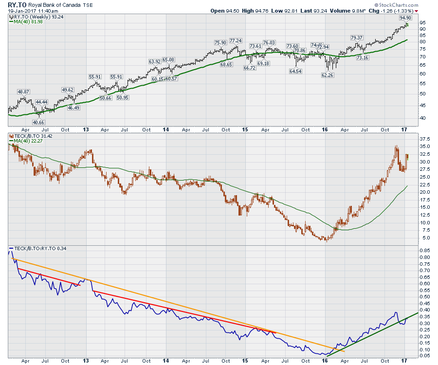
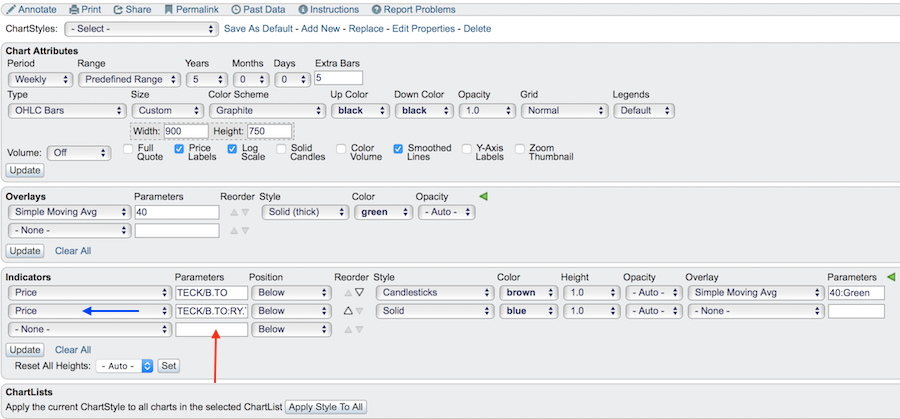
One of the strongest tools on StockCharts is the Ratio Chart. By inserting a colon ':' between two symbols you can get a comparison between two ticker symbols. Why would you want to do that? Well, understanding which chart is stronger can be extremely helpful in making sure you are in a strong performer. If both charts are trending up in 2016, which chart is trending up faster? You don't want to find out after the move. A longer view can help with this, but a ratio chart is very powerful. Note the ratio in the third panel below. I am comparing Teck Resources (TECK/B.TO) to Royal Bank (RY.TO).
 Here is a description of the settings I used to make this chart.
First of all, to get the price of another stock to show up in a new panel, select Price from the indicator list. The Blue arrow below shows that. Next, enter the two ticker symbols you want to compare, separated by a colon. In this case, TECK/B.TO:RY.TO so that they are together with no spaces between them as I have done below where the red arrow is pointing. In the next box, this allows you to decide where to put this ratio. I have it selected as below. If I wanted it in the second panel rather than the third panel, I would use the up arrow beside position to move that up easily using the 'reorder' column. Solid lines work great for ratio charts as that will compare the end of day closes.
 Lastly, how do I interpret this information? We can see on the chart above that the ratio was trending down for years and last year started trending higher. In this case, whatever is listed first - Teck Resources - was underperforming Royal bank for years (That's not hard to see!) but last year really outperformed. 2015 was harder to notice which stock was falling faster, but the ratio chart shows Teck failing faster. Now the ratio chart has broken the trendline again, suggesting Royal Bank may actually start to outperform Teck Resources again. This trendline break gives you a clue that the big outperformance by Teck Resources might be moderating or actually starting to underperform. Stay tuned!
If you would like to receive these emails and the helpful hints into your email box, click on the 'Notify Me' button in green at the bottom of this article.
I have a group of charts that you can always check out on the web. I update the trendlines every few weeks and write commentary there as well. Greg's Top Charts. You can click on these charts to save them to your own chartlist which is another member benefit. Click on the annotate tool before saving the chart, add a simple line somewhere on the chart and then click save. This will allow you to save my annotations as well for you.
I also tweet, along with the famous people of the world on Twitter! @Schnellinvestor ! Ha!
Good trading,
Greg Schnell, CMT, MFTA.
