Across my macro bundle of charts, which includes equities, commodities, bonds and currencies, many, many charts are trying to hold trend lines. I recently tweeted on Twitter that I currently have 40 or 50 charts that are positioned for a major breakdown.

Canadian Grizzlies - May 22, 2019, Photo by Greg Schnell
In equities, the $SPX sits just above 2800, with less than 57% of the stocks on a buy signal, down from 79% in mid-April. Perhaps the real problem is not the breadth, but the stickiness of the breadth. When 80% of the $SPX are on a buy signal, that is undeniably bullish. However, when they quickly reverse and barely 1/2 are on a buy signal, that is weak. There is a solid history of bounces at the 50% level marking typical support. However, there are an equal number of occurrences of the market unraveling. The worst part is that the bond market is signaling the major unravelling, not support. (While a lot of my historical information looks back 20 years, there might be some other examples in history.)
The spring (Q2) of 2002 went from 77 to 15 with one bounce in between. The bounce started at current levels but is hard to see on this compressed chart.
The final high in 2007 and the bounce off the 2008 lows into January 2009 had big rallies that church-spired in terms of sentiment and plummeted. Check out the chart below. By the way, the $SPX is usually the strongest of the indexes because of its sector diversity.
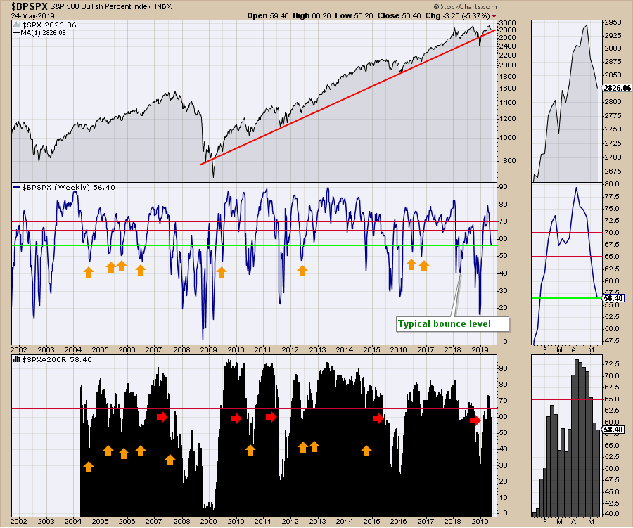 In the lower panel on the chart above, you can see that when the percentage of stocks above the 200-day moving average drops below 60%, the market usually unwinds significantly. Notice the green line (now below 60) and how stocks behave when sentiment is falling. I think we can agree on both measurements it needs to hold right here.
Just as a point of information for new readers of technical analysis, I was referring to the 200-day moving average above. In the charts below, I will mention different moving averages based on the chart being monthly, daily or weekly. The 10-month, 40-week and 200-day moving averages are all similarly located on a chart, so we change the moving average number to reflect the time period of the chart we are looking at. If it is a weekly chart, we use the 40-week moving average. On a daily chart, we use the 200-day moving average which is 40 weeks x 5 days/week. By using similar moving averages, we can approximate the same level. It won't be exact, though, as the monthly only has 10 data points while the 200-day moving average uses 200 data points. The reason the 200-day is used is to reflect a longer term opinion. Below, a 200-day moving average is usually a downtrend of longer-term importance. For an uptrend, when things are above the 200-day, that is typically a bullish scenario. In the lower panel on the chart above, this indicator keeps track of what percentage of stocks are above or below the 200-day moving average.
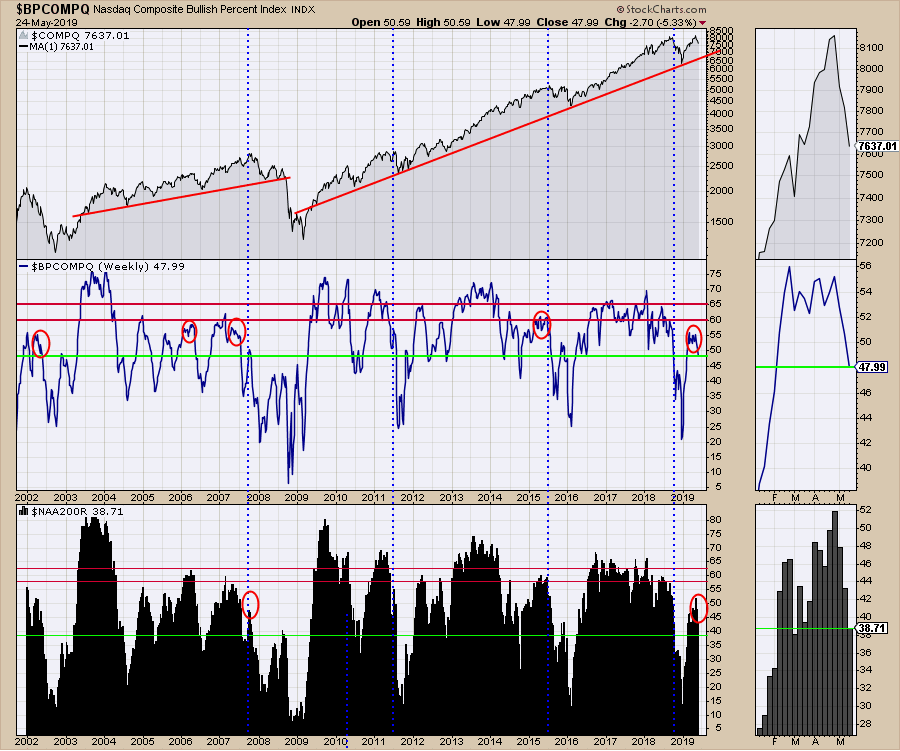
For the broad indexes like the Nasdaq and the NYSE, it is very late in a rally as these levels are very low for the market to hold up. These charts always break before the $SPX, but I'll take the early warning information rather than be shocked. In this case, I have circled 5 periods where the Nasdaq market stalled below the optimal areas above the red lines. Even without that similarity in history, if only 48% of the stocks are on a buy signal and dropping and only 38% - yes, 38% - are above the long term 200-day moving average, we are in a correction or heading for much worse.
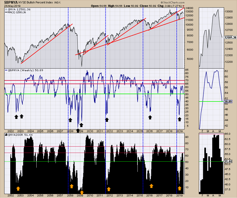
 The NYSE chart does not wobble as fast as the Nasdaq market, but the facts aren't much better: 51% on both metrics below. Again, the broad market didn't rally up into the bullish and very bullish levels denoted by my red lines on the panels below. We are hanging by a thread on both panels.
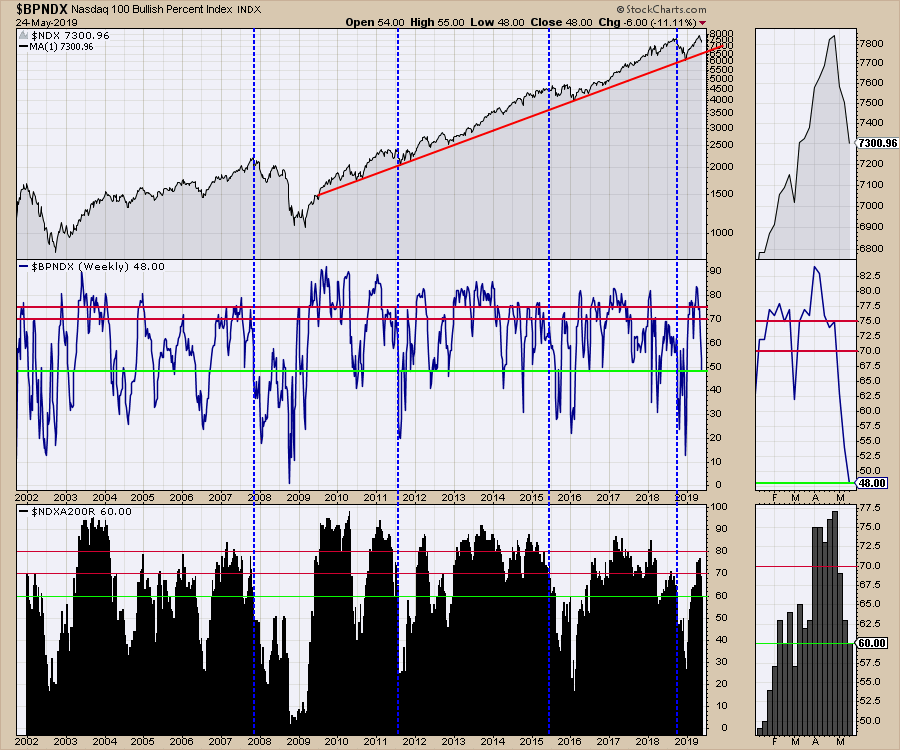
 The narrowest, most bullish index is the Nasdaq 100, shown below. Less than 50% of the stocks are on a buy signal. Gulp.
 These charts on their own could suggest a normal pullback. Fair point. I don't know of a chart that will tell you the final warning. It is the current cluster of information across assets that makes the situation more precarious. The problem is that the bond market is lining up with trend lines that marked major tops, like in 2000 and 2007.
I'll go to the bond charts now.
Get ready for 5% - Jamie Dimon, August 2018.
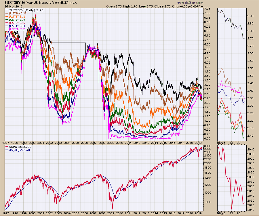
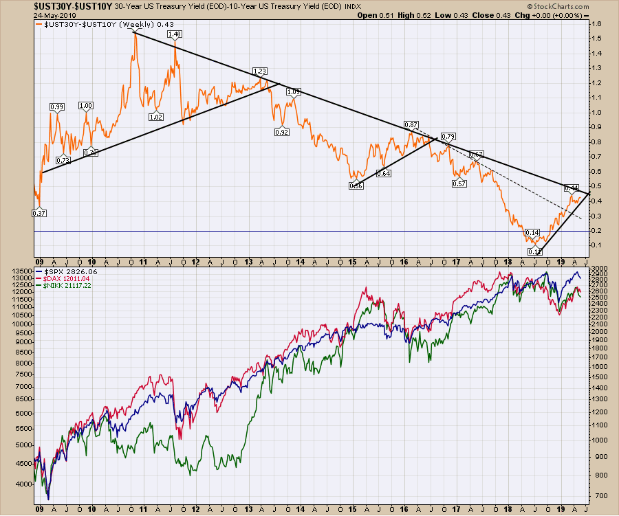
For the 30-year chart, busting an up-sloping red trend line late last year, it was the shot across the bow. Yields rallied off the December low, but the rally stalled at the 40-week moving average. That is a problem when two-year trends break.
However, another important data point occurred after Jamie Dimon said get ready for 5% back in August 2018. I noted this event on the 10-year yield chart coming up later in the article. It was a few months before the final rally of bond market yields since late 2014. This rally was a false breakout, as we can see now. Hindsight is 20/20, but I think we did a good job of noting the momentum rolling over at the time.
What If the Bull Market Just Never Ends - Bloomberg April 24,2019
On the macro picture, we still have a series of lower highs, but a four-year high looked bullish at the time. I don't put Jamie Dimon's name on here to belittle such a smart man. Chartists commonly see extremes in sentiment occur near tops. It was a good data point for an extreme in sentiment when a prominent bank CEO in the world could only see upside. It reminds me of the recent Bloomberg article "What If the Bull Market Just Never Ends? - April 24, 2019." We'll see how that plays out, looking at my charts below.
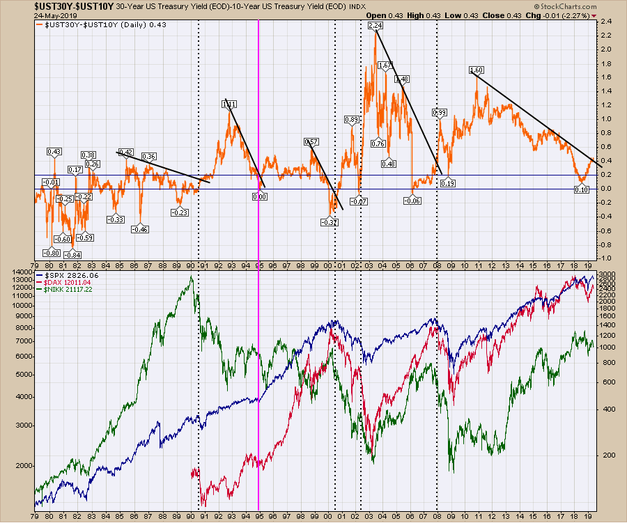
Here is the 30-year.
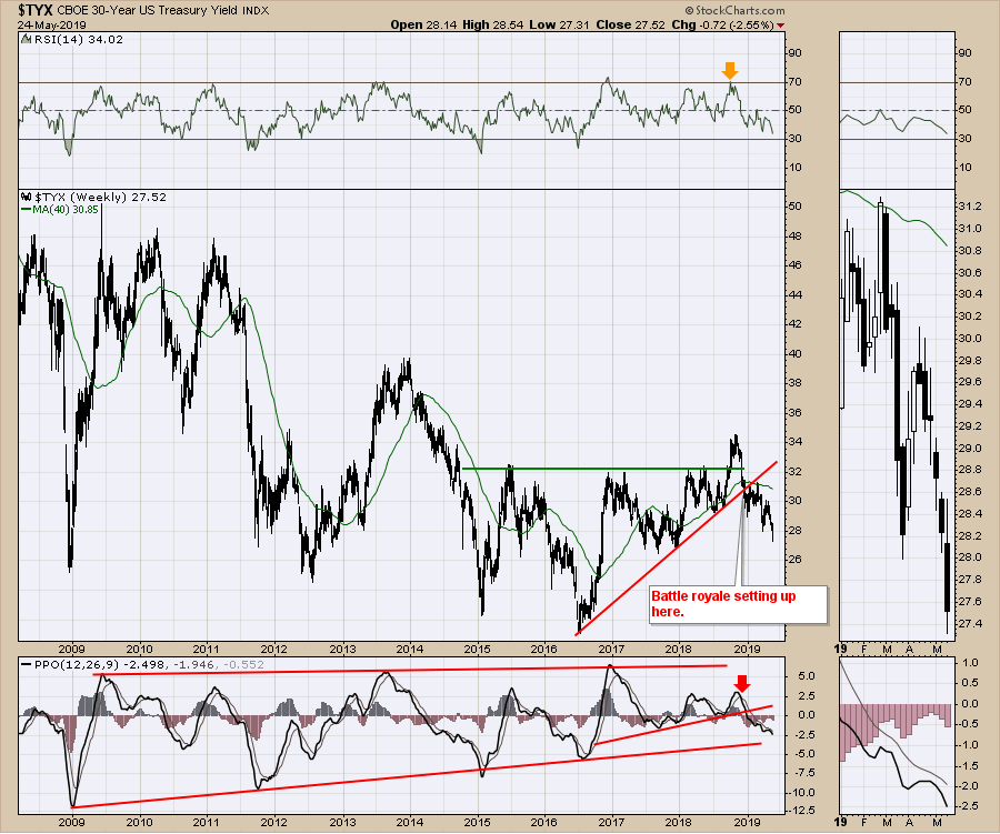 Staying with the chart above, notice that we are getting close to testing the 2009-2019 uptrend on the PPO. A break through that line would be another confirmation of a major trend change for me.
For those following my work, I was concerned by the 10-year bond starting to make new 52-week lows. In hindsight, March was a little too early for marking a stock market top, but we are back to late March levels now on the $SPX and lower on other markets. Is an early warning a problem or a nuisance? The 10-year chart moved to new lows this week and the tension in the various charts has only gotten tighter.
The chart tension for me is as tight as the tension in Jurassic Park in Toronto last night during the Raptors basketball game. Yes, that's an extreme level! Notice both the PPO and the long time frame (80 periods rather than 14) full stochastics have broken to lower lows. While this looks extremely bearish, the PPO has been lower in the past. 10-Year yields topped shortly after the stock market topped in September 2018. It would appear that they disagree with the current equity rally.
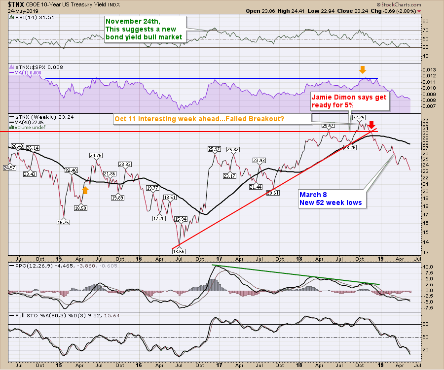
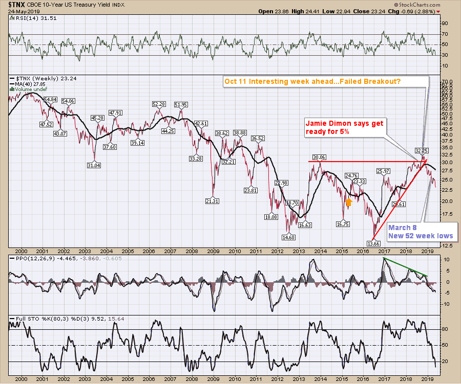
Here is a longer term perspective of the 10-year. Once a trend is in place, it can run a lot further than most expect based on the indicators.
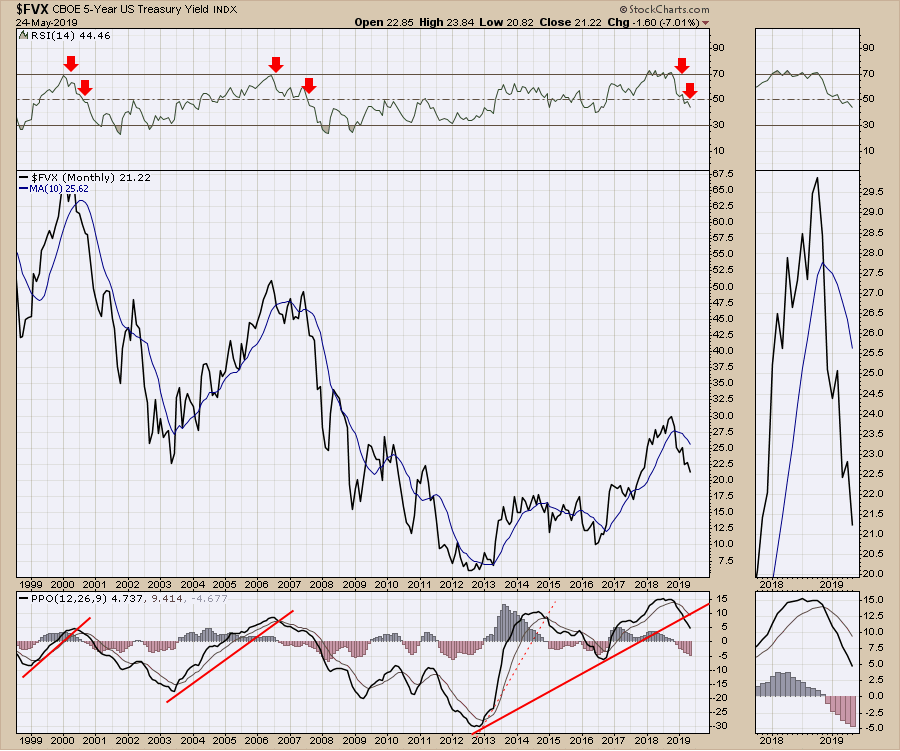
 Moving to the 5-year, it is also confirming. Notice this monthly chart has some red arrows on the RSI. The monthly RSI suggests an extreme has been reached when it gets to 70. But a more important signal shows up when the RSI drops below 50 after being extreme at 70 or "overbought" as a market participants phrase. This is especially true on monthly chart. An RSI of 70 is extreme.
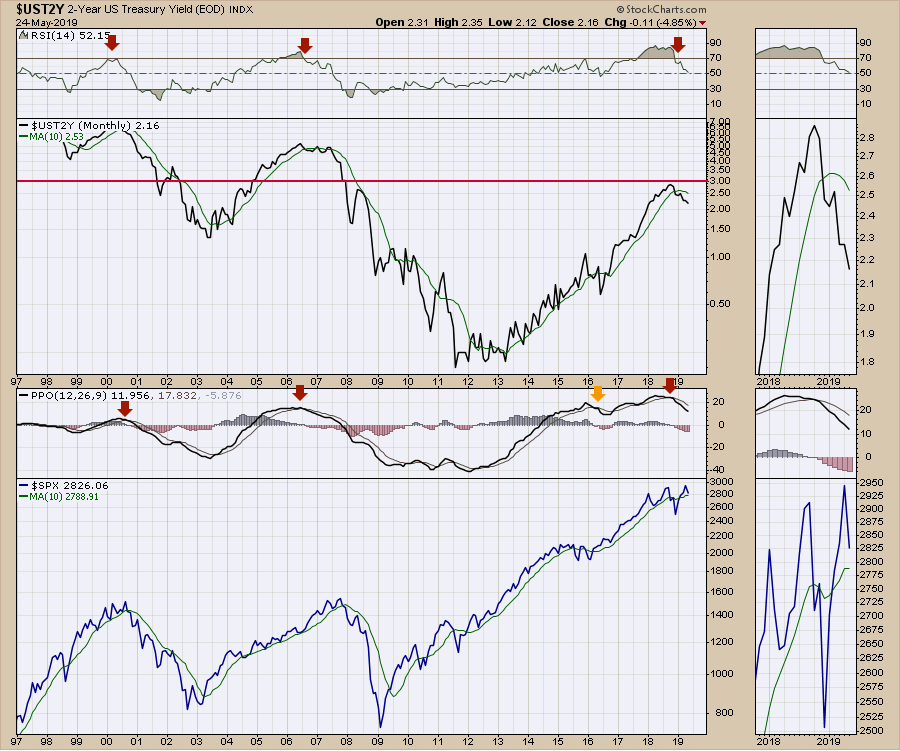
The two-year suggests the same issue. The RSI has not dropped below 50 as of Friday's close. We have another week for the May reading to lock in on the close. We'll keep an eye on this RSI level. At this point, it's very close.
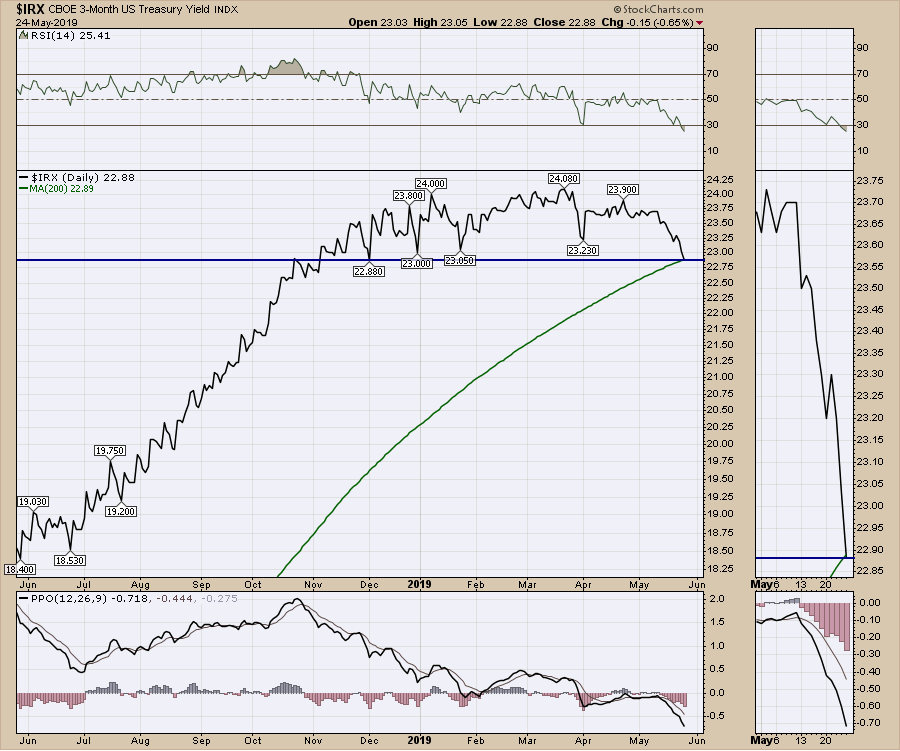
 The 3-month rolled to new 6-month lows. That doesn't sound extreme. However, for a yield chart that has been trending up for 4 years, that's a bigger deal. We also moved below the 200-day moving average on Friday. You can see the 200-day moving average trending up in the bottom of the zoom panel.
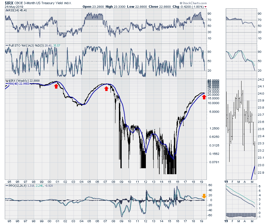
 Looking at it on a longer time frame, the quantitative easing period really jolted this chart all the way from 2008 to 2014. It still took another year for the yield chart to start moving "normally." I used bars rather than a line chart to help illustrate how difficult it was to use this chart for anything meaningful during the QE period. With the chart normalizing for the last three years, we can see it is rolling over similarly to 2000 and 2007. Note that the RSI behavior on this weekly chart has dropped below 50. This has not dropped below 50 on the monthly charts (not shown), but we have another week to watch how it closes out May. That is the 40-week moving average poking up on the zoom panel on the right.
 That covers the range from 30 years to 3 months on the bond charts. As these data points line up in unison, it makes the directional case more compelling, much like evidence in a courtroom. But the bond charts give us more data when used with each other.
First of all, the normalization of the bond yield curve is starting to take place. Notice how the 30-year yield is holding up, even while the others are falling away like they did in 2000 and 2007. Notice how the 3-month in pink just stayed on the bottom for years under QE. In the zoom panel, there is some separation starting to occur. The big drops in the stock market occurred as this normalized. We could still get some sort of shock to the upside like the chart shows in 1998, so it is not a one-way street. Could a China trade deal be that catalyst?
 This chart of the spread since 2009 shows the difference between the 30-year bond yield and the 10-year bond yield, which has not broken yet. One of the issues with this chart is that a large part of it on the left side is influenced by the QE period from 2008-2014. You may remember that the stock market corrected from 2015 to early 2016. Also, the stock market has not been able to hold above the September highs yet. Both of these situations saw this spread between the 10-year and the 30-year increase. I have drawn a dotted line that represents the post-QE trend. In the case of the 4-year rally from 2016-2019, it has broken out. In the longer case, it has not done so yet, but it is approaching that line. This is one of those trend lines that I would expect to break if the bear market settles in here.
 Here is a longer-term view. A break of the trend lines occurred with US market recessions. The exception is the pink line.
 This chart below shows the US recessions and the 3-month treasury yield minus the 10-year treasury yield. When the yield spread rolls over, that tends to be timely for recessions. The 1995 top and the 1985 top didn't have recessions, so it's definitely not perfect. The zoom panel shows this spread near the lows for the year.
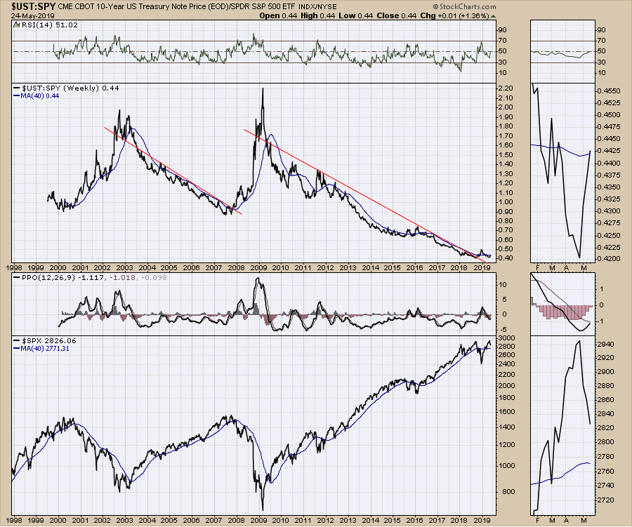
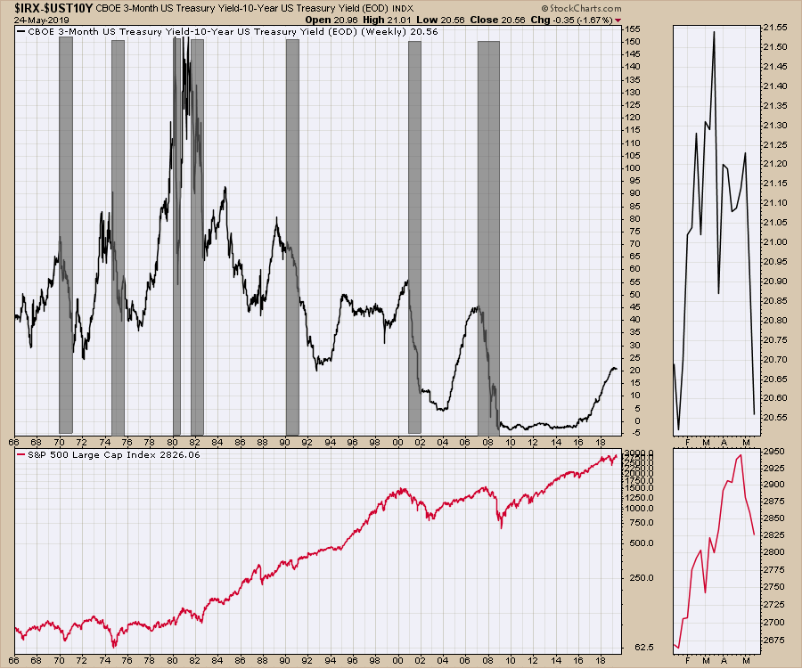 Here is a comparison of the bond market to the stock market. This compares the price of the 10-year bond to the price of the S&P 500 ETF, SPY. While it has broken the trend line, it has not started to accelerate higher. I think it is helpful to know that, if each one of these moves slowly, the line would trend up but not meaningfully. Both major market tops have seen aggressive spikes. Based on all the charts above, that setup is here; however, it has not arrived. The 2000 and 2007 data spikes were big. I am sure by the time the next spike occurs, we'll be concerned. A move above December highs would probably be enough to kickstart a meaningful downtrend. Again, the difference between the 2014-2016 highs and now is the precarious position of the bond charts above.
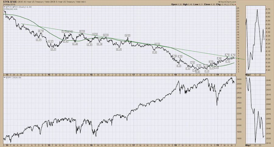
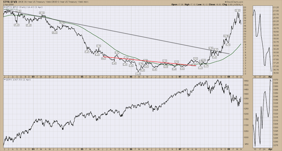
Lastly, compare these two ratio charts. One is current, one is from 2007. They compare the 30-year to the 5-year. To me, they suggest a need to be mindfully aware of some extensive downside risk. If the chart doesn't break, we could continue, but the setups are there.
 Here is the chart from 2007:
The new Market Roundup video highlights a lot more of these important conditions. Now, I've added the entire energy sector getting pounded with crude oil dropping precipitously this week. There is a lot of varied information on the video.
 Thanks for following along. The bullish percent indexes are just barely holding above breakdown mode. The Nasdaq internals obviously have already. Friday's muted $SPX rally on a followup after Thursday's pommelling suggests lower levels to me.
Good trading,
Greg Schnell, CMT, MFTA
Senior Technical Analyst, StockCharts.com
Author, Stock Charts For Dummies
Want to stay on top of the market's latest intermarket signals?
– Follow @SchnellInvestor on Twitter
– Connect with Greg on LinkedIn
– Subscribe to The Canadian Technician
