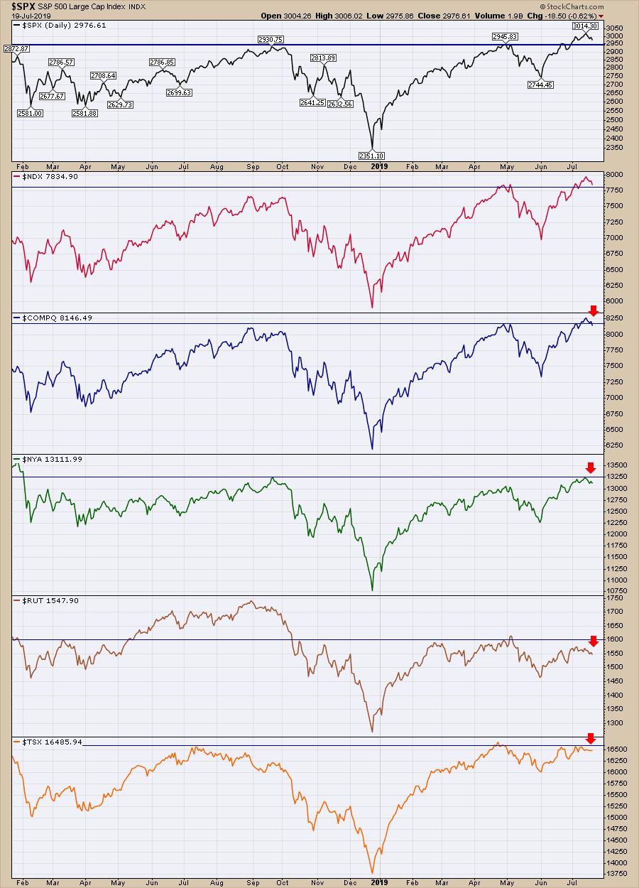
The market has been soaring ever since the December lows. Following a brief pullback in May, the markets have roared to all-time highs. One of the principles of technical analysis is support/resistance. Once a level of resistance (a former high) is broken through, this level becomes support. As the weeks roll by, we want to continue to see the market move up and away from the level of the prior high.
If the market fails to keep going and retreats, this will create a second failed attempt (the first was when the chart originally topped out, creating a level of resistance), which will reinforce the level as important resistance. Lining up the various indexes, you can see that we are in the process of trying to break through prior highs. The Nasdaq Composite has failed to hold the breakout level, so this is a warning shot. We'll need to see it resume the uptrend soon. You'll also notice that, so far, the New York Composite, the Russell 2000 and the Toronto Stock Exchange have all failed to get through resistance. In other words, the S&P 500 is on its own at this point. That doesn't usually end well, so let's use this week as an alarm bell to be more focused on potential trouble.
While this is insignificant for a few days, the rest of the world has been dropping for three weeks and this is the second week that the US markets have been dropping.
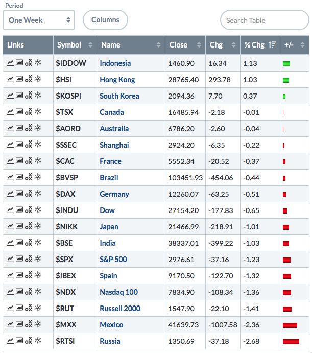
One of my main biases is that the US market is the strongest market, meaning the rest of the world will usually weaken before the US markets will. Canada, as a major trading partner to the US, made highs back in April but has been unable to take them out yet. It is not uncommon for Canada to be a hint that something isn't right. Canada's stock market ($TSX) topped in July 2018; the US took until September to top out. However, the rest of the world has had three down weeks in a row. That leads into a question: just how many weeks can the rest of the world fall before it starts to impact the S&P 500, which gets 50% of the revenues globally?
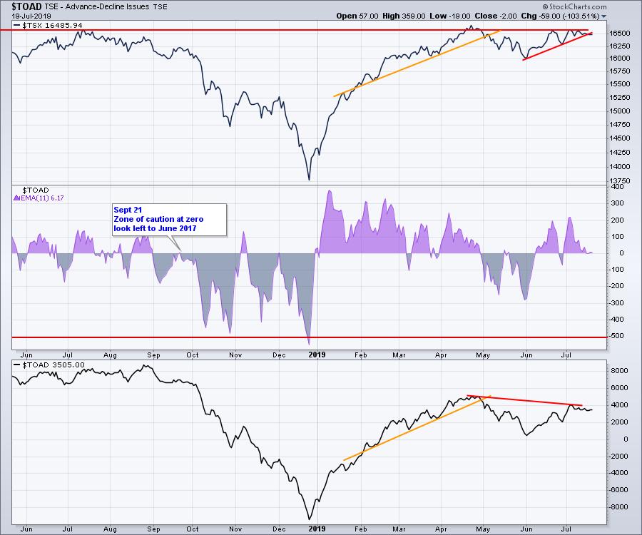
We also have Advance/Decline line divergences on the Canadian and Nasdaq markets. Here's a tip - an A/D line just measures the number of advancing stocks compared to falling stocks (decliners) each day and adds it to/subtracts it from the previous day to keep a running total. What typically happens at major tops is that we may see a divergence where less stocks are participating, creating a situation where fewer and fewer stocks are taking the market higher.
We don't have any divergence on the advance/decline data for S&P 1500 or the New York Composite. While the picture is murky because some do and some don't, I suggest watching, not ignoring, these indicators.
The Nasdaq has a downward bias, but the Canadian market does not. Again, the Canadians do a lot of trade with America. Here is an example of the Canadian market divergence. The $TOAD has a slight downward slope while price is higher. If we look past the April high, we have a huge divergence going back to the 2018 high. It is at a serious inflection point when we look at the centre indicator. It is almost right at zero when we use a moving average, but it closed a heartbeat above zero. This chart is going to give us some information soon. Can it suddenly surge to turn bullish again?
While that may not mean anything without some reference points, let's look through some history here. I think one of the benefits of my Canadian perspective is that I may use different charts than the ones you have seen from others before. Compare the $TOAD in the third panel with the $SPX below. The four significant divergences all occurred when we had bigger issues for the $SPX.
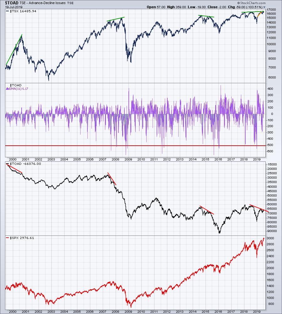
There is no guarantee, but it is very difficult to argue that this chart might be the warning we need so that we don't get blindsided by a major break. Let's see if the chart breaks higher or lower over the next few months.
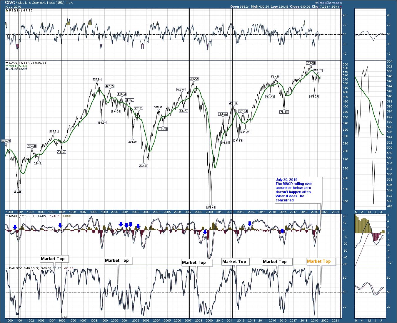
Lots of other charts are on this week's video. While the timing isn't to the day, there are lots of reasons to be concerned. Here is an example of the geometric mean chart. Look at the full stochastic and the MACD in the zoom panel - they are very close to generating another signal. Both indicators are in a very weak place on the chart to roll over. When the MACD rolls over, under or near zero, that is usually important and meaningful downside occurs. The blue arrows mark other examples. It isn't 100%, but notice that this is a lower high after the May high. The May high could have been an important signal, so now that we have have a lower wave, that's even more concerning.
For the full stochastic, zoom out and note where the weakness is on the chart. Full stochastics that can't rally back to the top are usually part of major downtrends. For more information on geometric mean, follow this ChartSchool link.
The market top indicators refer to when the US market topped.
Here is the link to the video. For more information on Gold/Silver, check Friday's Market Buzz.
Have a good trading week, but watch closely for more clues.
Good trading,
Greg Schnell, CMT, MFTA
Senior Technical Analyst, StockCharts.com
Author, Stock Charts For Dummies
Want to stay on top of the market's latest intermarket signals?
– Follow @SchnellInvestor on Twitter
– Connect with Greg on LinkedIn
– Subscribe to The Canadian Technician
– Email at info@gregschnell.com
