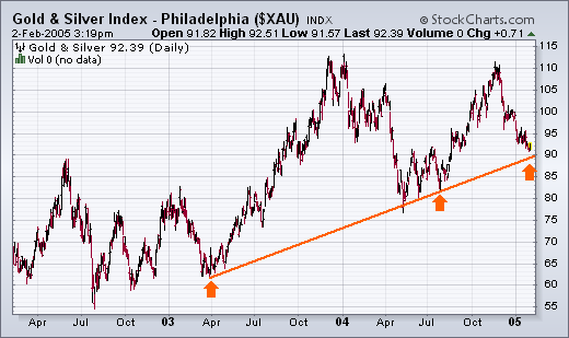
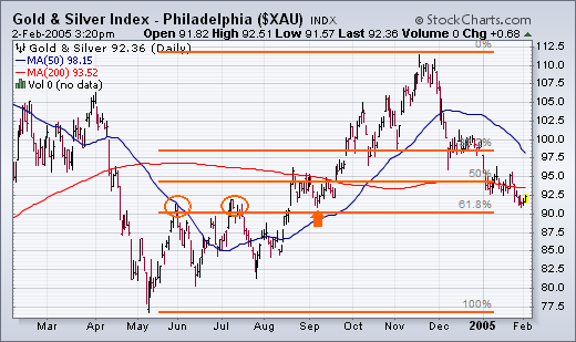
GOLD INDEX STILL TESTING TRENDLINE SUPPORT... Back on January 10, I wrote about the Gold & Silver Index (XAU) being in a support zone defined by the rising trendline shown in Chart 1. The trendline starts in April 2003 and is drawn under the April/July 2004 lows (see arrows). The third arrow still shows potential trendline support near 90 in the XAU Index. Chart 2 applies Fibonacci retracement levels to the rally that began last May. It shows that the XAU has retraced close to 62% of that uptrend. That also makes the area around 90 a potential support level. That lower horizontal line also shows potential chart support along the summer highs (see circles) and the September low just above 90 (see arrow). That's the good news. The bad news is that despite being in support, and in an oversold condition, gold stocks haven't shown any bounce at all. In fact, they've been the weakest market group during 2005. Which brings us to another charting technique that I wrote about in mid-January to help pinpoint a buy signal. That's a Point & Figure chart.
Chart 1
Chart 2
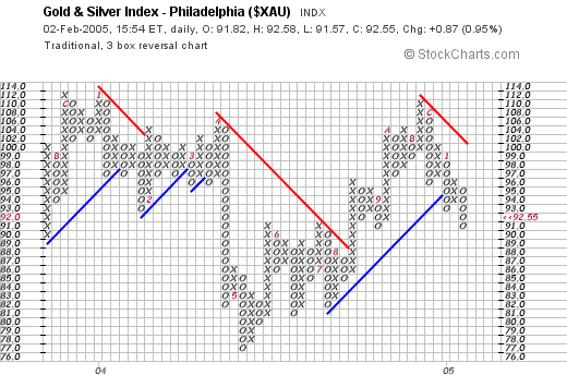
GOLD HASN'T GIVEN P&F BUY SIGNAL YET ... This is the same headline that I wrote on January 14 in another discussion of gold stocks. I was referring specifically to the lack of a buy signal given on a point & figure chart of the XAU Index. An updated version of that chart is plotted in Chart 3. Each box is worth one point. The x columns represent rising prices while the o columns represent falling prices. A sell signal was given during December at 98 when an o column fell below a previous o column. Since then, prices have continued to trend lower. In order to give a buy signal, the last x column has to rise above a previous x column. For that to happen on this chart, the XAU would have to rise to 97. It closed today at 92.35. The reason for incorporating P&F signals into your work is that they give more precise buy and sell signals than bar charts and, as a result, inject more discipline into trading decisions. Gold stocks are a good example. Although I happen to think that the XAU has declined to a level where it should start to do better, it's usually safer to wait for the market to prove itself. One way to do that is to wait for it to move back over moving average lines on the bar chart. Another is to wait for a Point & Figure buy signal. Or both.
Chart 3
BUT OIL STOCKS HAVE ... This is the second part of the headline that I used on January 14. I was trying to show that while gold stocks hadn't given a p&f buy signal, oil stocks had. At the time, the P&F chart of the Energy Select Sector SPDR (XLE) was giving a buy signal at 35.75 as the last x column exceeded a previous x column (Chart 4). Since then, the XLE has risen to a new high. It tacked on another couple of x's today (see green boxes) to close at 38.70. There's another lesson here. And that has to do with taking what the market is giving us. The point in trading is to make money in the market. That's done by buying something that's starting to move up. We can't always be sure in advance what that's going to be. It's one thing to have our analysis suggest that something should be going up. It's another to actually see it going up. That's why we use charts to trigger buy signals. And, while you're waiting for a buy signal in one group, try not to miss a good move in another. Take whatever the market is giving.
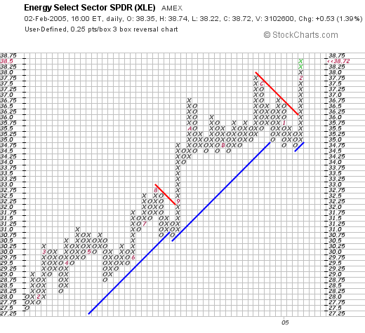
Chart 4
UNDERSTANDING POINT & FIGURE ... I've received a number of messages asking for more information on how to create and read Point & Figure charts. Stockcharts.com provides an excellent explanation which you can find under P&F Charts on the main menu. Once you get to the p&f page, simply click on "Understanding Point & Figure Charts" and you'll find more than enough to get you started. If you want to read even more on the subject, Chapter 11 in my book on Technical Analysis of the Financial Markets is devoted to p&f charting. I highly recommend that you learn more about this form of charting. [P&F charts are older than bar charts]. Each form of charting offers some benefits. Why not take advantage of both?
