Let's focus first on one of the strongest indices, the NASDAQ. Technology stocks have been performing quite well and there's been a challenge for the tech-heavy NASDAQ to pierce price resistance at 2541. Thursday's close of 2549 was enticing, but volume was just moderate and the Friday jobs report was in the on-deck circle. I wasn't buying into it, actually removing a QLD play Thursday afternoon rather than play stock market roulette on Friday morning. It's always better to preserve capital, lock in profits and be safe rather than sorry, especially when mired in an intermediate-term downtrend with price action trying to negotiate resistance. The jobs report Friday was shocking as the unemployment rate jumped from 5.0% to 5.5% rather unexpectedly. The bears grabbed control of the action at the opening bell and would not let go. Below in Chart 1, you can clearly see the current trading range for the NASDAQ:
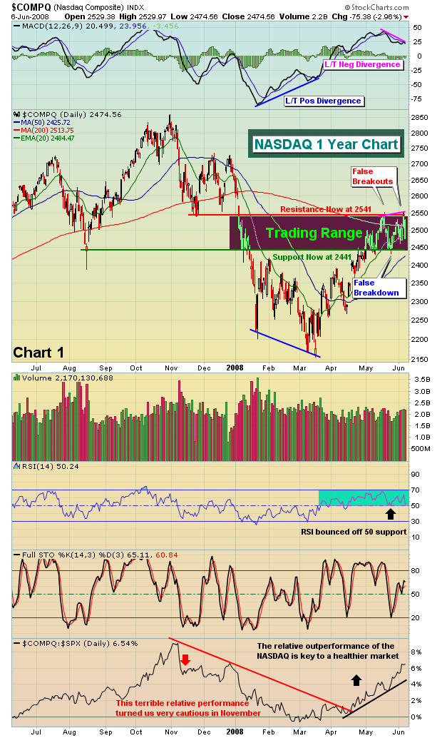
Notice on the latest price high on the NASDAQ that a long-term negative divergence has formed on the MACD. This suggests to me that we'll see a pullback continue to test the 50 day SMA and the bottom of the recent trading range. Look for 2425-2441 as a target on the current move down. If that support area is lost, the market could have much further to drop. Continue to play the trading range, but beware of changing conditions. The market has recently enjoyed outperformance by the NASDAQ 100, or NDX. Chart 2 is a "flight to safety" chart that compares price action between the Dow Jones and the NDX. When equity prices are under pressure and downtrending, the "flight to safety" ratio generally moves higher as money rotates from the high-growth, high PE NDX stocks to the more stable and secure blue chip companies. However, a strengthening equity market normally results in a decreasing "flight to safety" ratio. Should the current downtrend in this ratio be broken, it would be yet another sign of further weakness to come in the equity markets.

Next up is the S&P 500. I had identified 1370 as fairly strong short-term price support. That support level was lost on Friday's close, as was the 50 day SMA. The S&P 500 joined the Dow in losing their respective 50 day SMAs. Below is the current chart on the S&P 500:
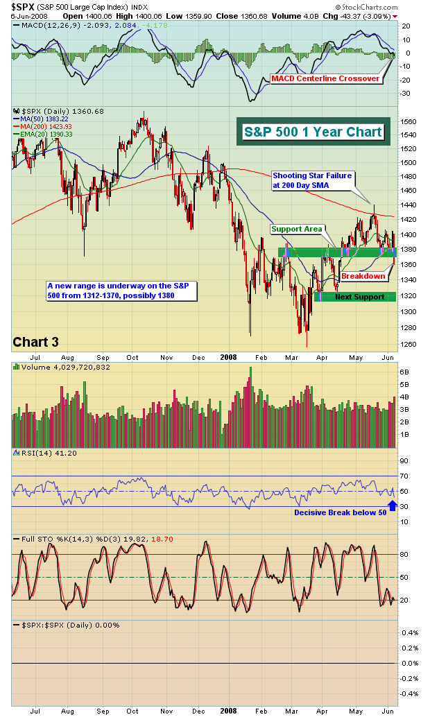
Losing price support on the S&P 500 was ominous enough. However, watching the MACD cross the centerline on the S&P 500 has put us in a very cautious mode. Think capital preservation.
Happy trading!
