StockCharts now has four different "time independent" forms of charting. I thought I'd take some time this week to introduce you to all four.
A "Time Independent" chart is a chart that doesn't have a consistent horizontal axis. On a typical price chart - a standard Bar Chart for example - each time period on the chart occupies one vertical column of space, even if the stock doesn't trade during that time period. So, one week of time occupies the same amount of horizontal space regardless of the ticker symbol you are charting. On a "Time Independent" chart, each time period may or MAY NOT result in vertical columns of space being added to the chart - it depends on the price action during that period of time.
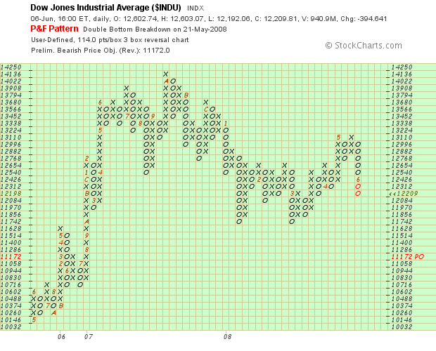
You are probably familiar with Point and Figure charts - the ones with the X's and the O's. We've had P&F charts on StockCharts almost from day one. They are the most common example of Time Independent charting on our site. On a P&F chart, new X's or O's only appear if the price "fills" the next box in the current column. New columns appear only if the price reverses direction by a large enough margin. (Click here for the gory details.)
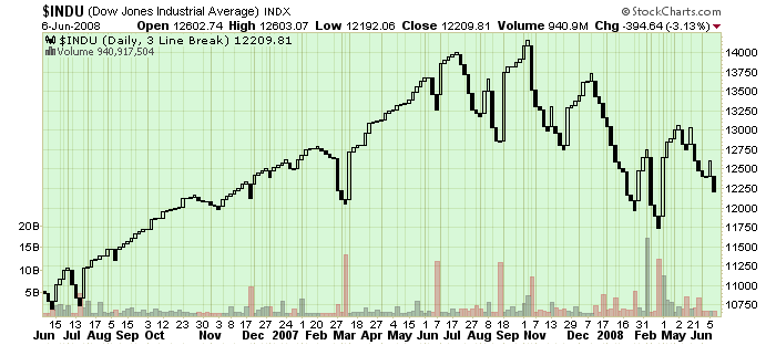
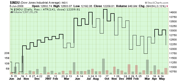
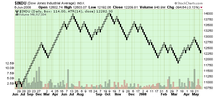
In addition to Point & Figure charts, StockCharts.com now supports Three-Line Break charts, Kagi Charts, and Renko Charts - the four most popular time independent charting styles out there. Here's what all of those charts look like:
Point & Figure Chart
Three-Line Break Chart
Kagi Chart
Renko Chart
(Click on each chart to see how it was constructed.)
As you can see, each kind of charting has its advantages and disadvantages. For example, the P&F Chart clearly shows the recent Double Bottom Breakdown that occurred at the end of May. The Three-Line Break chart shows the Head & Shoulder top that appeared on the chart at the end of last year. The Kagi chart makes it easier to spot support/resistance levels such as the one around 12750 that was recently broken. Finally, the Renko chart clearly shows when the Dow was trending up and down.
You can read more about P&F Charts, Kagi Charts and Renko Charts in our ChartSchool's Chart Analysis area now. (We'll have a Three-Line Break article up soon.)
The key reason to use Time Independent charts like these is that they filter out all of the "insignificant" price moves and give you a better view of the "big picture." Make sure to add these important tools to your charting arsenal.
