StockCharts.com is all about visually representing what's going on in the markets. Here's a sobering visual representation for you:
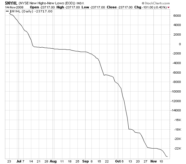
Daily NYSE High-Low Line:
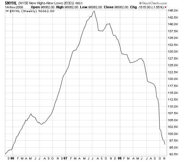
Weekly NYSE High-Low Line:
You can view these two charts anytime at http://stockcharts.com/charts/gallery.html?$NYHL
The $NYHL index a market breadth indicator that is calculated at the end of each day by taking the number of stocks making New 52-week Highs on the NYSE and subtracting the number of stocks making New 52-week Lows. Those values are then plotted cumulatively to create the NYSE High-Low Line that you see above.
Because it is a cumulative plot, the actual value of each point on the chart is unimportant. (In fact, they will change if you adjust the starting date of the chart.) What is important is the shape of the line - up is healthy, down is sick.
Get the picture? We're sick. We've been sick awhile. We will probably be sick for a while longer. For long-term ChartWatchers, there's not much point in hopping back into the market until these lines start going up again.
-- Chip
