Hello Fellow ChartWatchers,
Here's an article that first appeared in 2006 about using the ADX indicator. With lots of stocks starting to trend upwards now, I thought it was a good time to revisit this topic. Enjoy! - Chip
Trend analysis is one of the most important technical analysis skills anyone can have. Knowing if a stock is trending or oscillating can have a big impact on what kind of approach you take to trading it. Stocks that are in a strong uptrend should be bought and held until one or more momentum oscillators show signs of weakness (a moving average cross-over for example). Stocks that are oscillating sideways within a trading range should be studied using oscillating indicators like Stochastics for entry and exit points.
So, how do you tell if a stock is trending or oscillating? And how do you tell if the trend is strong or weak? One way is to use the old Mark 1 Eyeball- but unfortunately that isn't always as accurate and impartial as one might like. A more objective technique is to use the ADX indicator.
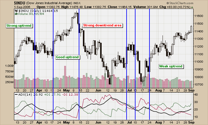
The ADX indicator was invented by Welles Wilder, the same guy who created the RSI. It is part of an indicator "system" whoses official name is "Wilder's DMI". Wilder's DMI consists of three lines - the green +DI line, the red -DI line and the thick black ADX line. Check out this example that uses the Dow Industrials:
(Click the chart to see a live version.)
I've added vertical blue lines whereever the green +DI line crossed the red -DI line in a significant way (I ignored some whipsaw-like crossovers for clarity). When +DI is above -DI, the chart is in an uptrend. When -DI is on top, the chart is in a downtrend. The "strength" of the trend (up or down), is indicated by the ADX line.
Working through the chart from left to right, at first the Dow was in an "uptrend" (+DI is above -DI) and it was a "strong uptrend" because the ADX line rose to a relatively high level. Next, in early April, came a short period of oscillation that saw the ADX fall. After that, in late April, another uptrend developed but a couple of down days near the beginning of May prevented the ADX from indicating that the uptrend was particularly "strong".
After setting a high in the middle of May, the Dow entered a strong downtrend for a couple of weeks. Notice that the ADX line continued moving higher during this downtrend - don't let that confuse you! The level of the ADX indicates the strength of the trend, not the direction. In this case, this downtrend is the strongest trend on the chart and therefore has the highest ADX levels.
The right side of the chart shows that we are currently in another uptrend however the "strength" of that uptrend is very questionable. Notice how the ADX line was at a very low level in mid-August and has only begun to move higher recently. The ADX is telling alert ChartWatchers to pay close attention for signs the Dow's current uptrend is running out of momentum and react accordingly.
The calculation of the ADX is complex and beyond the scope of this article however, we have recently gotten a very detailed new book about the ADX into our bookstore that can tell you everything (and I mean everything) you ever wanted to know about this important indicator. Although it is pricey, serious ChartWatchers will find that "ADXcellence" by Dr. Charles Schaap is well worth the cost.

