This is the next part of a series of articles about Technical Analysis from a new course we're developing. If you are new to charting, these articles will give you the "big picture" behind the charts on our site. if you are an "old hand", these articles will help ensure you haven't "strayed too far" from the basics. Enjoy!
(Click here to see the entire series.)
Fibonacci Lines
How high is "too high?" How low is "too low?" Think back to any time that you've owned a stock and think about when you started to get worried about its performance. At what point did "your gut" start to tell you that you needed to sell? Chances are your gut started talking to you after the stock had moved up (or down) by 38.2%.
Wow, that's a really specific number - "38.2." It seems kind of arbitrary also. There's no way that could be correct, right? I mean, without knowing anything about the stock you were trading, or the amount of money involved, or the overall market conditions, or anything else - how can we stand here and tell you that you got nervous right at 38.2%?
The reason is because 38.2 appears to be programmed into the human psyche (as well as many other parts of nature). 38.2 is one of a set of numbers called "Fibonacci Percentages." They are derived from the "Fibonacci Sequence" which is a list of numbers where each number equals the sum of the previous two. i.e.,
1, 1, 2, 3, 5, 8, 13, 21, 34, 55, 89, 144, 233, 377, 610 etc.
The branching in trees, arrangement of leaves on a stem, the flowering of artichoke, an uncurling fern and the arrangement of a pine cone - all these things exhibit Fibonacci characteristics . In addition, if you take any large Fibonacci number and divide it by the previous number, you'll get something very close to 1.6180339887 (the larger the number, the closer you'll get). Now, 1.6180... has been known for centuries as "The Golden Ratio" - mostly because we humans tend to prefer things - art, sculptor, architecture, etc. - that have proportions that equal the Golden Ratio.
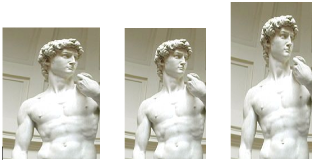
Which of these picture looks the most "natural" to you? The middle one has Golden Ratio proportions.
Getting back to stock charting, R.N. Elliott made the first well-known connection between price movements and the Golden Ratio. He noted that many reversals occurred around 61.8% or its compliment 38.2% (i.e., 100 - 61.8). Combined with 50% and 100%, they make up the standard set of Fibonacci Percentages.
Regardless of how the numbers were arrived at, chart analysts have observed that prices often will reverse after moving up (or down) by one of those percentages. Basically, those percentages are where something tells many people that it is time to take action - and thus prices reverse. Strange but true. Check it out:
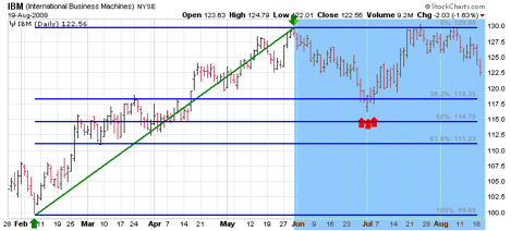
The Fibonacci Lines on this chart were created based on the move from Feb. 9th to May 30th - so just focus on the shaded blue area of the chart. Like a weatherman, the lines "forecast" that support for IBM would occur around 118.35 essentially because lots of people would probably feel that IBM had "fallen enough" and would start buying it again. That is precisely what happened at the end of June (red arrows).
Unfortunately many people have gone on to claim that Fibonacci lines (and their variants) have almost "magical powers" to predict price movements. Like most Technical Analysis tools, we think Fibonacci Lines are useful forecasting tools - but not magical.
You can add Fibonacci Lines to your charts using our ChartNotes annotation tool. To get started, simply click on the "Annotation" link below any SharpCharts.
Power Tip: If you hold down "CTRL" while drawing Fibonacci lines, we'll add the 23.6% and 161.8% lines as well.
Next time: Gaps!
