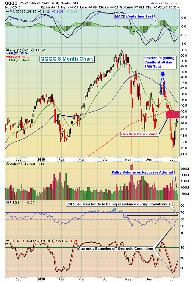
The following is a chart of the QQQQ, an ETF that tracks the NASDAQ 100 index. In my last article, I took a look at the QQQQ and pointed out the likely resistance at the 50 day SMA and provided reasons for potentially trading a juiced ETF (QID) to capture gains from any fall in the underlying NASDAQ 100 index. After falling for 2 weeks, the QQQQ moved into oversold territory and has bounced. Check out the chart:

The market was very oversold to start last week with the constant pounding by the bears the prior two weeks. RSI and stochastics had fallen to 30 and 7, respectively, a combination that generally favors the bulls near-term. From those oversold levels, the market has bounced and gains last week were in the 5-6% range across all of our major indices. It was certainly great to see the market regain half of what it had lost the prior two weeks, but even the gains didn't come without warning signs flashing and those warning signs were the subject of an hour long chat/video that I recorded at our website this past week for members of Invested Central. I see potentially BIG problems brewing as it appears the summer months will not be particularly kind to the bulls. I've discussed a few of these bearish signs in articles since mid-April, but if you'd like to check out the entire video, I think it'd be well worth the time to review this session. It's free, simply CLICK HERE.
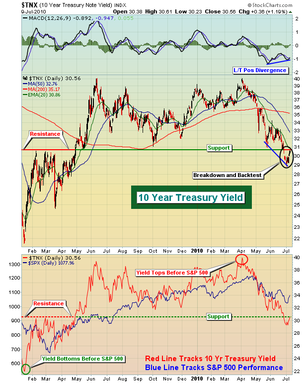
I'd like to focus on just one component of this session - the relationship between the 10 year treasury yield and performance on the S&P 500. First, take a look at this chart:
First, it's important to realize that bond prices and bond yields move inversely to one another. So when you see the yield dropping, it means money is flowing INTO bonds. When money flows into bonds, it's coming from somewhere. Over the past many years, it's generally been bad news for equities. What I've found is that many times the yield can be an indicator of things to come for the S&P 500. For instance, on the chart above, notice that the 10 year treasury yield bottomed in early 2009, just before the S&P 500. Then again, three months ago, the yield topped a few weeks before the S&P 500. There are several reasons why it appears that strength in equities will not be sustained for long. One of those reasons is the breakdown in the yield beneath significant long-term support near the 3.10% level. The recent spike in yields back to test that breakdown level is no doubt fueling the short-term rise in equity prices, but the question is - how long will it last? I doubt much beyond the 3.10%-3.20% level.
A sector that I always follow closely is the semiconductors. This group tends to lead during economic expansion, so watching the behavior here is generally critical to my market forecast. Semiconductors are trending lower, and while that makes me nervous, it's also important to note that the relative strength in semiconductors remains strong, but showing signs of potential weakness. Its relative performance vs. the S&P 500 is rising, but squeezing tighter and tighter into a narrowing triangle. I've featured this group as our Chart of the Day for Monday, July 12, 2010. If you'd like to view it, CLICK HERE.
Historically, the trend next week remains bullish. But after next week we enter the worst 2 1/2 month historical period of the year - BY FAR. Here's a fact. Over the last 60 years on the S&P 500, this period has accumulated losses totaling 23%. We've actually seen advancing prices in 33 of the 60 years. The problem is when the market goes lower, it REALLY goes lower. Check out the returns from mid-July to late September in each of the following years:
1957: -12.41%
1958: -10.31%
1974: -22.41%
1981: -13.76%
1990: -18.11%
1998: -11.97%
2001: -16.13%
Are we setting up for another year we can throw into this group? It's hard to predict that type of weakness, but to be honest, it wouldn't surprise me.
There have been 3 years where we've seen gains of +10% or more, including 2009 where the S&P 500 gained 11.06%. But if the market is prepping to make a big late summer move, there's probably better than a 2 to 1 chance it's going to be to the downside. While history never guarantees us anything, I have to admit I'm nervous heading into these historical headwinds with technical sirens blaring.
Happy trading!

