Hello Fellow ChartWatchers!
In my last article, I went over two key Intermarket relationships - the one between the US Dollar and Commodities and the one between Commodities and the US Stock Market. (Keep in mind that John Murphy and Arthur Hill describe new Intermarket developments every day in the Market Message area of the website.) This time I wanted to go into some more detail about that second relationship - the one between commodity prices and the US Stock market.
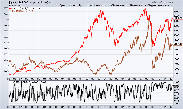
Last time I showed how there is a very strong positive relationship between stocks and commodities right now. We also saw that that relationship hasn't always been as strong. In fact, as the chart below shows, things have been pretty unusual since 2008:
(Click on the chart for a live version.)
Going back before 2008, if you look more closely, you can see distinct time periods where the correlation line had a bias towards the positive side and then a bias towards the negative side.
Unlike the period since 2009, most Intermarket charts are not 100% precise. Interpretation is involved. The trick to determining the dominant relationship during a given time period is to look at how the correlation line behaves after it crosses zero. If the line immediately moves back across zero or bounces at zero, that's a good indication that the correlation has not really changed.
For example, take a close look at the period between 2004 and 2008. Notice that the line was above zero more than it was below it. Also that the line only remained below the line for brief periods of time. Notice also that this effect is stronger in 2004 and 2005 than it is in 2006 and 2007 - a sign that things were breaking down going into the crisis of 2008.
Why is this important? Each time there is a generally positive correlation on this chart, it means the economy is in a deflationary environment where stock prices and commodity prices are strongly coupled. Each time that black line stays in negative territory, the economy is in an inflationary mode where rising commodity prices are bad for stocks. This chart will give you that critical piece of information well before economists and the financial press do.
For example, going back further on the chart, can you spot the exact moment where the current Deflationary environment began? The large jump into positive terrtory at the start of 2001 was the moment where the correlation changed significantly. The events at the end of 2001 and 2002 muddied the picture somewhat, but by late 2003 it was clear we were in a deflationary scenario - which we are still in.
Notice that prior to 2001, the correlation line had a negative bias (inflation). See how it tried and failed repeatedly to move above zero in 2000? Again, it's not precise, but you can see how the black line generally stayed below the zero line from mid-1996 through the start of 2001.
Going back further, there was a short period of positive correlation (deflation) from roughly 1993 until mid-1996. Prior to that, there was a long period of negative correlation (inflation) starting around 1985.
So I'll leave you with this question: Given what we just learned, what would it mean to your portfolio if the black line suddenly moved below zero for the first time in almost 4 years? That is the value of Intermarket Analysis.
- Chip

