Hello Fellow ChartWatchers!
In case you haven't noticed, the Financial sector has been dominating the market for over a year now with the Consumer Cyclicals not far behind. How do I know? I used our S&P Sector Performance chart. Here's how you can do that analysis for yourself:
1.) Click on the "S&P Sector Performance" chart link located on our Home page (just below the collection of ticker symbols in the middle of the page).
2.) After the PerfChart appears, click the grey "S&P 500" button in the upper, left corner of the chart. This will convert the chart into "Absolute" mode where each line represents the absolute performance of each sector ETF.
3.) Click the "Histogram Chart" icon in the lower left corner of the chart to change the chart into a histogram chart where each vertical bar represents the overall percent change for each ETF over the time selected.
4.) Finally, move your mouse pointer over the center of the chart and click the right mouse button to bring up the popup menu, then select "Performance Sort On."
If everything goes well, you should see something similar to this:
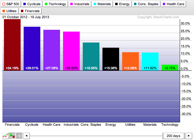
This chart shows that over the past 200 days, the S&P Financial Sector ETF (XLF) has outperformed all of the other sectors with a 34.19% gain. It also shows that the Technology sector - the sector that outperforms other sectors when a recovery is well under way - had the worst performance during that period.
(If you are unfamiliar with PerfCharts, check out this video for more information on using them.)
As you might be aware, you can use your mouse to move and resize the date slider at the bottom of the chart. If you can, take a moment to click on the "d" in "days" located in the middle of the slider and drag it to the left. As you do that, the size and position of the histogram bars change to show you the strength of each sector over that time period that corresponds to the slider's position.
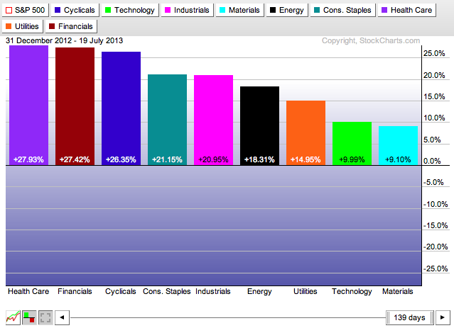
After you are don't experimenting, move the slider all the way back to the right side of the chart. Next, right-click on the "d" in "days" in the middle of the slider. A popup menu should appear with several date range choices. Select "Year-to-Date" from that menu and the date range will change accordingly. Here's what you should see:
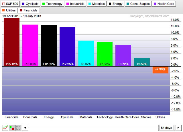
Note that Health Care is now in the #1 spot with Financials close behind on the Year-to-Date chart. Also note that Tech stocks have improved (slightly) to the next-to-last position. Now use that same popup menu to see how things look over the past 3 months.
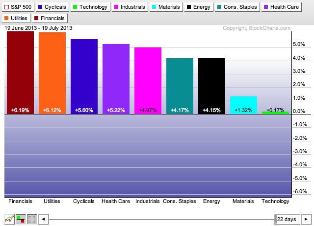
Did you get the same results? Again, the Financials is the top performer and the Tech sector has moved even more to the left of the chart. Finally, let's check out the 1 month verson of this chart:
Again, Financials is still in the forefront however Utilities has moved into the #2 position and the Tech sector lagged badly. This suggests a setback any near-term prospects for a strong recovery.
Hopefully you can also see the value of the "Performance Sort" feature of our PerfCharts tool.
Take care out there,
- Chip
P.S. Toronto, I will see you next weekend for our SCU 101 and 102 seminars!


