The StockCharts charting tools are very powerful but can be a little confusing at first, especially if you are used to the simpler charting tool on DecisionPoint.com. So I wanted to take time today and talk a little bit about the differences between those two tools.
First off, I've just posted a longer blog article about this topic in the new DecisionPoint Blog on the StockCharts.com website. You can click here to read it. It talks about how StockCharts lets you store your customized charts in your account as well as add more indicators and generally do more with your charts than the DP charting tool does. Again, I encourage all DecisionPoint.com members to read that article (and the rest of my blog) as soon as you have some time.
Now, there is one change that several people have asked about that I didn't address in that blog article - the Price Relative indicator. The old DecisionPoint.com charting tool has it, but it is not listed as an indicator in the SharpCharts dropdowns. Where did it go?
The good news is that it is there in SharpCharts, it is just in a different, more flexible form called a "Ratio Ticker Symbol."
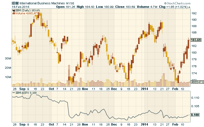
In SharpCharts, you can chart one ticker symbol if you want to see that dataset. However, you can also chart two ticker symbols joined together with a colon character (":") - e.g., "IBM:$SPX" or "$GOLD:$USD". That pair of symbols is called a "Ratio Ticker Symbol" and when it sees one of those, SharpCharts will plot the values for the first symbol divided by the closing value for the second symbol.
Sound familiar? It should. That is essentially what the old "Price Relative" indicator does.
That means that in order to chart a "Price Relative" line in SharpCharts, you actually need to add a "Price" indicator to your chart and then set the parameter for that indicator to the ratio symbol you want (e.g., "IBM:$SPX")
Here's an example:
(Click on the chart for a live version with all the settings.)
So I can hear the questions now - "This is so complex! Why? why? why? why? WHY?"
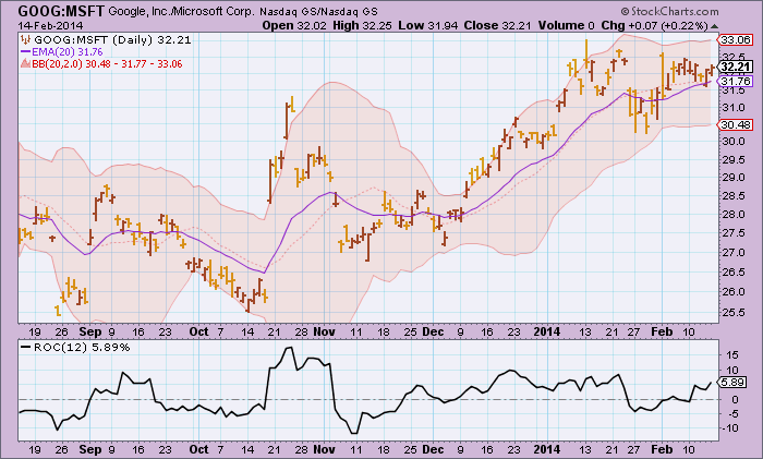
The good folks at StockCharts did this so that you can also plot a ratio symbol as the "Main" ticker symbol for your chart - something you cannot do with the old DecisionPoint charting tool. You can then add overlays like Moving Average and Bollinger Bands on top of it, you can plot it as a set of candlesticks instead of just a line, you can add indicators based on that ratio, and you can annotate it. Check out this example:
(Click on the chart to see a live version with all the settings.)
For instance in this chart, we can now track the Rate of Change (ROC) of our Google/Microsoft ratio which can alert us to upcoming changes in the relationship between those two stocks. We can also see if that ratio has moved outside of its typical Bollinger Band range.
All-in-all, Ratio Symbols are just as easy to use and much more flexible than the old Price Relative indicator.
Happy charting!
Erin


