Hello Fellow ChartWatchers!
I'm going to start with four important announcements and then we'll get into some sector-oriented market analysis:
- We now have the video of our ChartCon conference from back in August available in our bookstore. It contains all of the main presentations from the conference including talks by John Murphy, Martin Pring, Alexander Elder, Arthur Hill and many more. The material presented is just as relevant today as it was back in August. If you attended the conference, this is a great way to refresh your memories of what you witnessed. If you were not able to attend, this is your chance! You can now watch all of these presentations at your leisure on your computer. Click here to learn more about all of the great sessions that we captured on video and how you can get your own copy.
- Speaking of great video content, have you attended any of our webinars yet? Each week we are hosting a "mini-ChartCon" if you like with Greg Schnell (and other assorted guests) giving their thoughts on the market LIVE each Thursday after the markets close. This past week, Greg teamed up with Martin Pring for a live review of the US markets as well as Martin's thoughts on where things are headed. They then took questions from the audience for about 20 minutes before wrapping up. Click here to see a recording of the webinar and make plans to attended our next webinar this coming Thursday!
- Also, Alexander Elder's new book is out and it is full of StockCharts.com charts! Alex has completely updated "Trading for a Living" with new content, new examples and (of course) new charts. I am thrilled that we were able to help him create this amazing new version of his timeless classis. Check it out when you have some time. It is a "must have" book.
- Finally, a quick reminder to always try to spend some time each week reviewing the charts in our Public ChartList area. The authors of these lists - StockCharts users just like yourself - work very hard to update and maintain their charts for everyone to see. All they ask in return is for people to visit (and then pledge their undying loyalty by "voting" and "following"). With all of the other commentary on StockCharts these days, it is easy to overlook the Public ChartList area so please take a moment and check it out. Thanks!
OK, on with the show...
Stalking the Elusive Holiday Consumer with Technical Analysis
I've talked extensively in the past about Sector Rotation and doing sector analysis using the nine S&P Sector ETFs. We have many tools here at StockCharts that can help you see how the nine sectors that make up the US stock market are doing relative to each other and relative to the market as a whole. Today, I want to show how ratio symbols can be used to determine how bullish or bearish consumers are feeling heading into the upcoming holiday shopping season and what the implications of that battle are for the economy as a whole.
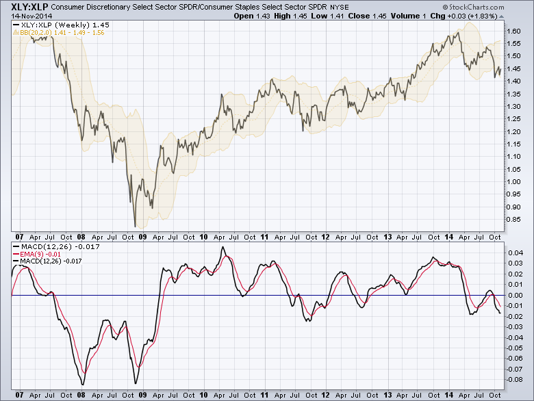
(Click on the chart for a live version.)
This chart shows the relative strength line for the Consumer Discretionary sector vs. the Consumer Staples sector.
The Consumer Discretionary sector (also called the "Cyclicals" sector) consists of companies that sell goods that consumers tend to buy only when they are bullish on the future. These are items that consumers are able to put off buying in difficult economic times. Industries within the Cyclicals sector include Gambling, Furniture, Durable Household Goods (e.g., appliances), Travel & Leisure products, etc. "By definition," the Cyclicals sector out-performs the rest of the market at the start of a new wave of economic optimism and remains relatively strong until that optimism wanes.
The Consumer Staples sector is essentially the "evil twin" of the Cyclicals sector. It consists of companies that sell goods that consumers will buy regardless of their opinion on the economy. Industries within the Staples sector include Food, Pharmaceuticals, Non-Durable Household Goods (e.g., cleaning suppies, batteries, etc.) as well as (somewhat sadly) various forms of booze.
Because these two sectors ourperform the market at opposite ends of the economic cycle, looking at the ratio of their corresponding ETFs (i.e., the black line on the top of the chart above) can be very enlightening. To chart the ratio of two symbols, you use a ticker symbol consisting of the first symbol followed by the colon character (":") and then the second symbol - just like I did in the chart above. The XLY:XLP ratio gives us a very good indication of how consumers feel about the economy based on how they are voting with their pocketbooks. If they are optimistic, this ratio will move higher. If they are cautious, the ratio will move lower.
Notice that since the crash back in late 2008, that ratio line has generally been moving higher. Looking closer however, a case could be made that things moved sideways between 2011 and the start of 2013, followed by a big move up that lasted until February of this year (more on that in a moment). I added the yellow Bollinger Bands to the ratio chart to give you a sense of how volatile the ratio's movements can be. Below this weekly chart, I also added a MACD indicator to help understand the momentum of these movements and see if there is any increase or weakening in the currrent trend.
Now, let's look more closely at things since February:
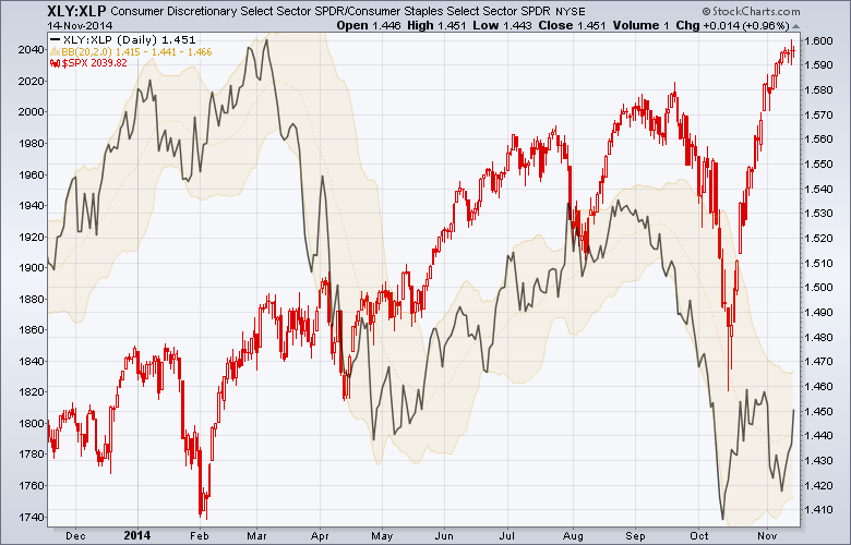
(Click on the chart for a live version.)
The key things to look for on this chart are divergences - places where one line is generally moving in one direction when the other line is generally moving in the opposite direction. There are two significant divergences on this chart - do you see them?
The first one happened in March - the ratio (i.e., consumer optimism) moved significantly lower while the S&P 500 (the red candles) moved sideway to slightly higher. What could have caused this? Well, if you remember, the end of February was the time when the fighting in the Crimea and, later, eastern Ukraine began. Clearly those events spooked consumers more than they did the markets. By May however, consumers had lost interest and their mood began to improve again as evidenced by the rising ratio line on the chart.
The next significant divergence started in mid-October and is still going on. The S&P has made some tremendous gains while the XLY:XLP ratio has gone sideways/lower. The exact cause of this divergence is not completely clear (low oil prices are probably playing a part in it) however; as technicians, we are not that interested in "Why?" Instead, we are interested in "How can I take advantage of this?" Based on the charts, things probably cannot continue diverging like this much longer. Either consumers will perk up and the ratio will start moving higher again or the stock market will fall back to earth when it realizes that consumers aren't interested in spending during the holidays.
Which will it be? Those recent doji candlesticks at the right edge of the S&P chart signal indecision on the part on the market and don't bode well for the near term. The MACD Histogram of $SPX (not shown, click here) also shows that $SPX is quickly running out of upwards momentum. So several things point to a decline in $SPX near-term. The magnitude of that decline may hinge on what the XLY:XLP ratio does in the coming days. It is worth watching closely.
- Chip
