Hello Fellow ChartWatchers!
It was a fairly positive week for the markets last week following a big down move during the week before. For the month of July, the Nasdaq was the big winner rising 2.3% and the Russell 2000 was the loser falling 1.4%.
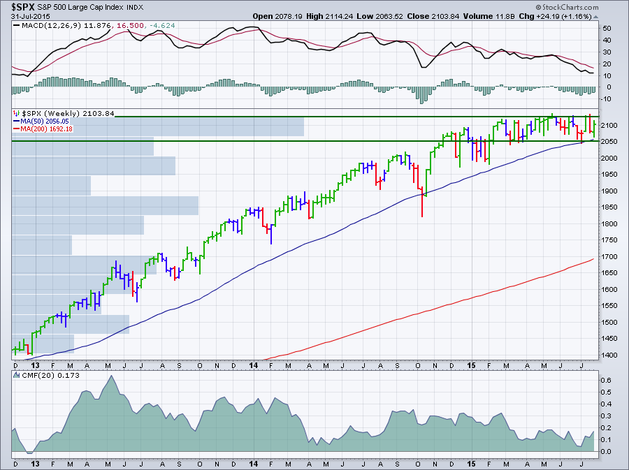
(Click the chart for a live version)
As you can see on the weekly chart above, after a long run up, the S&P 500 is now moving sideways in a range between 2050 and 2125 (green lines). The horizontal "Volume by Price" histogram bars show us that volume has now been concentrated within that range as well. Because the index is unable to move higher, it is losing momentum as shown by the falling MACD and Chaikin Money Flow (CMF) lines. Finally, the long-term moving averages are slowly closing in - the index has bounced off of its 50-week moving average twice now. Clearly, the gauntlet has been thrown down and the battleground is defined - a close above 2125 will be a major victory for the bulls; a close below 2050 will be a huge setback.
Acting on Impulse with Elder Impulse Bars
You may also notice on the chart above that the bars are colored either red, green or blue - what's up with that? Those colored bars are called "Elder Impulse Bars." They were designed by Dr. Alexander Elder. He talks about them extensively in his books. The simple explanation is "Green is good, red is bad and blue is neutral" but please read on for a more detailed explanation.
Technicians are very interested in two properties of a price chart - the stock's trend and its momentum. It is important to understand these two concepts in general. They also are key components in the Elder Impulse system, so let's take a moment and review them closely.
Trend is simple to describe and hard to quantify. Trend is the general direction a stock is moving in. Is it going up? Is it going down? And (most importantly) when does a stock's trend change direction?
Because stock prices often bounce around a lot from one price bar to the next, most technicians use various moving averages to help them determine a stock's trend and that can cause some problems. Which type of moving average should you use? How many periods should be used to come up with the average? The answer to those questions is always "It depends..." The key issue is that when you use a moving average, you introduce lag into your analysis. Your ability to detect changes in trend will be delayed somewhat which can be frustrating. Unfortunately, lag is unavoidable.
To help deal with lag, technicians turn to the concept of momentum. Momentum is the rate at which a stock is moving higher or lower. Is it moving upwards (or or downwards) quickly or slowly? And (most importantly) is it moving more or less quickly than it was yesterday? Momentum is important because before a stock can change direction, it needs to lose all of its momentum. Therefore, decreasing momentum is a leading indicator for a trend change(!).
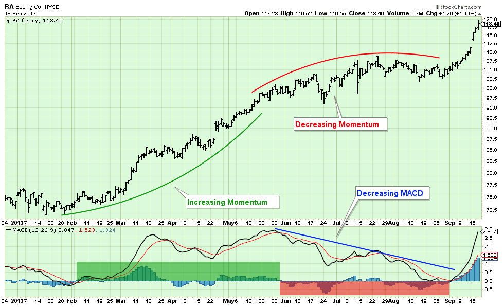
Technicians have several indicators that can measure momentum. One of the most popular is the MACD. You can read all about how the MACD works in our ChartSchool, but the important thing to remember is that if the black MACD line is rising, the stock has positive momentum and prices are rising faster than they were before. The MACD Histogram shows the rate at which momentum (i.e. the MACD Line) is changing. The chart below shows the relationship between MACD, the MACD Histogram and momentum:
Knowing that trend and momentum are very important, Dr. Elder did some research and came up with the following simple system for determining a stock's current status:
- Trend = the Slope of the 13-period EMA
- Momentum = the Slope of the MACD Histogram
- If Trend and Momentum are both UP, color the bar GREEN
- If Trend and Momentum are both DOWN, color the bar RED
- If Trend and Momentum disagree, color the bar BLUE.
And that is what the green, red and blue bars mean on a Elder Impulse System chart. You can use it as a strict trading system or, as I do, an additional (but optional) visualization of a stock's current situation. If you do use it for trading, be sure to consider the following:
"The Impulse System encourages you to enter cautiously but exit fast. This is the professional approach to trading, the total opposite of the amateur's style. Beginners jump into trades without thinking too much and take forever to get out, hoping and waiting for the market to turn their way." - Dr. Alexander Elder
Again, you can read much more about the Impulse System in Dr. Elder's books.
You can add Elder Impulse Bars to your own charts by selecting "Elder Impulse System" from the bottom of the "Type" drop down on the SharpCharts workbench page. That dropdown is located in the "Chart Attributes" area below the chart. Or just click here for another example. (Or just select the "Elder's Weekly" style from the ChartStyles dropdown below the chart.)
Hopefully, you will find the Elder Impulse System as useful as I have.
- Chip
