Wow, this market has been one for the Almanac. This week I read a commentary from a top technician saying the bull market is still intact. It was only 4 months ago that Dow Theory triggered a sell signal. Since October, the $SPX has been making higher highs and higher lows but continues to struggle at this level. Looking at the chart below, most people would have trouble calling this a bull market. It has been up a maximum of 2.84% from the one-year ago reference point and down 9.86%. The zero line just shows where prices were 1-year ago, but this is a pretty good support resistance line as well. We could all tune it more finely, but the bulls would use the July low in green and the bears would use the May-June lows in red. The highs marked by the price label software still labels a series of lower highs on the macro picture. 2.84%, 2.72%,1.83%, 1.48%. We are currently trying to break back above those levels.
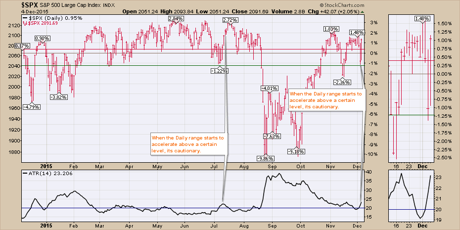
One of the other concerns has to be the escalating range of each day. The ATR indicator in the bottom box adds up the range of the intraday swing for each of the (14) days and divides by 14 to calculate the Average True Range (ATR). Considering the price has been about the same all year, look at what happens when the average range moves above 20. When the $SPX is swinging more than 20 points a day, that usually marks instability. The market has trouble making further gains. It doesn't mark the tops to the day, but it does suggest a lack of stability that soon leads to a pullback. You may notice that some of the best rallies have declining or flat ATR readings. The wide-ranging days give me cause for concern. Recently on Chart 1, the last 6 bars have bars longer than the previous day.
It is not uncommon to revisit the old highs before actually breaking down. In 2000, the official highs were in March and a retest in September. There was only one candle in March that exceeded the high in September 2000.
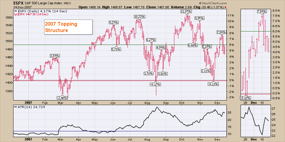
In 2007, the July highs were taken out in October for about a week, with a massive one day candle that shot well above the highs, below the lows of the previous 3 days, and ended well off the lows. That marked a change in trend in the ATR. 2007 was really trending on the ATR. Down trending ATR - bullish, up trending ATR - bearish. Notice on the zoom box, how the length of the bars (intra-day range) was very tall (about 2% -4%) in December as the market tried to get through the resistance.
My last chart shows the Bullish Percent Index ($BPSPX) as a wavy blue line, representing the percentage of stocks on a buy signal using PnF charts. The area chart in the background represents the actual $SPX. In the lower panel is the percentage of stocks above the long term 200 Daily MA ($SPXA200R). The lime green lines are the current readings so you can look back and compare to historical levels. We can see the Bullish Percent levels continue to get weaker on every rally and so far the last rally made a lower high (72%) once again. In 2007, this was the same level (70%) that the final high was made at. You will also notice similar levels in 2006. The main difference is that we did not have plunging lows preceding those $BPSPX tops in 2006 like we do now in 2014 and 2015. In my opinion, the plunging lows represent instability in the market.
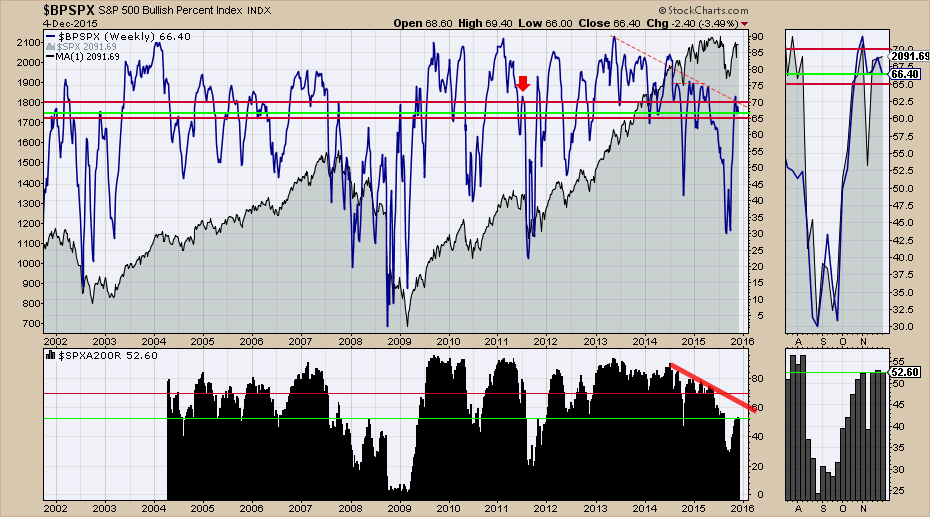
In the bottom panel, you will notice that in the bull market of 2004 to 2007, the lows that were made in terms of the % of stocks below the 200 DMA was around 50%. In 2007 and 2008, those levels got more depressed. This year currently looks more like late 2007 or early 2008. We had the same situation in 2011. However, the Federal Reserve used QE to restart the market in 2011. That currently does not appear to be on the table. The current highs around 50% for the last 5 of 6 weeks, suggests that there is not enough breadth to lift the market. You can be on a PnF buy signal for the Bullish Percent Index below the 200 DMA, but it usually means a bear market rally. Notice in 2007 and 2008, that the rallies lasted about 6-8 weeks. That's where we are now.
Can Mario Draghi's speech this week provide enough fuel to restart the bull market? I don't know if it can, but in order to get back into a bull market, we are going to need a wider swath of stocks to do the heavy lifting. Until then, this looks like a bear market map to me. The breadth, the bullish percent indexes, the junk bonds making lower lows, the trend line break in Corporate bonds, the 40-year break in the Commodities trend line, the lagging Russell 2000 and the 40 WMA ceiling on most of the major indexes around the world, all point to distress. The Mario Draghi ECB QE announcement of January 15, 2015, lifted stocks for about 6-8 weeks globally. Perhaps Friday was the start of another 2-month run. If so, these indicators will start to rise dramatically. The 40 $SPX points between here and the highs makes this zone challenging. A convincing surge to new highs would be bullish.
Good trading,
Greg Schnell, CMT
