 The "Yield Curve" is a term often used in finance and refers to the relationship between (government) bonds with various maturities.
The "Normal" relationship between the yield on various maturities is that the longer you lend money to someone. In this case the US government, the more "yield" you require. Similar to your mortgage, a fixed rate for five years is cheaper than a fixed rate for ten years or longer.
There are a few ways to look at yield curve relationships.
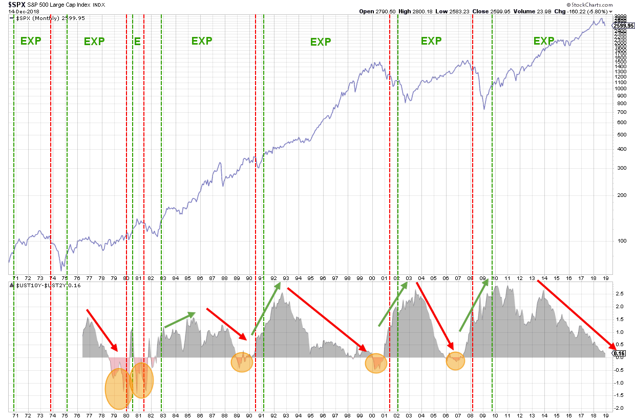
10-yr Minus 2-yr Yield
A popular, and generally accepted, way to look at the yield curve is shown in the lower pane on the chart above.
This plot shows the difference between the yield on 10-year and 2-year maturities. In a "Normal" situation that relationship is above 0%. When that relationship drops below 0%, the yield curve is "Inverse".
You can create similar charts for the different segments on the curve, for example, the difference between 5-year and 2-year yield or 10-year and 5-year yield.
The shaded ovals indicate where the curve inverted in the past.
It's not only the difference between the two yields that gives you information but also the direction in which that difference is moving. When the difference is rising it means that the curve is "steepening", when the difference declines, the curve is "flattening". This changing of the shape is indifferent from the level of the difference.
All these observations on and inside the yield curve can help investors paint a picture on, primarily, the macroeconomic aspects of changes in yield
The Complete Curve
You can get a more granular view on the yield curve and the possibility to see the interaction between various segments by using the Dynamic Yield Curve tool.
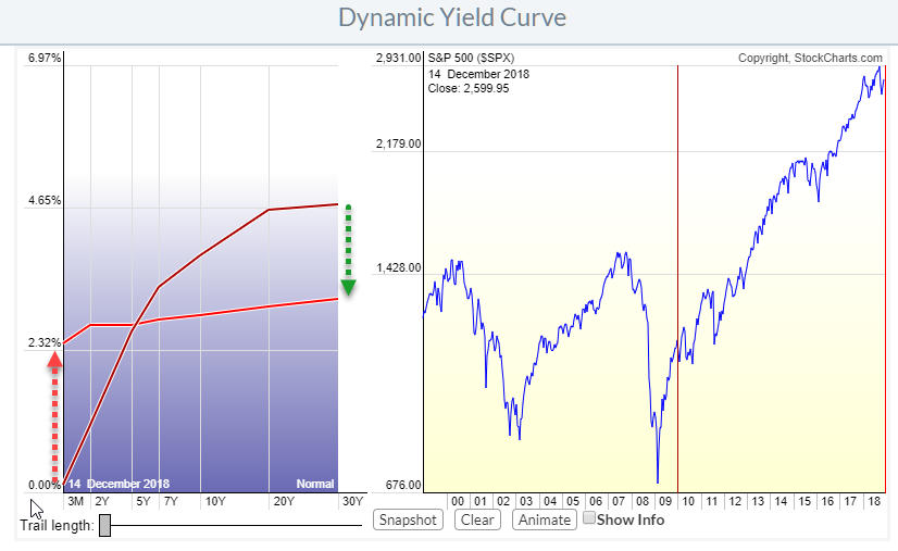 The chart above shows the various points, maturities, on the curve from 3-Months all the way up to 30-years and their yields. The nice thing about the Dynamic YC tool is that we are able to take a "snapshot" of the curve on a specific date and then move the slider in the (S&P) chart on the right to a different date and then see how the shape of the curve has changed.
The darker red curve is the situation at the beginning of 2010, the bright red curve is the current situation. As you can see the yield on longer maturities came down while the shorter maturities moved higher, changing a very steep curve in 2010 to a very flat curve now. The segment between 5-year and 2-year is exactly flat at the moment while it was slightly inverted, below zero, a week ago.
The Yield Curve And The Business Cycle
If we go back to the chart at the top of this article, you can see that I have overlaid red and green dashed vertical lines. These lines mark the peaks (red) and troughs (green) of the business cycle as defined by NBER (National Bureau of Economic Research).
So from a red to a green line marks a contraction period and from green to red marks an expansion period.
The information on the direction of rates and the changes in the shape of the curve is often used to determine where we are in the business cycle.
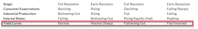 Combining the information that you can extract from the yield curve with the known behavior of the yield curve in relation to the various stages of the business cycle can help to determine where we are in the cycle which will then help you decide between risk on/off and/or over-/under-weighting equity sectors.
Adding all this up leads, IMHO, to the quick conclusion that we are now very late in the expansion phase or maybe already even in the early recession phase.
Use Relative Rotation Graphs to pick up steepening or flattening trends of the curve
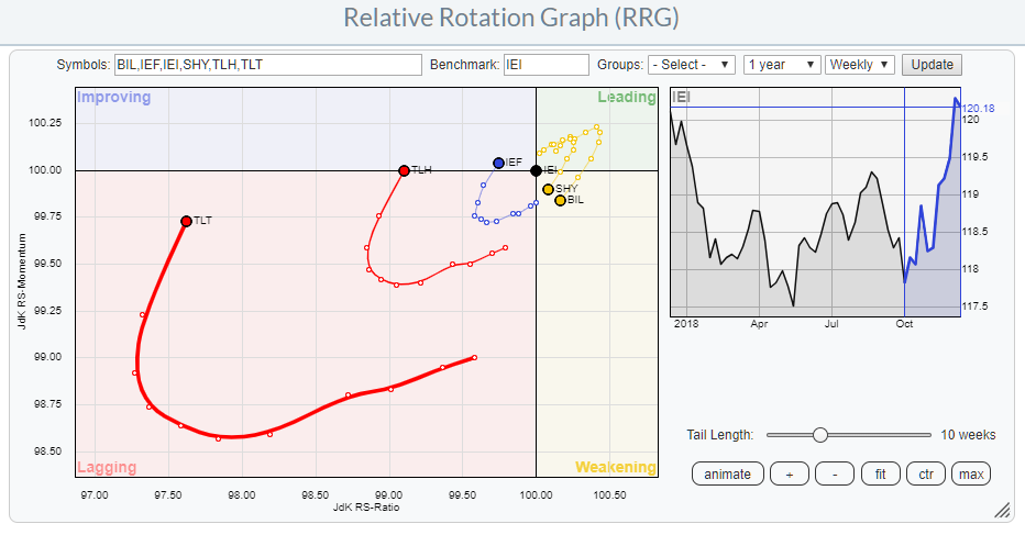 Finally, I cannot omit them, RRGs can help you to pick up shifts on the yield curve from flattening to steepening and vice versa by plotting bond ETFs tracking various maturities on a Relative Rotation Graph as shown in the chart above.
This blog article explains more in depth how you can combine RRGs and the Dynamic Yield Curve tool to make better-informed decisions.
My regular blog is the RRG blog If you would like to receive a notification when a new article is published there, simply "Subscribe" with your email address using the form below.
Julius de Kempenaer | RRG Research
RRG, Relative Rotation Graphs, JdK RS-Ratio, and JdK RS-Momentum are registered TradeMarks ®; of RRG Research
Follow RRG Research on social media:
Feedback, comments or questions are welcome at Juliusdk@stockcharts.com. I cannot promise to respond to each and every message but I will certainly read them and where reasonably possible use the feedback and comments or answer questions.
If you want to discuss RRG with me on SCAN, please use my handle Julius_RRG so that I will get a notification.
