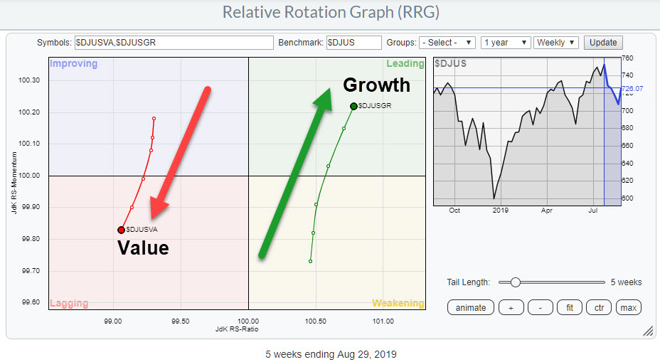
One of the Relative Rotation Graphs that I like to keep an eye on in order to get a handle on the general market condition (for stocks) is the chart above, which shows the rotation of Value versus Growth stocks using the Dow Jones US Index as the benchmark. The general take on this relationship is that Growth stocks do well when the market as a whole is doing well, while Value stocks are seen as a safe haven that will do well (or at least better than the general market) in times when stocks are coming down.
The rotation on the RRG very clearly shows the strength for Growth stocks over Value. The strong JdK RS-Momentum for Growth as it travels higher on the JdK RS-Ratio axes is causing a positive RRG-Heading on this group.
At the opposite side of the RRG, Value stocks are showing the reversed rotation. Weak RS-Momentum, in combination with dropping values on the RS-Ratio scale, make a rotation from improving back to lagging at a negative RRG-Heading.
Lengthening the tails for both indexes on this RRG shows the longer-term relationship for this rotation of Growth vs. Value.
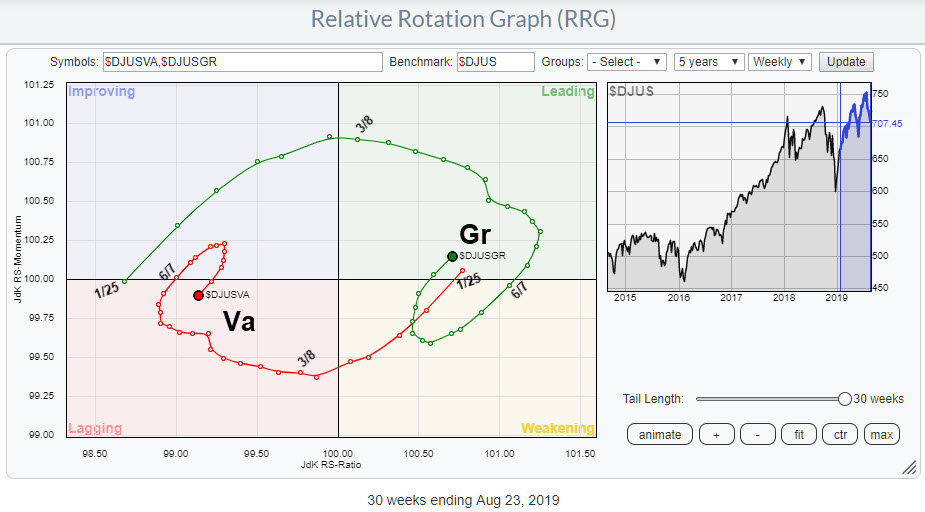
I have marked the dates when the tails cross over to different quadrants. On 25 Jan, both tails simultaneously cross over. Value moves from leading into weakening (this is the red tail in the chart above) while Growth moves from lagging into improving around 4 weeks after the December 2018 low was put into place.
Both tails then move through these quadrants in the next five to six weeks before then crossing over. Growth crosses from improving into leading in the week of 8 March; Value moves into lagging one week later.
As you know, there is no specific trigger point or signal point on RRG charts, but, in the period from 25 Jan to 8 March, evidence for improvement of Growth over Value continued to mount. Combining this type of information with observations on the price chart of the S&P 500 or (in this case) the DJ US Index can help you in assessing overall market conditions.
After the initial improvement and crossings into leading and lagging quadrants respectively, the tails rotated through leading and lagging and eventually moved into/curled up to weakening/improving around 7 June.
At that time, Growth was still much higher and above 100 on the RS-Ratio scale, meaning it was therefore ahead of Value. The rotations through weakening and improving were short-lived, however, and recently the tails turned around again. One to two weeks ago, Growth crossed back into leading while Value re-entered the lagging quadrant.
This sort of rotation is typical for the start of a new leg in an existing trend, in this case the outperformance of Growth over Value.
Personally, this observation makes me feel a bit more comfortable looking at the graphs for major market indexes (S&P, DOW, etc) wearing my buyer's glasses. It just gives you a little more confidence judging bullish indications from their price charts.
Therefore (imho) using RRG charts not only on primary series like stocks and (sector) indexes directly can add value to your process. The Growth vs. Value rotation as described in the example above, as well as Size indexes (small-, mid-, large-cap) or RRGs showing rotation of various forms of breadth data etc., can all help you get that little extra information that you cannot find on a price chart.
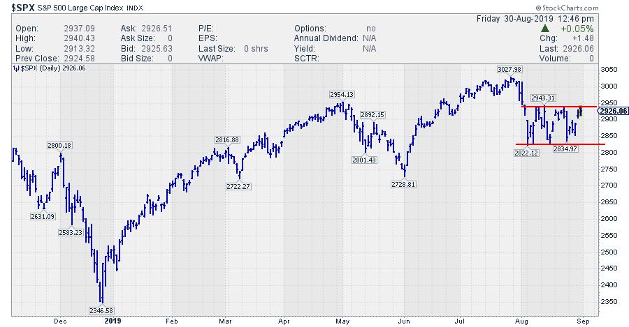
Taking the information on Growth vs. Value to the S&P 500 chart ($DJUS looks pretty much the same), my judgement is that a break from the current range is more likely to occur to the upside rather than the downside.
My regular blog is the RRG Charts blog. If you would like to receive a notification when a new article is published there, simply "Subscribe" with your email address.
Julius de Kempenaer
Senior Technical Analyst, StockCharts.com
Creator, Relative Rotation Graphs
Founder, RRG Research
Want to stay up to date with the latest market insights from Julius?
– Follow @RRGResearch on Twitter
– Like RRG Research on Facebook
– Follow RRG Research on LinkedIn
– Subscribe to the RRG Charts blog on StockCharts
Feedback, comments or questions are welcome at Juliusdk@stockcharts.com. I cannot promise to respond to each and every message, but I will certainly read them and, where reasonably possible, use the feedback and comments or answer questions.
To discuss RRG with me on S.C.A.N., tag me using the handle Julius_RRG.
RRG, Relative Rotation Graphs, JdK RS-Ratio, and JdK RS-Momentum are registered trademarks of RRG Research.
Julius de Kempenaer
Senior Technical Analyst, StockCharts.com
Creator, Relative Rotation Graphs
Founder, RRG Research
Host of: Sector Spotlight
Please find my handles for social media channels under the Bio below.
Feedback, comments or questions are welcome at Juliusdk@stockcharts.com. I cannot promise to respond to each and every message, but I will certainly read them and, where reasonably possible, use the feedback and comments or answer questions.
To discuss RRG with me on S.C.A.N., tag me using the handle Julius_RRG.
RRG, Relative Rotation Graphs, JdK RS-Ratio, and JdK RS-Momentum are registered trademarks of RRG Research.
