Editor's Note: This article was originally published in John Murphy's Market Message on Thursday, August 15th at 3:47pm ET.
Everyone's talking about inverted yield curves. The 10 year - 3 month yield curve turned negative a few months ago. The 10 year - 2 year spread turned negative for a brief time yesterday, but hasn't officially inverted yet. For that to happen, the 10-year yield needs to drop below the 2-year yield, and stay there for awhile. But it's getting close enough to get people worried. That's because inverted yield curves have a strong history of signalling economic recessions. There is, however, something different about the current situation. And that's the direction of commodity prices.
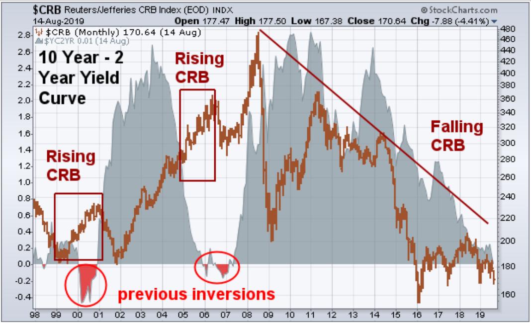
The gray area in Chart 2 plots the ten year - two year yield curve. As of yesterday's close, the 10 year yield was one basis point above the two-year. It's still positive, but barely. The brown bars plot the CRB Commodity Index. The last two yield curve inversions took place during 2000 and 2006 (red circles). Both led to stock market peaks and economic recessions within a year. Notice, however, that the 2000 inversion was accompanied by rising commodity prices (first box). In fact, crude oil prices tripled during 1999 which forced the Fed to raise short-term rates enough to push them above long term yields. Commodity prices also surged during 2005 (second box) which again forced the Fed to tighten, which led to an inverted yield the following year. Both of those yield curve inversions had bad endings. And rising commodity prices had a lot to do with them. This time is different.
The brown bars show commodity prices in a steep downtrend over the last decade. And they're down again this year. That's especially true of agricultural commodities, industrial commodities (like copper), and energy prices. Gold is the only commodity winner this year (along with silver). But that has more to do with falling global interest rates than rising inflation. [Gold is often incorrectly viewed as just an inflation hedge. But it's also a good hedge against deflation which is its current role].
What makes the current situation unusual is that we have very little experience with what's causing the current inverted curve, or the threat of one. Previous yield curve inversions were usually caused by short-term yields rising faster than longer-term yields. The current inversion is being caused by longer yields falling faster than shorter yields. Falling commodity prices at this late stage of an economic expansion are also unusual. That also makes this time different. The absence of commodity inflation, however, also carries some risk. History shows that deflation can be just as dangerous as inflation. And it's a lot harder to fight. Just ask central bankers.
Chart 2