
Relative Rotation Graphs, or "RRGs", were born while I was working as a sell-side analyst for an investment bank in Amsterdam, doing research and making calls on stocks and sectors. The clientele of the bank were all institutional investors, ranging from pension funds and endowments to hedge funds.
One thing these PMs and fund managers all have in common is that they are interested in relative performance. The pension fund and the endowment are looking to beat a "benchmark" while the hedge fund manager is looking for absolute return, but, as they usually play the short-side of the market as well, they are very often interested in pair trades to mitigate general market risk. That also requires a "relative" view.
Selling research to an institutional client base is a pretty competitive environment, as you are up against all other analysts on the street, meaning that you need to "stand out from the crowd." RRG was my way to get out of the box and show trends in relative strength in a different way.
Using RRG For More Than Just Sectors
Because of my role at the time, I was pretty focussed on the equity markets and its sectors, which was my primary universe for use with Relative Rotation Graphs.
When I moved on to a new role as a fund manager for an asset allocation fund/investment company, I started using RRG for other applications as well, which was when I really started to understand and appreciate the versatility and power of this type of graph. RRG can really be used as a tool for a top-down approach to markets, giving you a high-level overview of the markets in various layers.
Discussing RRG on MarketWatchers Live
Last week Thursday and Friday, I substituted for Erin as co-host on MarketWatchers Live with Tom Bowley, where we had some interesting discussions and examples of use-cases for RRG. If you have not seen these shows, please go to our YouTube channel and have a look, as there is a decent chance you will pick some fresh ideas - particularly in the Friday show (8/16) , where we talked about how to use RRG for analysis of the yield curve.
In the past few days, the yield curve for US government bonds has been making a lot of headlines again - or, more specifically, the inversion of the yield curve is making headlines.
For the yield curve itself, we have the "Dynamic Yield Curve" tool, which is actually a pretty cool piece of equipment as it allows you to visualize the change in the yield curve over time in an interactive way.
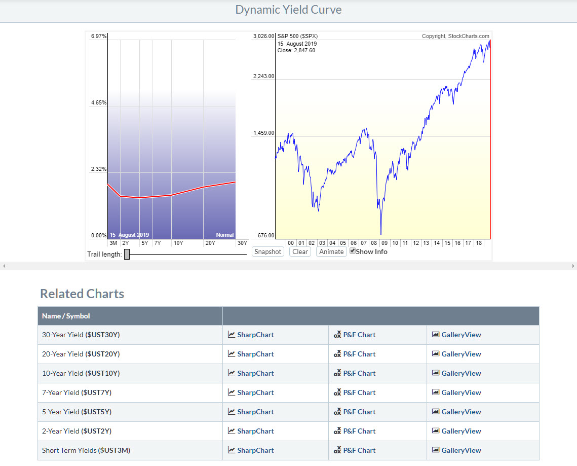 Dynamic Yield Curve tool
When you click on the image above, it will take you to the yield curve tool on StockCharts.com. This will be a very beneficial tool for tracking the movements of the yield curve and (double-)checking if there really is an inversion or if the curve is steepening or flattening.
The Yield Curve tool above will show you the current state of the curve and, by using the snapshot and trail length functions, you can see its movement over time. When you, like me, are interested in the relative movements of the various segments on the curve, RRG can help you get a handle on that.
Visualizing Yield Curve Movement on RRG
In order to visualize the movement of the yield curve, we first need to set up the RRG to do that. It is important to realize that yields are moving inversely to prices. So, when prices of bonds go up, the yield goes down. This is important because RRG tracks prices, so we need price-based instruments (ETFs or Total Return bond indexes) to plot on the RRG.
Theoretically, it would be possible to use yields on a Relative Rotation Graph, but that will "flip" the rotation around. My preferred set of ticker symbols to track the yield curve is the family of bond ETFs provided by iShares. I have added these ETFs to the RRG below:
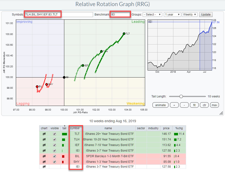
These ETFs track the various segments (maturities) on the yield curve. For the benchmark, I have used IEI, which represents the 3-7 year maturities that are (sort of) the middle of the curve.
This RRG still shows you the relative movement/rotation of all these various segments versus that IEI benchmark and against each other.
At the moment, you can see strength at the long end of the curve, maturities 3-7 year, while, at the short end of the curve, BIL and SHY are in relative downtrends vs. IEI. Translating this to yields means that the long end of the curve is coming down while the short end of the curve is going up. This is a "flattening" of the curve, and RRG will show you this movement very clearly.
The opposite rotation, with long maturities towards and into lagging and the short maturities towards and into leading, represent a steepening yield curve.
Using This Information To Build The Big Picture
In order to build the big picture of events, you need to blend all this information into a framework of thoughts. A good tool/approach to do this, IMHO, is by using the business cycle and the connected sector rotation model as a framework.
Two good pages to keep an eye on with this regard are:
- The ChartSchool article on Sector Rotation Analysis and the Business Cycle
- The Sector Rotation Model including the table below it on the PerfChart page (scroll down to below the PerfChart)
My regular blog is the RRG Charts blog. If you would like to receive a notification when a new article is published there, simply "Subscribe" with your email address.
Julius de Kempenaer
Senior Technical Analyst, StockCharts.comCreator, Relative Rotation Graphs Founder, RRG Research
Want to stay up to date with the latest market insights from Julius?
– Follow @RRGResearch on Twitter– Like RRG Research on Facebook– Follow RRG Research on LinkedIn– Subscribe to the RRG Charts blog on StockCharts
Feedback, comments, or questions are welcome at Juliusdk@stockcharts.com. I cannot promise to respond to each and every message, but I will certainly read them and, where reasonably possible, use the feedback and comments or answer questions.
To discuss RRG with me on S.C.A.N., tag me using the handle Julius_RRG.
RRG, Relative Rotation Graphs, JdK RS-Ratio, and JdK RS-Momentum are registered trademarks of RRG Research.
Julius de Kempenaer
Senior Technical Analyst, StockCharts.com
Creator, Relative Rotation Graphs
Founder, RRG Research
Host of: Sector Spotlight
Please find my handles for social media channels under the Bio below.
Feedback, comments or questions are welcome at Juliusdk@stockcharts.com. I cannot promise to respond to each and every message, but I will certainly read them and, where reasonably possible, use the feedback and comments or answer questions.
To discuss RRG with me on S.C.A.N., tag me using the handle Julius_RRG.
RRG, Relative Rotation Graphs, JdK RS-Ratio, and JdK RS-Momentum are registered trademarks of RRG Research.
