|
|
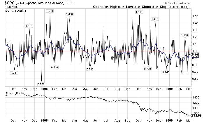
$CPC is our symbol for the CBOE Put/Call ratio. It is a market sentiment indicator that shows the total number of "Put" options (bearish) divided by the total number of "Call" options (bullish). That means that it is an "inverse" indicator - i.e., readings below 1.0 are bullish while readings above 1.0 are bearish. Here's a daily $CPC chart for the past couple of years:
 Click here for a live version of this chart
Some people find the daily $CPC too volatile and use the 20-day EMA to smooth it. If the EMA (blue line) is above 1.0, things are bearish, if it is below 1.0, things are bullish.
As you can kind of tell, $CPC gives some pretty good longer-term signals which causes people to want to examine it using shorter and shorter time frames. However there is an interesting problem with ratio-based indicators like $CPC when you look at their intraday datasets. Check out this intraday chart for $CPC:
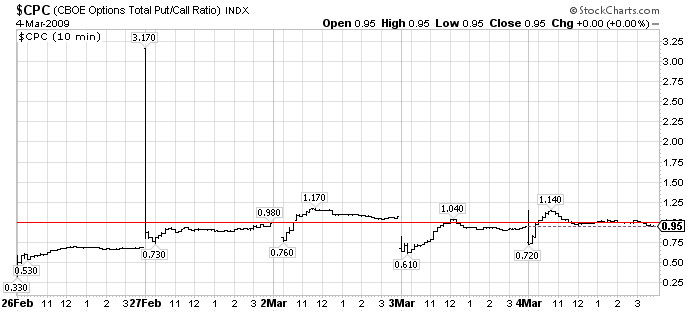 Notice how, at the start of each day, $CPC basically "freaks out" and jumps to an "extreme" value that is almost always the high or the low for the day. $CPC usually settles down within the first hour and then moves around in a relatively narrow range until the close. The next day, the pattern repeats again.
The "freak out" behavior at the open is due to the fact that the initial "Put" and "Call" volumes reported by the CBOE can be skewed and/or delayed by a variety of factors. When that happens, the division operation can results - on bearish days - in some very LARGE spikes right at the open. Bullish days aren't quite so bad since bullish readings are restricted to between 1.0 and 0.0 - although if you are charting $CPC on a log scale chart, those same large spikes will also appear.
On the chart above, the spike that goes up to 3.70 is a very mild example of what I'm talking about. As you can see, big spikes do not always occur.
If they appear, the spikes happen right at the open and then the $CPC almost immediately gravitates back towards 1.0. Unfortunately, the spikes will often cause the scale on the chart to expand dramatically which makes it very hard to analyse the $CPC values during the rest of the day. The spikes can also have a huge impact on the values of any moving averages or indicators that appear.
Because these spikes have a huge impact on the chart and because they are "artificial" in the sense that they depend mostly on the speed at which the first "Put" and "Call" data is reported, we here at StockCharts.com feel that they are extremely misleading and should be removed from the chart. The question then becomes "How?"
Initially, we "removed" them by making $CPC an End-of-Day only index. We simply didn't allow people to create intraday charts for $CPC and we always set the daily open, high, and low equal to $CPC's closing value.
Ultimately though that solution didn't seem fair to our users that wanted to see $CPC values during the day so recently we've change $CPC back into a full-featured intraday index. But, that has reignited the issue of what to do about the spikes.
One solution we considered was to not show any $CPC values until after 9:45am each day. By then, the spike (if any) would have "settled down" and wouldn't be distorting the chart as much. The problem with that approach is that it would deny people access to the direction of the $CPC in the first minutes of each day and - while the magnitude of the spike is usually misleading - the direction (bullish or bearish) can be valuable. So just "hiding" the spike would deprive our users of potentially critical trading information.
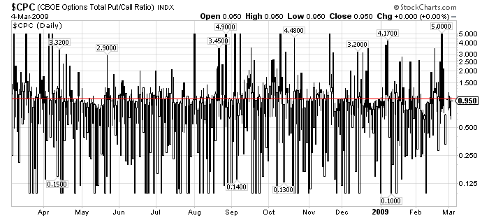
Instead, we decided to simply cap the value of $CPC at 5.0 and at 0.10.
This approach allows people to see the value of $CPC throughout the entire day and it limits the "misleadingness" of any spikes. The value of 5.0 was chosen somewhat conservatively since the largest closing value for $CPC in the past 14 years was 1.70 in early 2007. Similarly, the smallest $CPC value during that same time has been 0.30 in 1998, so a minimum value of 0.10 seems pretty reasonable.
By capping $CPC, we think we've come up with a solution that allows useful, usable charts even when intraday time periods are used.
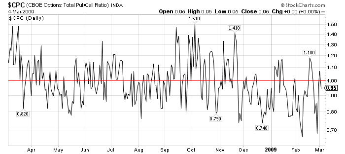
NOTE: If you have a saved $CPC chart in your account that relied on our old "End-of-Day" data format, it may look very different as a result of our changes. You can "fix" that problem by changing your chart from a Candlestick or OHLC chart into a "Line (thin)" chart like I've shown below:
BEFORE:
I'd love to hear from you if you have an opinion about this change. We're always open to better solutions if the can help everyone make better investing decisions.
- Chip
As you can kind of tell, $CPC gives some pretty good longer-term signals which causes people to want to examine it using shorter and shorter time frames. However there is an interesting problem with ratio-based indicators like $CPC when you look at their intraday datasets. Check out this intraday chart for $CPC:
 Notice how, at the start of each day, $CPC basically "freaks out" and jumps to an "extreme" value that is almost always the high or the low for the day. $CPC usually settles down within the first hour and then moves around in a relatively narrow range until the close. The next day, the pattern repeats again.
The "freak out" behavior at the open is due to the fact that the initial "Put" and "Call" volumes reported by the CBOE can be skewed and/or delayed by a variety of factors. When that happens, the division operation can results - on bearish days - in some very LARGE spikes right at the open. Bullish days aren't quite so bad since bullish readings are restricted to between 1.0 and 0.0 - although if you are charting $CPC on a log scale chart, those same large spikes will also appear.
On the chart above, the spike that goes up to 3.70 is a very mild example of what I'm talking about. As you can see, big spikes do not always occur.
If they appear, the spikes happen right at the open and then the $CPC almost immediately gravitates back towards 1.0. Unfortunately, the spikes will often cause the scale on the chart to expand dramatically which makes it very hard to analyse the $CPC values during the rest of the day. The spikes can also have a huge impact on the values of any moving averages or indicators that appear.
Because these spikes have a huge impact on the chart and because they are "artificial" in the sense that they depend mostly on the speed at which the first "Put" and "Call" data is reported, we here at StockCharts.com feel that they are extremely misleading and should be removed from the chart. The question then becomes "How?"
Initially, we "removed" them by making $CPC an End-of-Day only index. We simply didn't allow people to create intraday charts for $CPC and we always set the daily open, high, and low equal to $CPC's closing value.
Ultimately though that solution didn't seem fair to our users that wanted to see $CPC values during the day so recently we've change $CPC back into a full-featured intraday index. But, that has reignited the issue of what to do about the spikes.
One solution we considered was to not show any $CPC values until after 9:45am each day. By then, the spike (if any) would have "settled down" and wouldn't be distorting the chart as much. The problem with that approach is that it would deny people access to the direction of the $CPC in the first minutes of each day and - while the magnitude of the spike is usually misleading - the direction (bullish or bearish) can be valuable. So just "hiding" the spike would deprive our users of potentially critical trading information.
Instead, we decided to simply cap the value of $CPC at 5.0 and at 0.10.
This approach allows people to see the value of $CPC throughout the entire day and it limits the "misleadingness" of any spikes. The value of 5.0 was chosen somewhat conservatively since the largest closing value for $CPC in the past 14 years was 1.70 in early 2007. Similarly, the smallest $CPC value during that same time has been 0.30 in 1998, so a minimum value of 0.10 seems pretty reasonable.
By capping $CPC, we think we've come up with a solution that allows useful, usable charts even when intraday time periods are used.
NOTE: If you have a saved $CPC chart in your account that relied on our old "End-of-Day" data format, it may look very different as a result of our changes. You can "fix" that problem by changing your chart from a Candlestick or OHLC chart into a "Line (thin)" chart like I've shown below:
BEFORE:
I'd love to hear from you if you have an opinion about this change. We're always open to better solutions if the can help everyone make better investing decisions.
- Chip


Posted by: Xavier J. Borsellino March 05, 2009 at 01:13 AM
Posted by: Blain Reinkensmeyer March 06, 2009 at 12:19 PM
Posted by: Dan Eckert March 07, 2009 at 06:43 AM
Posted by: Dan Frusescu March 08, 2009 at 01:55 AM
Posted by: Jim Abagis March 08, 2009 at 09:00 AM
Posted by: Will Fisher March 10, 2009 at 01:54 AM
Posted by: LEON TUEY March 17, 2009 at 02:54 AM