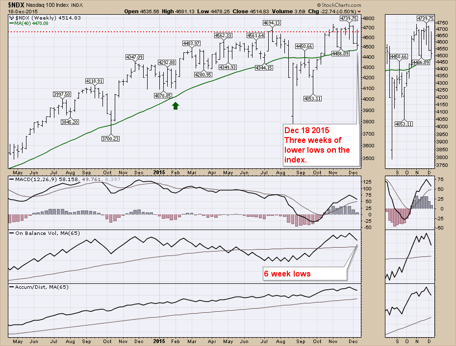
Investors had a tough week making money on the long side this week. Most of these charts are from the Commodities Countdown Webinar of 20151217. We closed just under last weeks' lows, but we went a long way up and gave it all back. This is the Nasdaq 100 ($NDX).
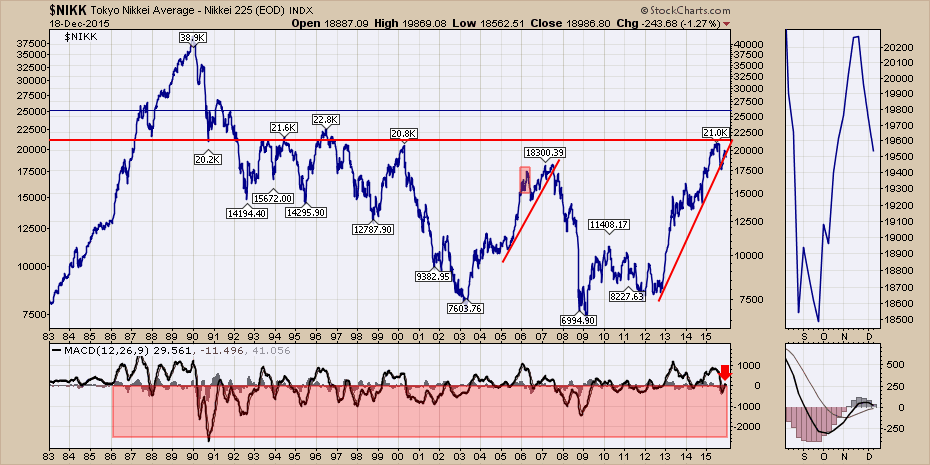
The Japanese Nikkei Index ($NIKK) looks very susceptible to lower prices here on this weekly chart. The MACD is rolling over, but next week should tell us if it goes negative or crosses the signal line or both. Click on the chart to see an update after Christmas or New Years Day. The zoom box gives a closer look. In the big picture, the 21,000 level is significant resistance. All three rating agencies have declared the Abenomics strategy for revitalizing Japan is not working. Friday's intraday swing was 883 points (4.4%) and increased volatility usually occurs in a downtrend.
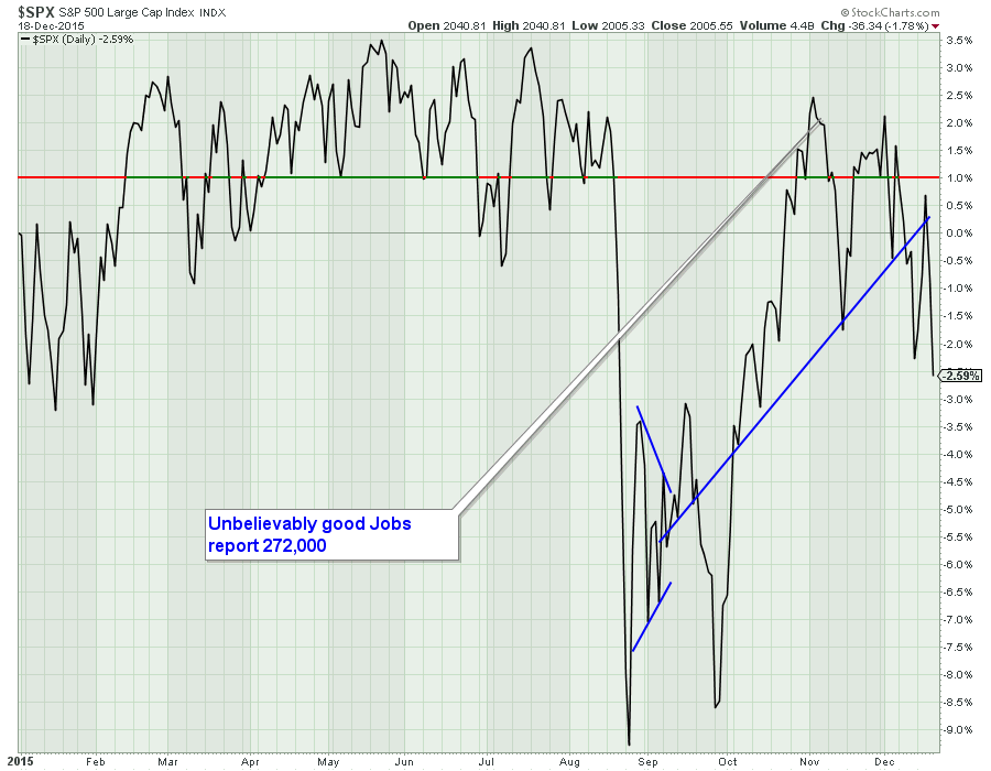
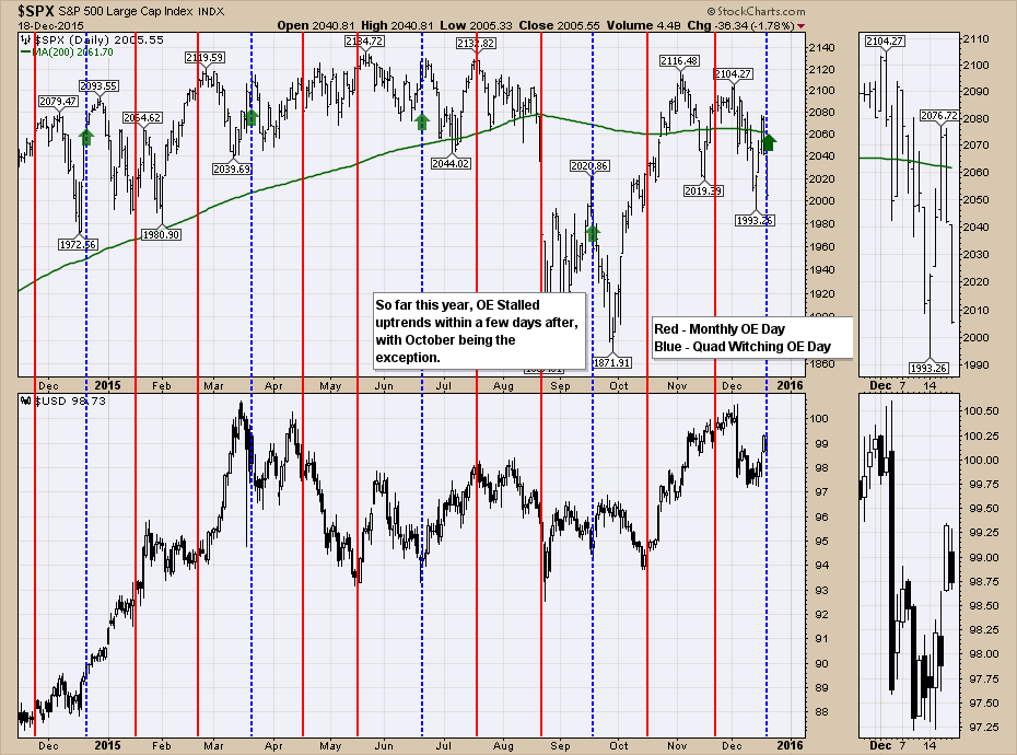
There are only 8.5 trading days left in 2015, will the market close positive? This is a Y-T-D look of the broadest Large Cap Index ($SPX).
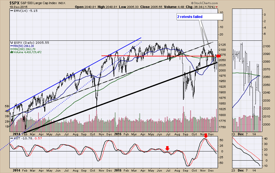
Friday's close was back below the major uptrend line. The $SPX also stalled out at horizontal resistance on Fed day. The KST moved below zero on the week.
The Quadruple Options Expiration (QOE) day has seen the $SPX roll over on or shortly after each of the last 4. It would appear to be happening again. I am also watching to see if it affects the $USD. The $USD soared from December 2014 QOE to March 2015 QOE so it makes me wonder if it might reverse in the same fashion. For more explanation on this chart, click on the link to watch the webinar. Commodities Countdown 20151217.
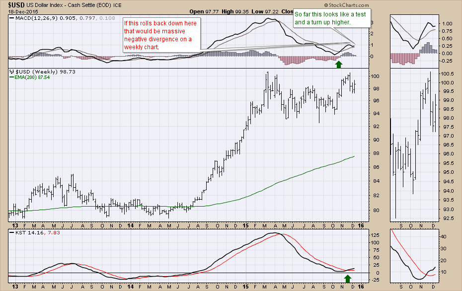
Below is a weekly look at the $USD with both the MACD and a smoother KST. Both indicators have positive signals for higher prices currently and that should remain our direction until proven differently. One fly in the ointment to that directional thinking is that the $USD actually pulled back on Friday on (QOE). Based on the chart above, that could be a meaningful place to look for a directional change. If the $USD starts a move down that would be significant for so many things so this bears watching closely. If the MACD rolls back over this close to the zero line, that would be extremely important as it would create serious negative divergence compared to the March top. We also have to be suspicious of a double top on the price level between the high back in March 2015 and the December 2015 high.
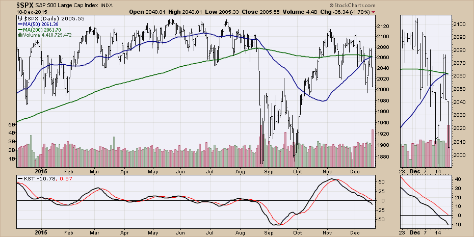
The daily $SPX lost 70 points in 2 days. Yesterday was also the day that the 50 DMA was expected to cross back above the 200 DMA. This may not actually cross here.
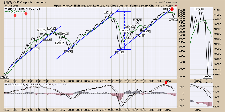
The failure at the 10 MMA continues to be a map. Hitting resistance at the 10 MMA after breaking the uptrend looks to be significant for the third time on the New York Composite ($NYA).
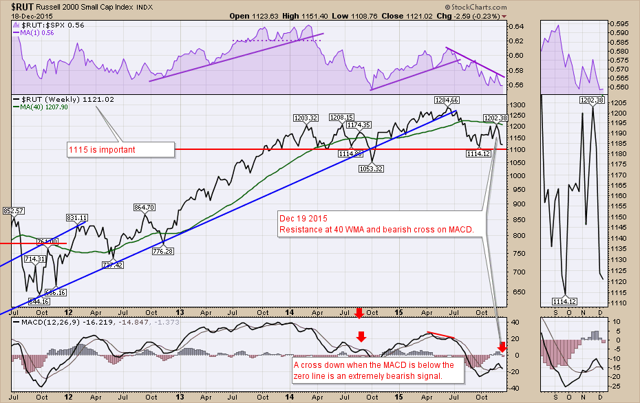
The Russell ($RUT) looks critically important here. A bearish cross below the signal line on the MACD while positioned below zero after just crossing above a few weeks ago, suggests momentum is terribly weak. Look in the zoom box to see a close up of the action. The resistance at 1200 is important and support at 1115 is critical.
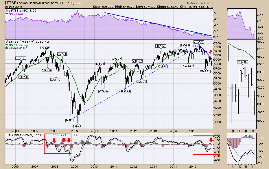
The $FTSE is similar to the $RUT with the MACD making a negative cross below zero on the weekly chart. It is important to understand the bearish omen whether you look back at the bearish cross down in June or August 2008 or December 2007 as it crossed back down after trying to get above zero. Weekly negative MACD crosses below zero deserve respect as this chart shows.
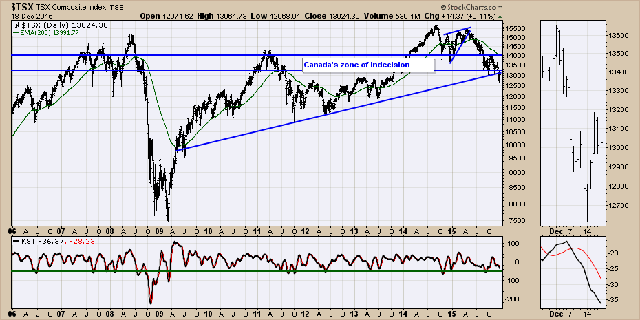
The $TSX was actually up 14 points on Friday while the US market plummeted. It keeps trying to hold on to 13000 and managed to close above that level for the week. It is still below the up sloping trend line.
There were lots of commodity charts continuing to point down. I would encourage you to watch the recording for a lot of other charts that are important right now. Commodities Countdown 20151217. Feel free to follow me on twitter @schnellinvestor or subscribe to this blog by clicking yes below if you would like an email when there is a new article.
Good trading,
Greg Schnell, CMT
