As a chartist, the world is a display of investor sentiment towards businesses doing well, and when the charts are declining, a sentiment towards businesses or industries declining. Through a series of charts, I hope to build a dialogue about how severe the contraction is in one of the largest businesses in the world. My hope is that you will forward the link on to people you know, so they can have their perception include this data as well.
Through this article and 10 charts, I want to discuss a broader view of low oil prices. I want to start with a deep analysis of the oil chart. We could use $BRENT to illustrate the data as well, but one oil chart is enough to tell the story pretty well. There are few critical components on the oil chart to understand. One is the macro picture of oil price history since the start of the century. By explaining this West Texas Intermediate Crude Oil ($WTIC) chart, the charts further down can be referenced to the critical dates.
You can click on any of these charts to see a live update at any time in the future.
1) The all-time high was in the middle of the financial crisis between Bear-Stearns and Lehman Brothers. Shown here as a weekly close at $145.29. The average price over 52 weeks at year-end marked by the red arrow for 2008 was about $100.
2) After 9 months of decline into the 2009 low, oil mounted a spurious rally to $72.04 and importantly the price closed the year out around $80 and well above the 52-week average of $65 marked by the second arrow.
3) Trading from 2010 to 2014, oil had rising lows but traded between $75 and $110. In July of 2014 oil started a decline and there was an obvious reason to believe it would continue to trade between $75-$110. It had stayed in that range for the last 4 years.
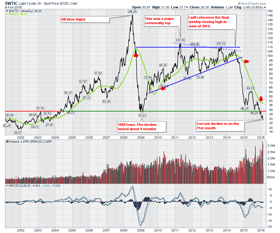
4) When oil broke below $92 (a wiggle in the price decline is apparent as traders thought the higher lows would continue to hold), the price of oil now had a lower high and a lower low on the big picture. This was the first time since 2009 where both conditions of a weekly declining trend (lower high, lower low) were met. 2014 ended with the average price shown by the green line near the red arrow at $94.
5) Price bounced a bit as it surpassed a 50% decline to $46 a barrel from the final high. There were many who were looking for the low price of 2009 to hold on this low as well. We can see now that we still have declining highs and lows. While the first half of 2015 created a trading range in the decline, oil resumed the downtrend. The average price was around $49 but the closing price was well below that.
I have highlighted the average price over 52 weeks as companies value the reserves using a combination of 3 different prices. The 52-week historical average, the current price being realized, and the prices on the futures curves looking out into the months ahead. In 2009, the price of oil returned to being above the 52-week average and the futures contracts looking at months farther out were also higher. This helped companies value their assets at levels higher than the lows or the historical average.
In 2015, both the futures curve and the current price at year end were well below the 52-week average of $49. This has forced companies to restructure their debts based on the value of oil in the ground that can be produced at these low prices. The fact that the price keeps declining into the second year is making this a legendary swing of historical proportions.
The volume of trading going on in oil is screaming higher as companies try to adjust and speculators continue to work in the market. The momentum shown by the wavy line in the bottom panel (MACD) is clearly negative and has been for almost 5 years.
I think it is important to also analyze the rest of the energy industry. I will use an ETF here for this industry group.
From iShares - What is an ETF? Like a mutual fund, an ETF is a collection of stocks or bonds. And like a stock, you can buy and sell an ETF throughout the day as long as the market is open.
Below is the trend in the Coal Industry (KOL) using an ETF that tracks companies in the coal business. This ETF only has 8 years of data. While this is not the same as tracking the price of Coal directly, this trend is almost wiping out the coal business. Companies of 80-100 years are being wiped out in 4.
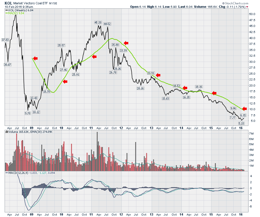 Notice the momentum curve in KOL has not been positive since the major commodity top I noted on the crude oil chart in 2011. Peabody Energy (BTU) was a $72 stock at the top of the commodity cycle. After going below $1 a share, it did a 1:15 share consolidation making the shares $15 each by merging 15 shares to 1. Companies are not allowed to stay on the major exchanges with share prices under a $1 and many funds are not allowed to invest in stocks under $5. That happened in October 2015, and the shares have lost over 80% since then. Here is what a chart looks like for Peabody Energy.
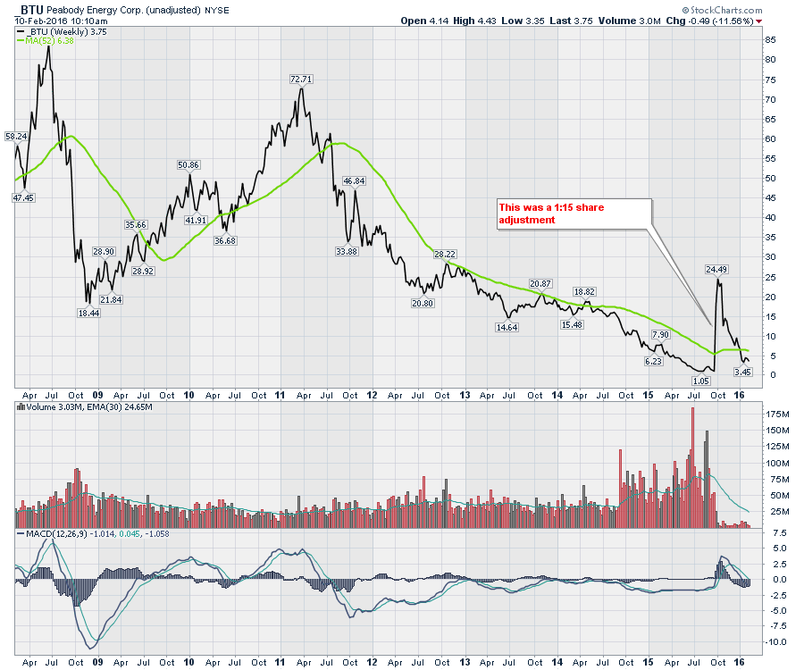 Not many scaled stock charts show a price scale with a zero as a lower boundary in the price chart! Arch Coal and many others have been wiped out within 4 years. Let's just say the trend in coal is brutal.
Next is the chart of Natural Gas ($NATGAS).
I have only drawn 2 lines on the chart. One at $4 which is a level of profitable production where explorers can make a little money to reinvest in more wells to develop more energy. The second line is at $2.10 which is stuck near 12-year lows. This is the current price.
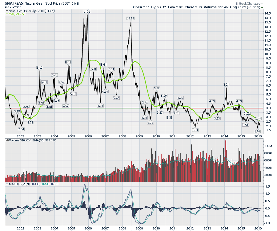
The good news on this Natural Gas chart is it does not start the price scale at zero. The fact that the price is almost 50% below profitable production levels is stunning. Since the financial crisis, the price has been below a profitable level almost half the time. As an aside, there are parts of North America where propane has traded at zero.
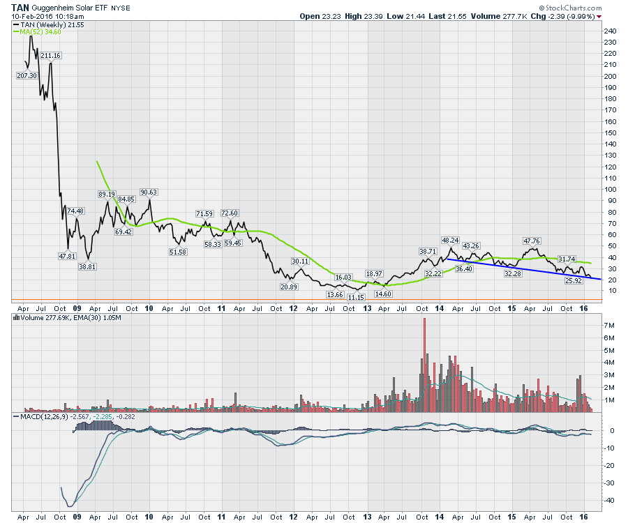
Next, we'll look at the Solar renewable energy ETF (TAN).

It has been in a downtrend since before oil started falling. This is a big problem. As the competitive price of energy has fallen, these stocks have not done well. Don't let the scale fool you, these have fallen in half.
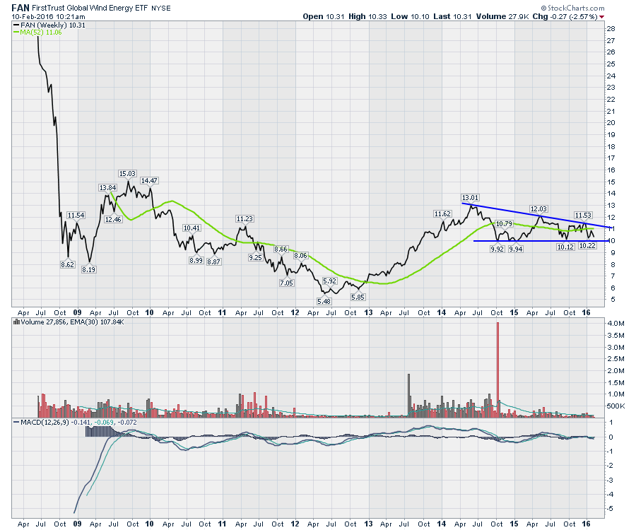
Below is the chart related to Wind Energy. (FAN). This chart is down trending since oil topped out. It has not taken out the lows yet. If this should break to new lows, watch for more trouble in the Wind Power space.
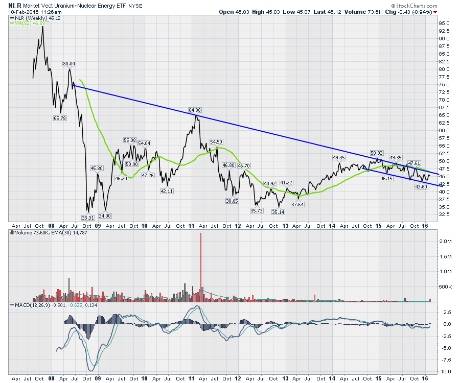
 Here is Nuclear Energy expressed through an ETF (NLR). Nuclear is supposed to be in a dramatic growth environment due to Asia's plans for more facilities. NLR started to decline shortly after oil broke down making the major high in December of 2014.
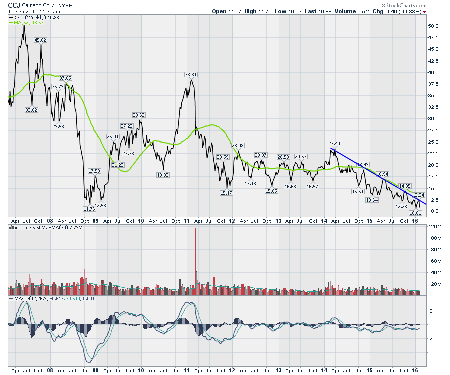
Here is the stock of the world's biggest Uranium producer. Cameco. Notice the high in 2011 with the rest of the commodities. This stock starting melting down 60% in 2014.
 We have an energy industry collapse worldwide. We have Malaysia, Brazil, Australia, Canada, Mexico, The Netherlands, France, Norway, China, Venezuela, Russia, Germany, the Middle East, and America to name a few regions with significant businesses in energy. However, the dominoes continue.
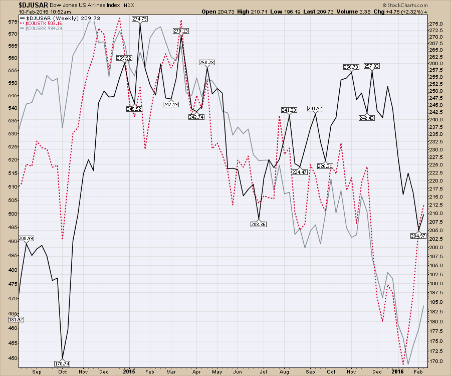
Let's look at the transportation sector and divide it into the three industry groups. This is the group that the financial news media and the fundamental investment community would suggest having the largest upside due to low oil prices. I have placed all three industry indexes on the same panel in the chart below.
The transports as a group started to roll over in 2015. The airlines made their highs in January (yes, January, a year ago) of 2015 even though the price of oil continued to decline. Airlines ($DJUSAR) were supposed to be the biggest beneficiaries of low oil. Airlines are now reducing the total number of seats available to maintain their revenue per seat mile. Airlines are now asking the plane manufacturers to push back delivery dates. They were one of the first to see the reduction in business miles from head offices out to very rural locations where the resource base was located.
Railways ($DJUSRR) have fuel as one of their largest costs. Optimistic rail CEO's suggested a downfall in crude would be irrelevant or even beneficial for them. After watching the stock prices hit 52-week lows, some are starting to notice the crude oil rail traffic is slowing. They are also starting to notice the movement of raw goods for the steel industry both in raw iron ore, metallurgical coal for firing the smelter, and finished steel goods as an example. The railway index made the final high in November 2014. November 2014 is only 5 months after the price of oil started to decline.
The Trucking industry ($DJUSTK) made its high in December 2014 and tested it in March 2015. As transportation of pumpjacks from Lufkin, Texas to Williston, North Dakota stops, it affects trucking volumes.
As Caterpillar stops shipping heavy equipment, it slows the trucking business.
As steel pipe stops moving, it slows the trucking business.
As John Deere stops shipping backhoes, it slows the business.
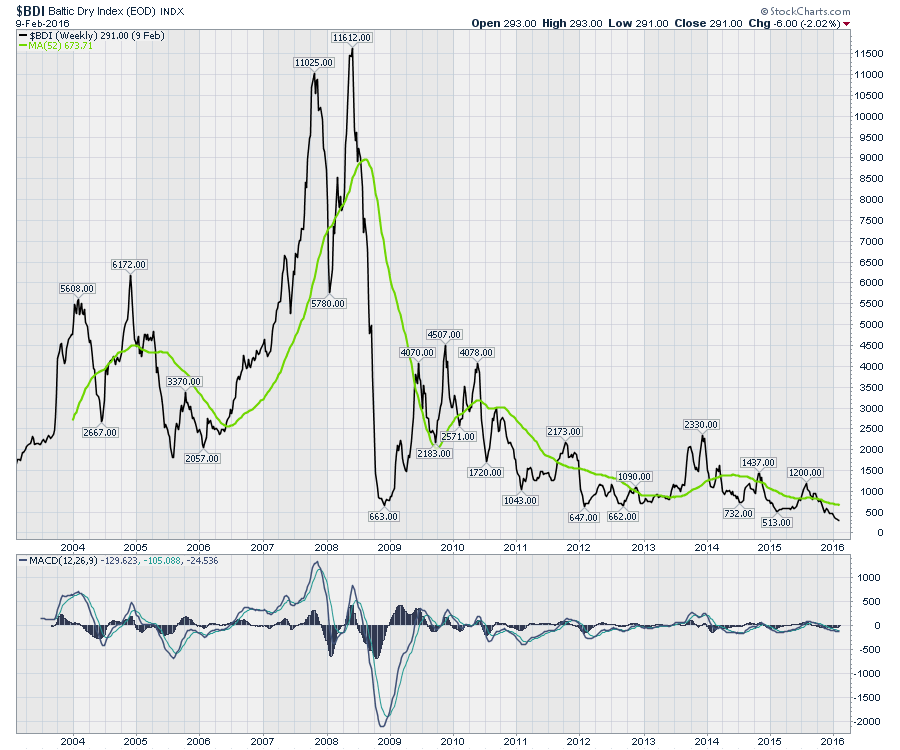
 Globally, freight has stalled. The Baltic Dry Index ($BDI) is near record lows.
Container traffic stalled according to Maersk Ship lines. Last year's Christmas was 'surprisingly weak'.
In my observation, continuing the notion that a sector-wide, collapsing energy industry is bullish, is irresponsible at best. For all the environmentalists, I do see distributed power as a road to the future. Getting there so fast that it spins the world into a global depression doesn't appear to be the best path. Global container freight, dry freight, steel, valve and actuator manufacturers, process control equipment, hotels, restaurants, oilfield supply, drilling, helicopters, telecommunications, heavy equipment, highway tractors, trailer manufacturers, specialty equipment manufacturers, and even clothing are all impacted to name but a few. The wind and solar companies have to compete at these new levels and many are failing to. In the finance area, the debt coming due is setting up global repercussions. Goldman Sachs, Morgan Stanley, and the major banks worldwide are all suddenly reeling at the size of the monster ahead. The worst part is other industries are falling in sales and their debt ratios are becoming outsized with a declining business.
The fact that the globe is slowing might be a story told by the complete collapse of the raw materials and energy sector. Using Commodities as a barometer of actual demand is not always perfect but this epic scale is important.
Having politicians, rock stars, movie stars, and sports personalities weigh in on their version of a green world is important. A little fact based knowledge is also. Wiping out the jobs in all the energy related sectors over a 5-year period without a replacement plan won't be the utopia shared in 30 second soundbites from government officials. The iconic tabloid stars addressing the media from their ($2000/day in fuel ) yacht decks, and ($1500 /fillup) private aircraft backdrops are spreading more harm than good. The majority of us need jobs, many of which are related back to the global energy business.
For every job removed, politicians will need an equal and more economically powerful job to replace it. The energy industry is one of the top paying industries because of the remote locations to access the resource.
There have been so many academics, economists, journalists and TV commentators touting the $10 Billion benefit of low oil to the American consumer. One mega-project in the industry is $20 Billion in direct spend, and over 150 projects of varying sizes have been stopped worldwide. Financially related investment communities worldwide that continue to say the banks are the only systemically important sector are surprisingly nieve. It might be time to roll through the charts and send some facts into the conversation.
Feel free to share this article with friends. You can follow me on twitter @schnellinvestor. I'll be hosting a Commodities Countdown webinar Thursday, February 11, 2016. Click here to register. Commodities Countdown 20160211. I will be devoting a substantial part of this webinar to the expanding this analysis and demonstrating when the economic downturns in each sector became influenced by the continued collapse in the energy sector. If you miss the webinars live, click on this link for the StockCharts Webinar Archives on Vimeo. StockCharts Archives. The webinars are displayed in chronological order.
Lastly, get the word out that a continuation of the destruction of the energy business worldwide won't be recessionary. It will be much worse than that as the charts are starting to show.
Good trading,
Greg Schnell, CMT
