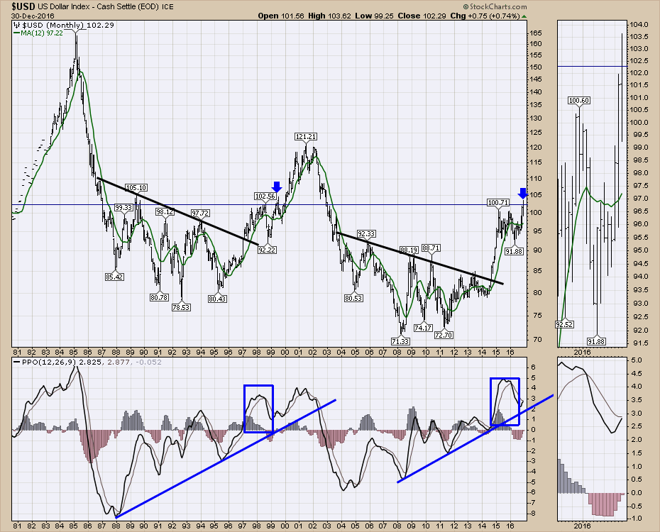
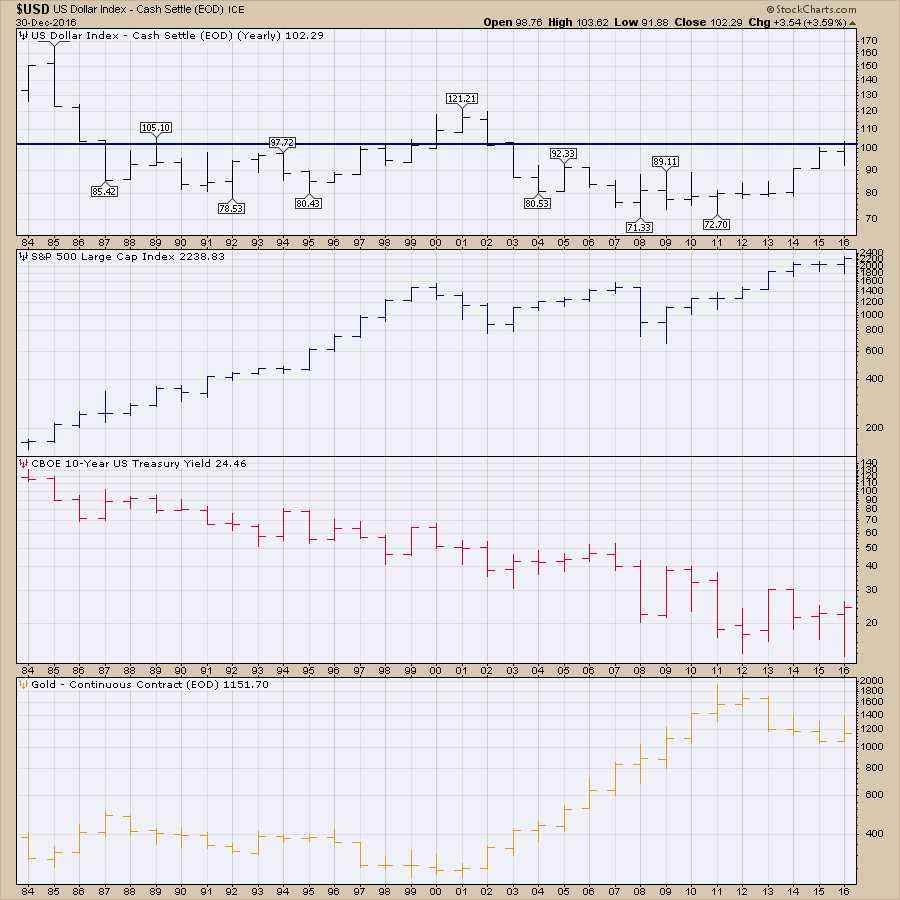
2016 marked a breakout on the $USD above a 2 year consolidation. But the big picture on the $USD is probably the most important at this level at this time of year. Lets walk through some charts.
On the chart below, which is monthly, there are a lot of $USD reversals in direction around the first of the year.
1985, 1988, 1991, 1992, 1993, 1994,1995,1997,1999, 2000, 2001, 2002, 2004, 2005, 2006, 2007, 2009, 2010, 2011, 2012, and 2016 all have a reversal within a few weeks either side of the new year. 21 out of 32 years is a high expectancy.
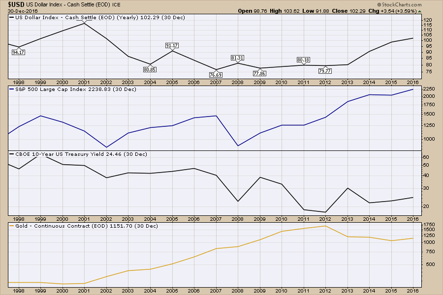
Another factor for the Dollar is the current set up is eerily reminiscent of the 1999 mid year top around 104.50 where the blue arrow is. After working hard to get through the 100 level, the dollar pulled back in late 1998. Then it surged up, breaking out by a couple of cents above the 102 level, only to roll over, go back and retest the support on the breakout. The dollar fell almost 7 points before reversing at 97 and making a spectacular 2-year run to 121. As you can see, the charts are set up extremely similar from 1987-1997 and 2004 to 2014. Even the price action on the Percentage Price Oscillator (PPO) is quite similar. So if the $USD were to pull back 5 - 7 points to get back under the 100 and check for support one more time, this would still keep the same set up intact. All that to suggest, we may have seen this movie in the dollar before.
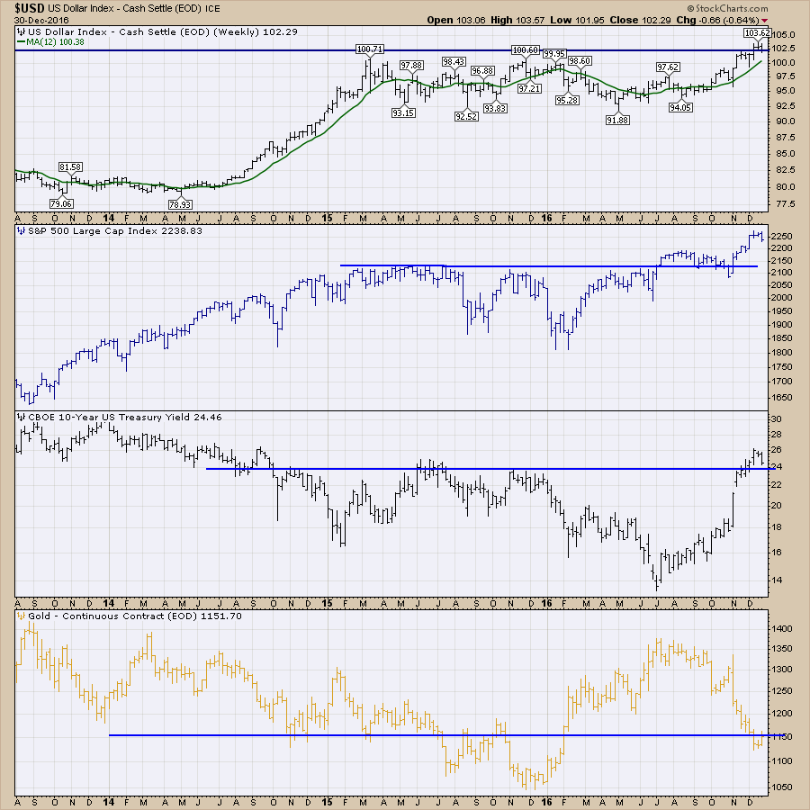
Before moving onto the weekly time frame for the $USD, I think it is important to look back at the 1998-2000 period for the dollar more closely and compare it to today. The end of the 1999 calendar year had the $SPX closing close to all time highs, the 10 Year treasury yield had just violated a 16-year downtrend line, and Gold had a remarkable run that broke above a 4-year downtrend. While all of that matches the current story, the recent surge in 10-year Yields has been more vertical than the move back in 1999. However, we have also seen the yield curve surge above a trend line in 1994, 1999, 2006, and 2016.
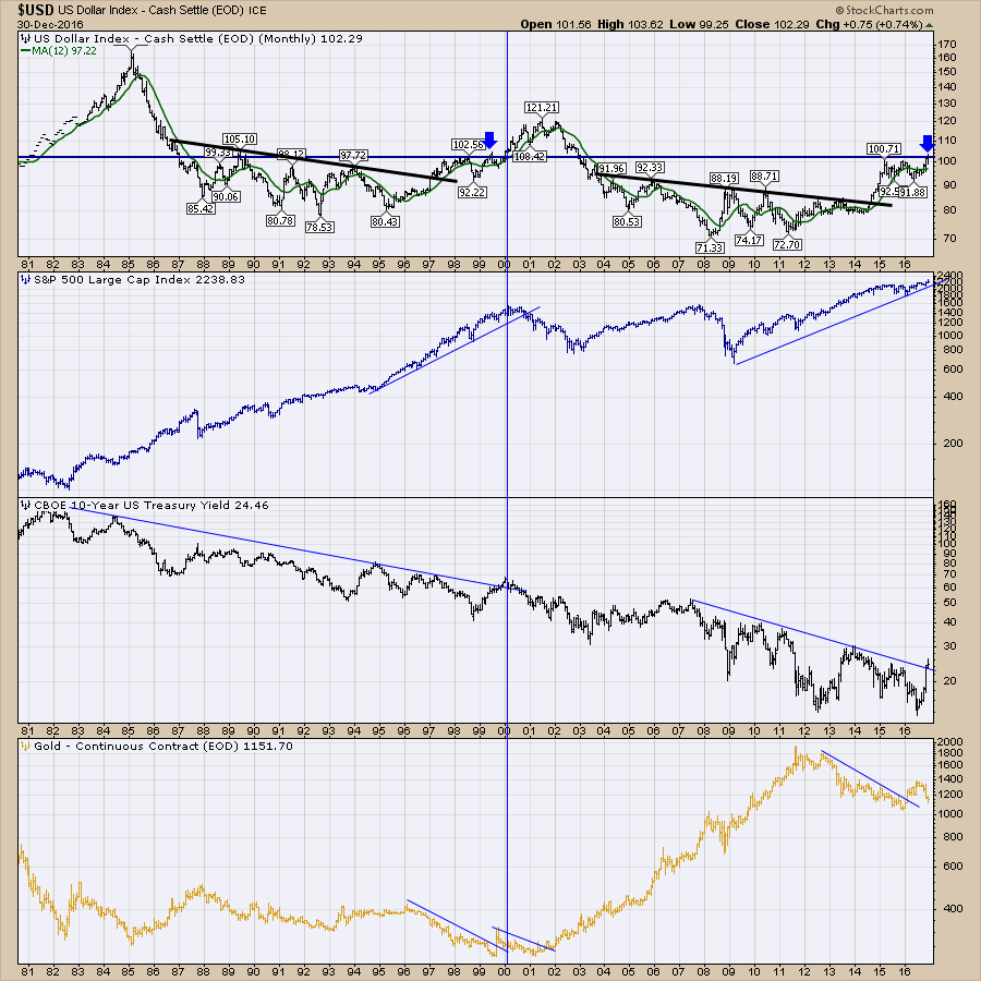 There are a lot of similarities to 1999 right now with the current chart shape of the $USD. While thousands of brokers maybe right saying there are no bubbles out there currently, this is a good time to review the $SPX relative to the $USD back in 1999-2000. If I am wrong, that's fine, but if it plays out the same, it won't surprise us in 2017. I've put the Dark blue arrow where things seem to match the $USD to now. Obviously calendar wise, it would be closer if it was the light blue arrow at year end. What appears to have happened is as the $USD climbed, the US larg cap stocks had more trouble internationally and the market stalled for the entire year. As the dollar continued to move up, the $SPX got weaker and yields dropped, meaning bond prices were rising. So let's throw that on the table as a potential scenario for 2017.
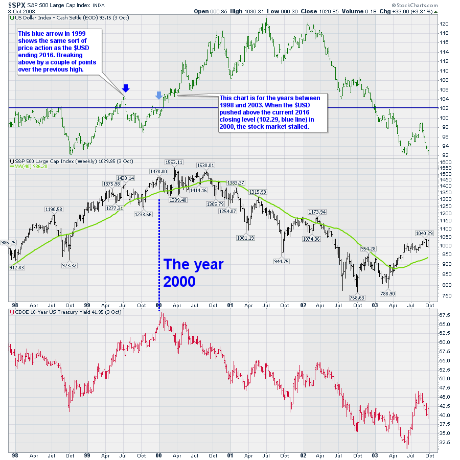 I would like to use the same chart settings and move to the current stock market so you can evaluate the similarities for yourself. Again, the only reason for this comparison is the huge similarities for the $USD.
 Let's end the comparison there.
We'll move on to just look at the US Dollar recently. The blue line on the $USD is the closing level for 2016. Here is the look with annual bars. We only get the chance to get a completed bar once a year, so this is as good a time as any to look at it. As we can see, it is slightly above the previous highs in 2015 so this closes out the year with a bullish annual candle. That screams for a very bullish interpretation of the $USD. This chart of the $USD shows the stock prices following it with an outside bullish reversal candle.
The Yields have been working higher and most major bases in the yield charts through history are big, wide saucer bases. Nonetheless, moves from 2% to 4% are a double so bond investors are living through more volatility right now.
If we are currently building a major breakout on the Dollar, the bonds should continue to be sold as the Yield stays in trend with the $USD, and Gold should be sold as an opposing trend. The Dollar has closed higher each of the last 4 years. The levels are 80.28 and 90.62 and 98.75 and 103.20. Constantly rising.
However, all four of these went higher last year. That has not happened since 2004. I'd suggest that should put us on watch for some change in at least one of the big trends.
 Gold year end closes for the last 4 years are $1204 and $1189 and $1060 and $1151. The 2015 close was $1060 that looks like a low. It's worth thinking about anyway.
When these relationships start to change, I would expect some serious upheaval. Until then, timing the Dollar trend is probably the most important. With the potential and I emphasize potential base in $GOLD or the $TNX, we might not be far off from an upheaval in trend.
Good trading,
Greg Schnell, CMT, MFTA
