 This is a complementary article to Secular Bears that I wrote on May 14, 2015. To be perfectly honest (that is how someone usually leads into telling a lie) I planned on doing this article shortly after the first one and totally forgot. Secular Bulls and Secular Bears is terminology that I don’t ever recall hearing more than 15-20 years ago. Now I see the term bandied about all of the time and often it is different in a number of ways. For full disclosure, my entire education on secular markets comes from Ed Easterling. Ed wrote two wonderful books that I strongly recommend – “Unexpected Returns” and “Probable Outcomes.” Ed also maintains a website that is loaded with great articles and charts (even though they are not SharpCharts) at http://www.crestmontresearch.com. Secular is one of those words that I don’t think is well defined, but the dictionary says it pertains to occurring once in an age. My version is simply that it doesn’t occur very often. Even that depends on your viewpoint, but since we are talking about the stock market and it has been around since the late 1800s, we can think of secular as something that happens every couple of decades or so.
Ed is somewhat unique in how he describes or defines a secular bull or secular bear market. I’ll just quote something he wrote for me that I put in my “Investing with the Trend” book. Easterling points out that these secular periods are not random as they follow each other; he actually calls them cycles. The driver of these cycles is the inflation rate as it moves toward and away from price stability. Trends of rising inflation and deflation drive the market valuation lower and result in low returns. As prices stabilize from either deflation or high inflation, valuations are driven upward and the result is high returns. Keep in mind that this is a process whereby moves away from price stability simultaneously cause PE to decline and low or no returns result. Moves toward price stability simultaneously cause PE to rise and result in high returns. I underlined that because I think it is critically important to understand. And when you pause to think about it, it also just makes sense. The data used that most folks who analyze this stuff is the Robert Shiller data; he created a monthly database of cyclically adjusted price earnings, called CAPE or PE10.
Chart A is from Easterling’s website (crestmontresearch.com) showing the monthly S&P back to 1900 along with the CAPE below. It shows that rises in PE coincide with rising secular bull markets and declines in PE coincide with sideways/down secular bear markets. And this is important, he only works with reported earnings, you know, the actual ones; not the foolish guesses of the analysts.
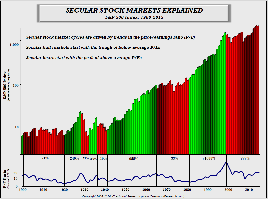 Chart A
Chart B shows all four of the inflation adjusted secular bull markets since 1900. It is clear that there is a wide range of time frames for secular bull markets from only 57 months to 288 months. The blue one is the last secular bull that has lasted 212 months. I have to say that writing about cyclical or secular bear markets is more enjoyable. This is downright boring. Sorry! But at least it completes the Secular information.
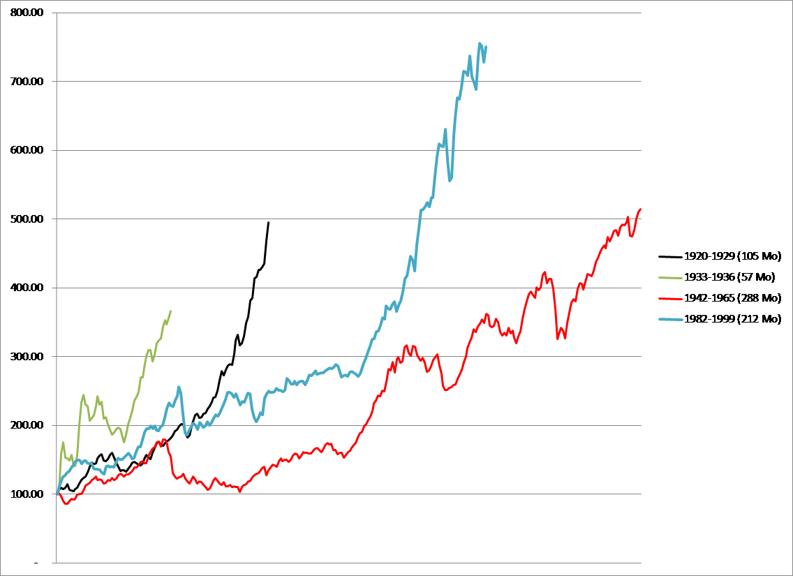 Chart B
Chart C shows all of the secular bull markets cyclically adjusted price earnings ratios since 1900. These are the same secular bulls as shown in Chart B, but this one is showing the cyclical adjusted price earnings (PE10) and not price. The important point to notice on this chart is that they all began with a PE in the 5 to 10 range. The all ended with PE greater than 20. Especially notice the PE in 2000, which was almost 50% higher than the next highest.
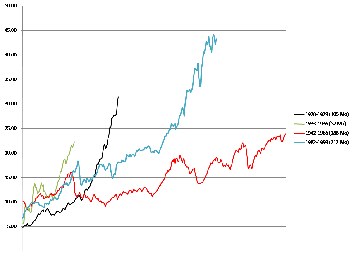 Chart C
Chart D is from Doug Short’s website at Advisor Perspectives. Doug was kind enough to create a number of charts for me to use in my Investing with the Trend book, which by the way covers secular markets in excruciating detail. Chart D shows the CAPE which in March, 2009, reached 13.3. So the question most will ask was this the low or the end of the secular bear that began in 2000? Fair question especially based upon the level of the CAPE during previous secular bear terminations, even though they were all single digit, this one is close. The current CAPE on the Secular Bear is 24.3, certainly in the range where all previous secular bears ended. The blue line is the monthly S&P adjusted for inflation and you can clearly see that it has been down since 2000. Based upon this information, I do believe we are still in a secular bear. But time will tell. Sadly, we are not playing horseshoes, we are dealing with the uncertainty of the future.
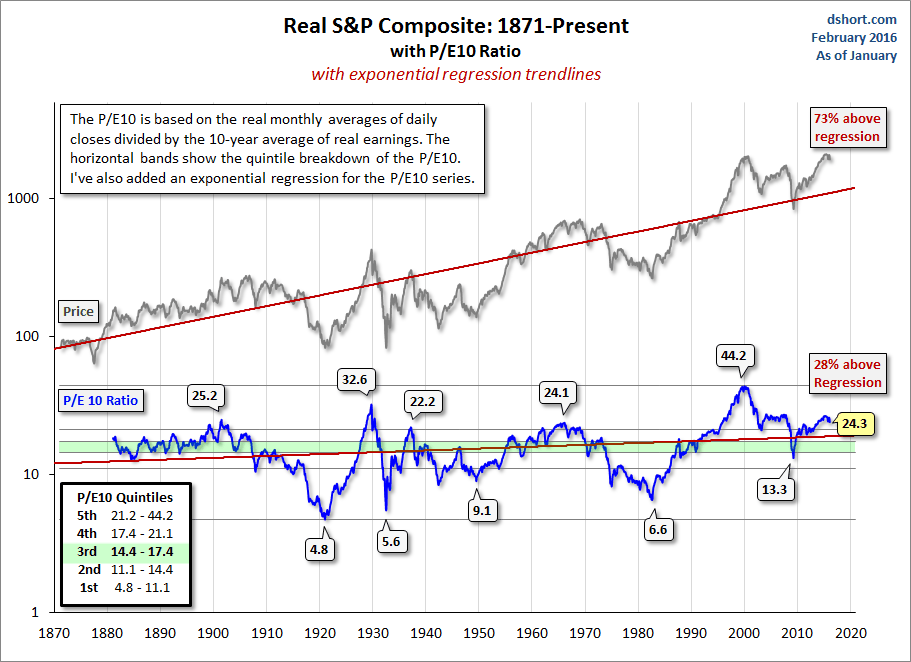 Chart D
Chart E shows the monthly S&P adjusted for inflation (real) back to 1871, using the Robert Shiller database. When you see the last Bear (white area on far right) adjusted for inflation it is a little easier to accept the belief that we are still in that Secular Bear. Also, ignore the bullish period at the beginning as did not have the PE back then.
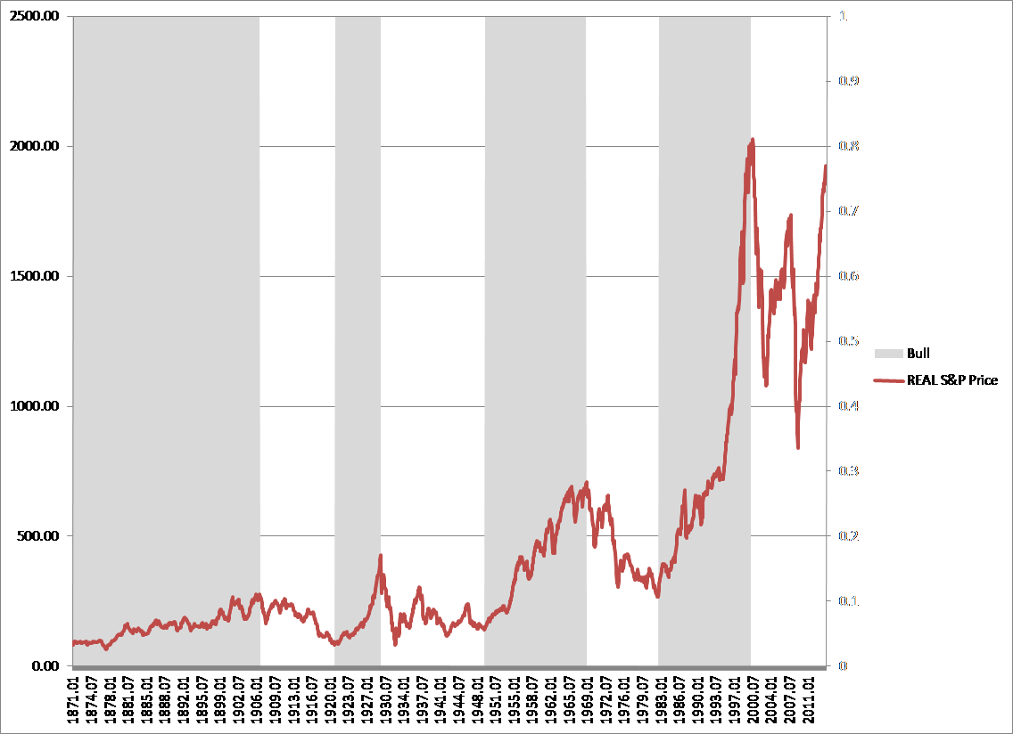 Chart E
After a cyclical bull run that has lasted almost 7 years, it is very easy to lose the long term picture. I hear both sides of the argument about the secular bear being over and a new secular bull began in March, 2009. Those folks just may or may not be correct, but I do know they do not agree with the definition of what a secular bull and bear market are in regard to Easterling’s work. And as Ed Hart, the wonderful credit analyst on FNN in the 1980s used to say – we will all be smarter in the fullness of time.
Trade with Knowledge,
Greg Morris