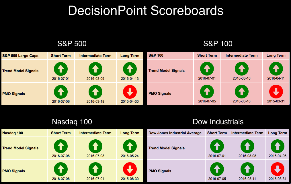
 One look at the DecisionPoint Scoreboards and a review of the DP Market/Sector Summary and you'll see the plethora of BUY signals and green paint. Yet the market is traveling sideways and has been for 12 days. Should we expect an upside break or downside break? Read on.
 First here's a look at the 10-minute bar chart for the SPY. The run of consolidation within a trading range of less than 1% is lengthy.
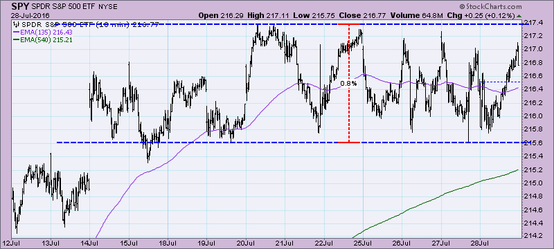
There are two ways to approach this type of price activity. It is the "cup half-empty" or "cup half-full" approach. If you are in the bearish camp (half-empty), you would rightly point out that price has been unable to penetrate the top of this range for days and therefore, it is time for a decline. However, a bull "cup half-full", would point out correctly that price has held on to support for days and has refused to break down. Whose idea holds the most promise? Unfortunately our short-term indicators haven't revealed their choice. On the other hand, intermediate-term indicators are calling for a decline.
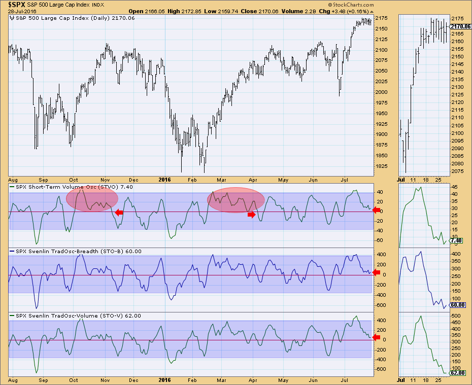
The short-term indicator chart for the S&P 500 will soon reveal its sway. Typically when these indicators top and start lower, it is in conjunction with a price decline. However, I have highlighted two areas where the opposite has occurred. What's the difference? The key is the oscillation above the zero line. These indicators have been teasing us for days, twitching just above the zero line. It appears readings are trending lower, but they are obstinate about crossing into negative territory. If we see these indicators start to scoop up, then this is a pause before the next rally upward. However, if they drop below zero, price becomes vulnerable to a decline.
Intermediate-term indicators are very bearish right now. They've reached highs they haven't seen in years and have topped. All but the ITVM has had a negative crossover. Note that readings at these extreme levels have resulted in declines or corrections. The exception still didn't result in an intermediate-term boost. It finished where it started, basically neutral. Again why was it different? Oscillation above the zero line followed, indicating internal strength.
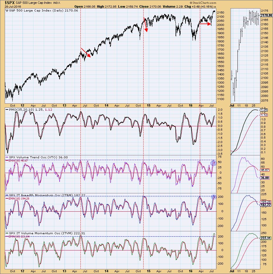
Conclusion: I believe you can make a case for another rally, but those IT indicators have me worried. It's been pointed out that in the longer run, even after intermediate-term highly overbought readings, the market ultimately kept moving up. This is absolutely true, but it did mark intermediate-term corrections and declines within that overall rising trend. Long-term analysis is best done on a monthly chart. Those charts go final tomorrow, so join me for tomorrow's webinar where I will go over not only the weekly charts that will have gone final, but the monthly charts that go final tomorrow as well. Additionally, for StockCharts.com members, I'll be analyzing both weekly and monthly charts in tomorrow's DP Alert blog.
Come check out the DecisionPoint Report with Erin Heim on Wednesdays and Fridays at 7:00p EST, a fast-paced 30-minute review of the current markets mid-week and week-end. The archives and registration links are on the Homepage under “What’s New”.
Technical Analysis is a windsock, not a crystal ball.
Happy Charting!
- Erin