** While Erin is away, we will be posting some of her "greatest hits" educational blogs. Some information may be dated **
 During the MarketWatchers LIVE program (airs 12:00p - 1:30p EST M/W/F), Tom Bowley and I have started a segment called "Anatomy of a Trade" where we go through our process for identifying investment prospects. I use Price Momentum Oscillator (PMO) scans to start every mining exercise. One of the scans I have been using regularly identifies stocks that have PMOs rising for three days and have a bullish IT and LT Trend Model set-up (meaning the 20-EMA > 50-EMA > 200-EMA). I did adjust this scan slightly (for the better I think) from the one I ran today by screening for only US stocks that are trading above $10. Today's favorite (you can see it in the MarketWatchers LIVE blog for today) was UMC, but it trades in the $1 - $2 range and really isn't for beginning traders or those with a low risk tolerance due to its volatility.
Here is my scan. If you are an Extra member or above, you have access to the advanced scanning workbench where you can copy and paste this scan. To make sure you copied it properly, be sure to click on the "check syntax" button to make sure it will run. I've used comment lines in this scan so you can understand what the code is actually telling the scan engine to do.
// The first two lines narrow down the universe to stocks with decent volume and from the US
[type = stock] AND [Daily SMA(20,Daily Volume) > 50000]
AND [country is US]
// Keeps the penny stocks and high volatility stocks out of your results
AND [Close > 10]
// This identifies a PMO that hasn't yet had a positive crossover its signal line
AND[today's PMO Line(35,20,10) < today's PMO Signal(35,20,10)]
// This identifies a PMO rising for three days
AND [today's PMO Line(35,20,10) > yesterday's PMO Line(35,20,10)]
AND [yesterday's PMO Line(35,20,10) > 2 days ago PMO Line(35,20,10)]
AND [2 days ago PMO Line(35,20,10) > 3 days ago PMO Line(35,20,10)]
//This ensures we get a positive IT and LT Trend Model configuration
AND [today's ema(20,close) > today's ema(50,close)]
AND [today's ema(50,close) > today's ema(200,close)]
Using this scan, I received only six results. The best way to screen from here is to save your results in a ChartList and then view them all using CandleGlance. I have my own "CandleGlance" style so your results will likely look different than mine. You can create your own CandleGlance ChartStyle by creating your preferences in the charting workbench and saving and naming the new ChartStyle as: "CandleGlance". Look up "CandleGlance" in the search box for more information.
My CandleGlance looked like this:
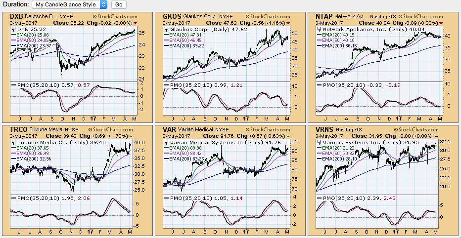
Once I have these charts up, I look for oversold PMOs and breakouts or chart patterns that look interesting. Truth be told, I looked at all six of these daily charts and I am not buying today. I'd prefer to wait for better looking charts to invest in. Let me run through a few.
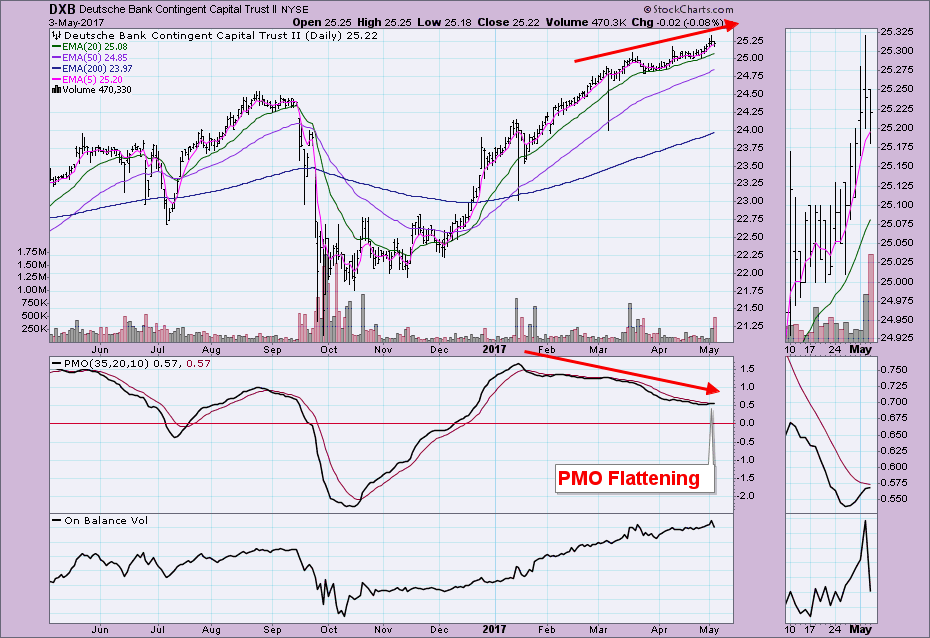
First, DXB caught my notice. I know that the Financial sector has been getting healthy and I like the clear rising trend. However, I wouldn't call this one up necessarily because I can see a clear negative divergence between PMO tops and price tops in the CandleGlance above. When I call it up, you can see a PMO that is now indecisive even though it is still technically rising. That would be enough right there to turn me off on this stock (a negative divergence and waffling PMO).
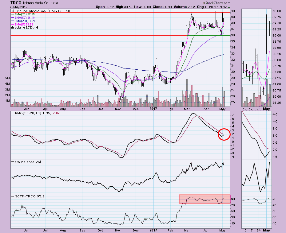
The next one that caught my eye was TRCO. I liked the gap up and would take a look based on that. The daily chart does show promise with a nice PMO and SCTR in the "hot zone" above 75, but the inability to move above overhead resistance is troubling.
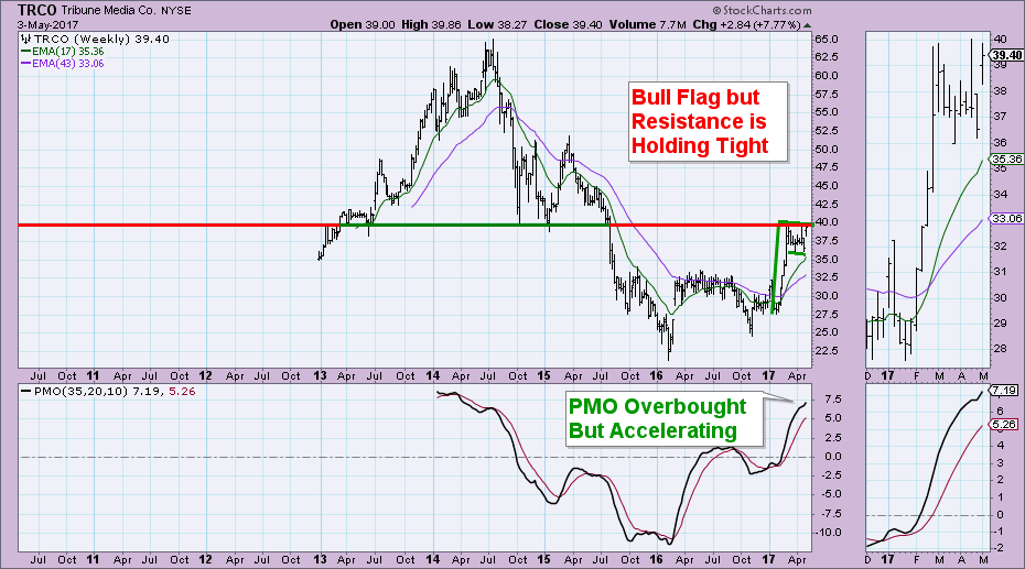
The weekly chart shows us just how strong that overhead resistance is. I do like the bullish flag formation and rising PMO, but the PMO is overbought and again, the top of the flag is at that difficult overhead resistance level. I think this one would be a good 'watchlist' candidate.
Conclusion: Looking at the four charts I didn't discuss in the CandleGlance graphic, here's why I passed on them. GKOS - looks like a head and shoulders forming with negative PMO divergence (yuck!). NTAP - clear declining trend and negative divergence, i'm not interested in going that far down to bottom feed. VAR and VRNS have both reached overhead resistance and appear to be stymied. When you have more like 100 + results from a scan, you can't look at every chart, so it's important to look for the patterns and PMO divergences so you can quickly delete them from your scan results.
The DecisionPoint LIVE Shared ChartList is available now! Click on the link and you'll find all your favorite DP charts all annotated! Be sure and bookmark it!
Technical Analysis is a windsock, not a crystal ball.
Happy Charting!
- Erin