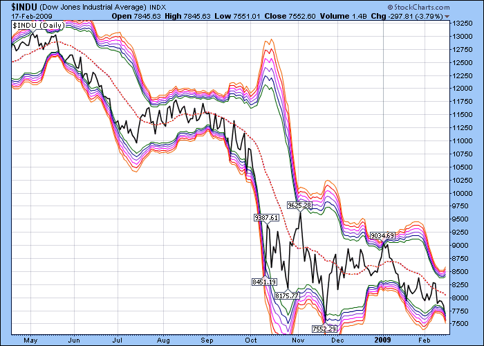
Click here for a live version of this chart.
Based on the statistical concept of Standard Deviations, Bollinger Bands graphically illustrate how "far away" prices are from their "average" value. Traditionally, 2.0 standard deviations are used to determine where the upper and lower bands should appear. In the chart above, I've layered 6 different Bollinger Bands on top of each other going from 2.0 deviations to 3.0 deviations forming two "bands of Bands." The "deeper" prices go into either band, the more likely things will "snap back" towards the dashed average line. That's good news since the Dow plunged deep into the lower band today.

About the author:
Chip Anderson is the founder and president of StockCharts.com.
He founded the company after working as a Windows developer and corporate consultant at Microsoft from 1987 to 1997.
Since 1999, Chip has guided the growth and development of StockCharts.com into a trusted financial enterprise and highly-valued resource in the industry.
In this blog, Chip shares his tips and tricks on how to maximize the tools and resources available at StockCharts.com, and provides updates about new features or additions to the site.
Learn More
