Don't Ignore This Chart! August 31, 2010 at 06:10 PM
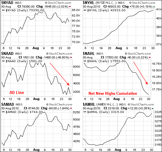
The AD Line and cumulative Net New Highs line shows relative weakness in Nasdaq stocks. From the breadth indicators page at Stockcharts.com, the chart below shows these two Nasdaq indicators moving sharply lower the last three weeks... Read More
Don't Ignore This Chart! August 30, 2010 at 06:00 AM
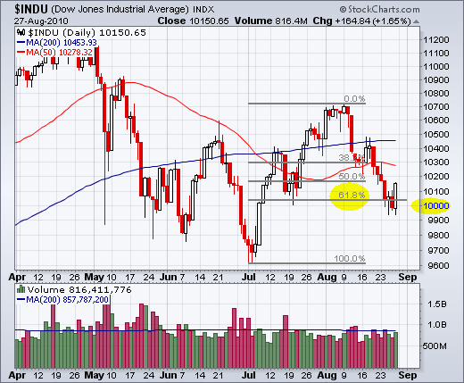
With the close at 10040 on Tuesday, the Dow retraced around 61.8% of its prior advance (Jul-Aug). This Fibonacci retracement sometimes marks a reversal zone. The Dow managed to recover after dip below 10000 on Friday and close above 10100. Resistance might not be far off through... Read More
Don't Ignore This Chart! August 27, 2010 at 07:22 AM
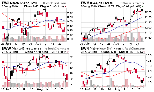
Stocks markets around the world have been moving lower the last few weeks, but there are some pockets of strength to be found in Asia... Read More
Don't Ignore This Chart! August 25, 2010 at 08:34 PM
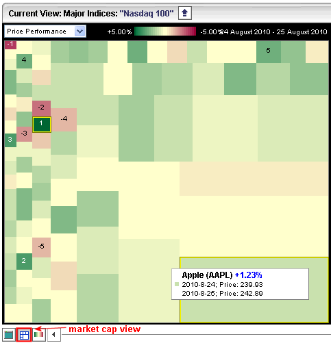
A look at the Market Indices Carpet in market cap mode shows Apple (AAPL) taking up the most real estate with the largest rectangle. This means Apple carries the most weight in the index. Click the "Nasdaq 100" header to focus on the Nasdaq 100... Read More
Don't Ignore This Chart! August 24, 2010 at 05:40 PM
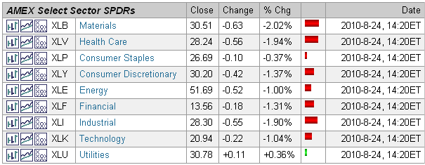
Stocks were down sharply in afternoon trading on Tuesday, but the Utilities (SPDR) was bucking the trend with a small gain. As this screen grab from the Market Summary page shows, XLU was the only sector in positive territory. Looks like utilities like low interest rates... Read More
Don't Ignore This Chart! August 23, 2010 at 08:23 PM
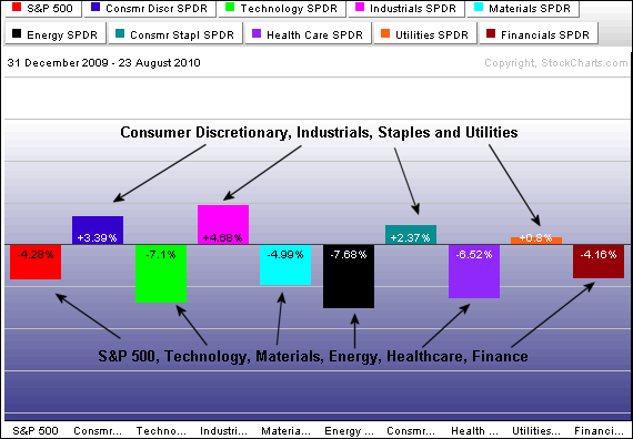
Year-to-date sector performance shows five up and four down. In a rather strange twist, the consumer discretionary and industrial sectors are up, but the technology and finance sectors are down. Performance for the S&P 500 reflects the net result for the nine sectors (down 4... Read More
Don't Ignore This Chart! August 20, 2010 at 08:06 AM
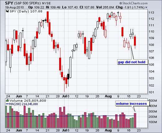
The S&P 500 ETF (SPY) gapped up on Tuesday and then filled that gap with a long red candlestick on Thursday. The inability to hold the gap is clearly negative. Also notice that volume increased as the ETF declined last week and this week... Read More
Don't Ignore This Chart! August 18, 2010 at 09:01 PM
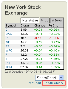
Half of the 10 most active NYSE stocks on Wednesday came from the finance sector. The Free Charts page at Stockcharts.com shows the 10 most active for the Nasdaq and NYSE. Even though the market was mixed today, nine were up and only one was down. All five financials were up... Read More
Don't Ignore This Chart! August 17, 2010 at 06:37 PM
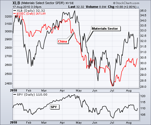
The Shanghai Composite ($SSEC) and the Materials SPDR (XLB) have been moving together in 2010. The moves in XLB are a little more exaggerated, but the positive correlation is clear. Most recently, both bottomed in early July and moved higher the last six weeks... Read More
Don't Ignore This Chart! August 16, 2010 at 01:42 PM
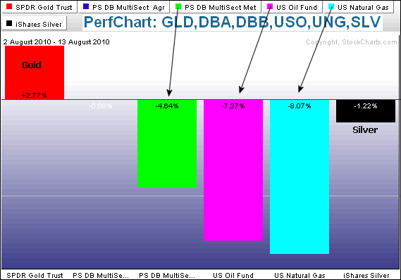
Outside of gold, August has been a tough month for commodities. The PerfChart below shows performance for six commodity related ETFs. Only one is up. Metals, Oil and Natural Gas are down rather sharply. Gold, in contrast is up over 2%... Read More
Don't Ignore This Chart! August 14, 2010 at 02:57 PM
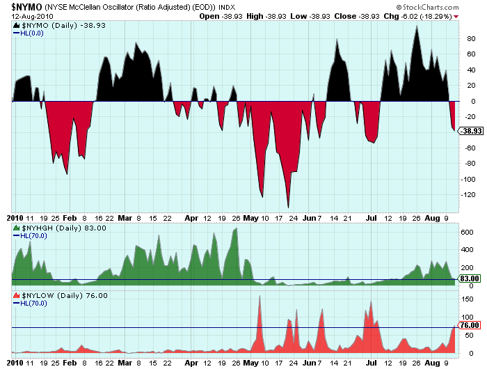
The "Hindenburg Omen" has been getting lots of press this week so I thought I'd put up a chart that people can use to track this elusive prophet of doom. All the different factors that go into the Omen's signal can be found in this article... Read More
Don't Ignore This Chart! August 13, 2010 at 07:09 AM
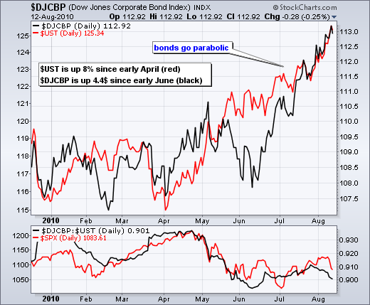
Bonds have been on a tear since April with the 10-Year US Treasury Note ($UST) advancing some 8% in three months. The DJ Corporate Bond Index ($DJCBP) is not far behind with a 4.4% gain since early June... Read More
Don't Ignore This Chart! August 12, 2010 at 09:00 AM
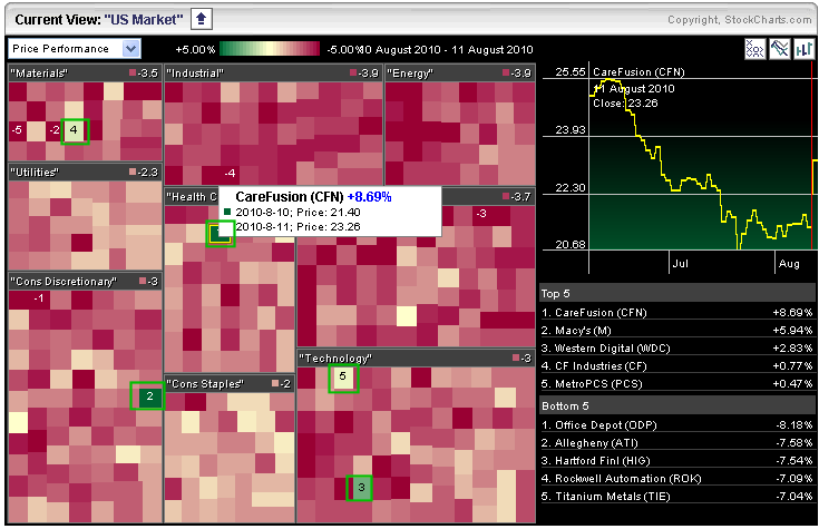
Stocks were down sharply with a broad based decline on Wednesday, but there were a few stocks swimming against the tide. The S&P Sector Market Carpet provides an easy means to visual scan for green stocks in a sea of red... Read More
Don't Ignore This Chart! August 11, 2010 at 03:52 PM
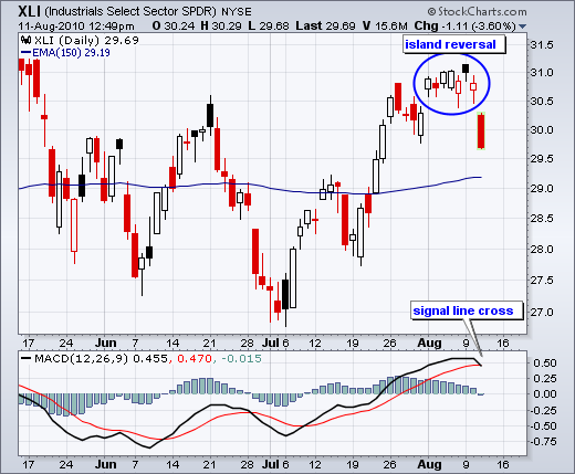
With a gap up eight days ago and a gap down on Wednesday, the Industrials SPDR (XLI) formed an island reversal. Notice how the ETF gapped above 30.5 and largely held above this level for seven days. That ended with a large gap down that signals a reversal... Read More
Don't Ignore This Chart! August 10, 2010 at 08:58 AM
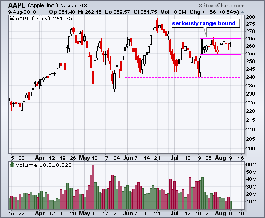
Apple (AAPL) continues to consolidation within a relatively narrow range. The stock has traded between 266 and 254.90 for the last 13 days. Falling volatility is confirmed with the Bollinger BandWidth indicator, which shows the bands at their tightest in over five months... Read More
Don't Ignore This Chart! August 09, 2010 at 08:53 AM
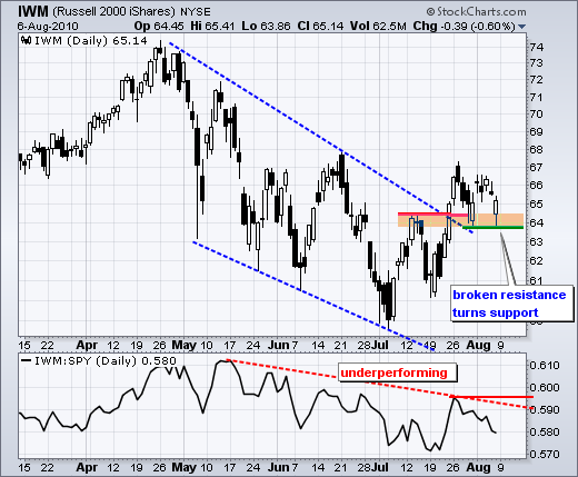
A classic tenet of technical analysis is that broken resistance turns into support (and visa versa). The Russell 2000 ETF (IWM) broke the April trendline and resistance from its mid July high with a surge above 64.5 in late July. This broken resistance zone (63.8-64... Read More
Don't Ignore This Chart! August 06, 2010 at 07:34 AM
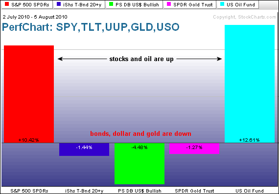
The intermarket relationships over the last five weeks show stocks and oil rising together. On the other side, bonds, the Dollar and gold are down since early July. This looks like the classic "risk-on" trade. Strength in stocks and oil reflects an increased appetite for risk... Read More
Don't Ignore This Chart! August 04, 2010 at 08:36 PM
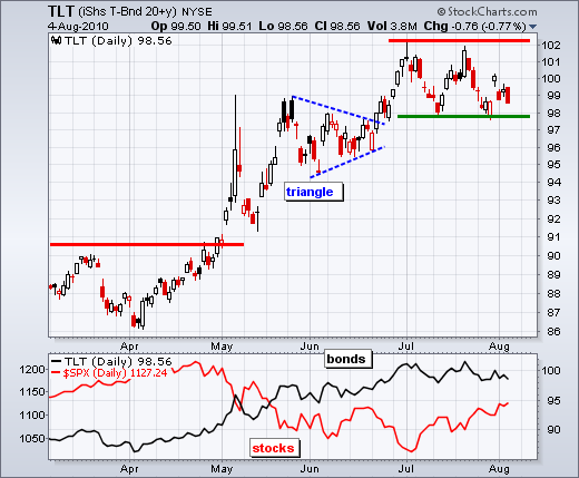
The 20+ Year T-Bond ETF (TLT) is at a make-or-break level with two key employment related releases over the next two days. An improving employment picture would likely lead to a support break, but further weakness in the employment numbers could keep bonds buoyant... Read More
Don't Ignore This Chart! August 03, 2010 at 06:15 PM
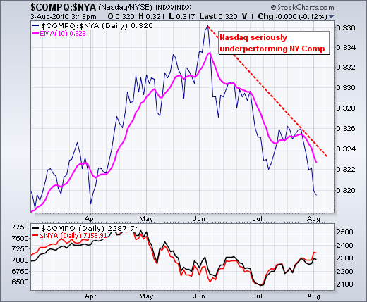
Ratio charts allow chartists to compare the performance of one security against another. The chart below plots the ratio of the Nasdaq and the NY Composite. The Nasdaq is underperforming because this ratio ($COMPQ:$NYA) has been falling since June... Read More
Don't Ignore This Chart! August 02, 2010 at 01:20 PM
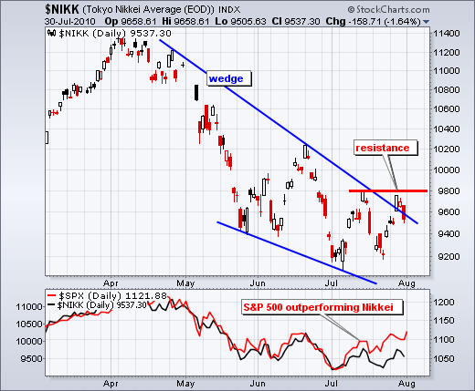
While the S&P 500 moved above its mid July high, the Nikkei 225 ($NIKK) remains short of a breakout and within a downtrend still. $NIKK surged to resistance last week, but fell just short of 9800 and pullback on Friday... Read More