Here are the top 10 technical charting developments that happened during 2010 as selected by our crack staff of technical analysts. See if you agree...
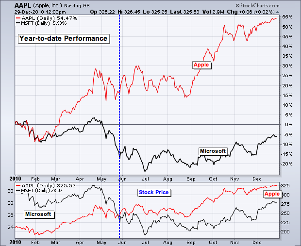
10. Apple surpassed Microsoft in market capitalization on May 26th and gained over 50% on the year.
Apple is currently valued around $298 billion, while Microsoft's market cap is around $239 billion. Both recorded around $65 billion in sales for the prior year. No prizes for guessing which is growing the fastest.
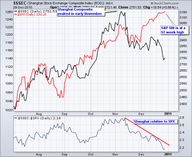
9. Shanghai Composite continues to show relative weakness.
While the S&P 500 zoomed to new highs in December, the Shanghai Composite ($SSEC) peaked in early November and moved lower in December.
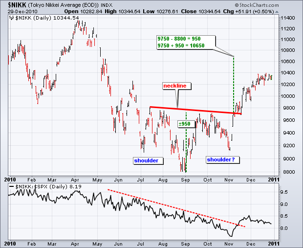
8. Nikkei 225 ($NIKK) perked up with a November breakout.
The index broke neckline resistance from an inverse head-and-shoulders pattern and held this breakout as prices continued higher in December. The relative strength comparative, which compares Nikkei performance to the S&P 500, turned up sharply in November and pulled back in December. Will outperformance continue in 2011?
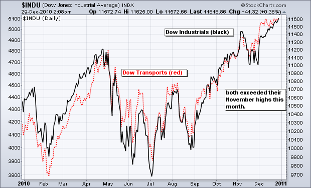
7. Dow Theory remains on a buy signal.
Both the Dow Industrials and Dow Transports moved above their November highs this month. These higher highs confirm a Dow Theory buy signal. The November lows now mark key support.
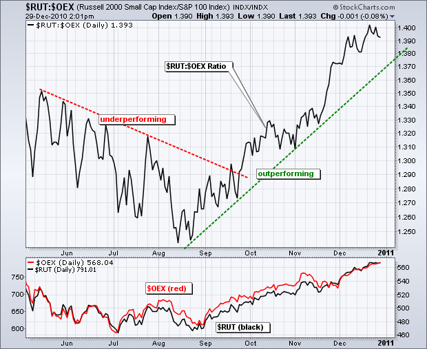
6. Small-caps continue to lead large-caps and show no signs of relative weakness.
The chart below shows the Russell 2000 ($RUT) relative to the S&P 100 ($OEX) via the relative strength comparative ($RUT:$OEX ratio). The ratio remains in a clear uptrend.
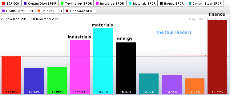
5. Resurgent finance sector takes over market leadership.
The PerfChart below shows the S&P 500 with the nine sector SPDRs over the last five weeks. Industrials, materials, energy and finance are leading the way. It is a strange group, but relative strength in finance is positive for the market overall. It is also strange that technology and consumer discretionary are lagging.
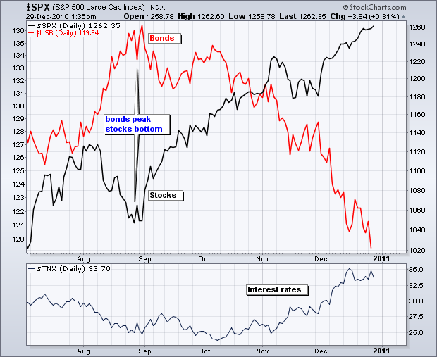
4. Bonds decline as stocks move higher.
The chart below shows bonds peaking in late August and stocks bottoming at the same time. These two have been moving in opposite directions since August. Money is moving out of bonds and into stocks.
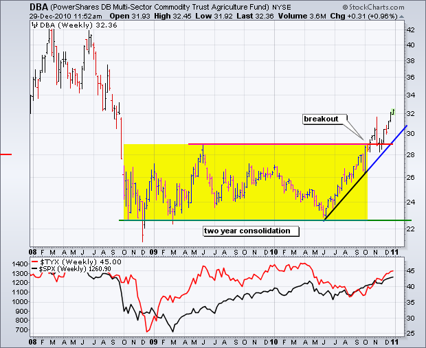
3. Agriculture prices breakout of a two year consolidation.
Higher prices at the farm could eventually lead to higher prices at the supermarket or the restaurant.
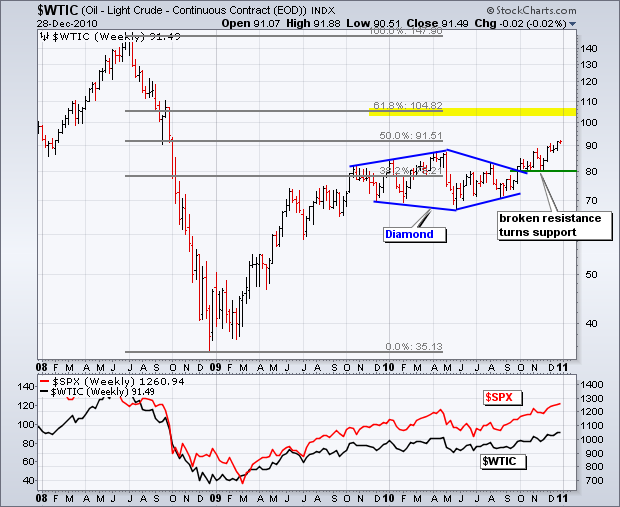
2. Oil breaks diamond resistance and exceeds $90 for the first time since the Lehman Brothers collapse.
Strength in the stock market is providing a confidence boost for the economy, which bodes well for oil demand.
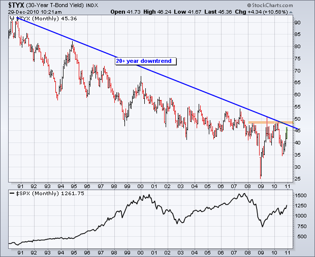
1. Long-term rates are poised to challenge resistance from a 20+ year downtrend.
Economic strength and inflationary pressures are weighing on the bond market. Remember, bonds move down as rates move up. A breakout in rates would be long-term bearish for bonds.
So there is our recap of 2010 from a Technical charting perspective. Do you agree? What were your top 10 technical developments of 2010?
And finally...
****** Happy New Year! ******

