Don't Ignore This Chart! February 29, 2012 at 12:04 PM
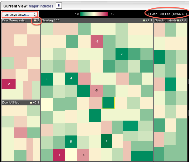
The major index market carpet shows the Dow Transports underperforming with its components showing more down days than up days in February. Since 31-Jan, the Trannies show -2 for net up days-down days for all components... Read More
Don't Ignore This Chart! February 28, 2012 at 02:26 PM
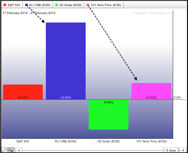
The CRB Index ($CRB) and the 10-year Treasury Note ($UST) usually move in opposite directions. However, as the John Murphy's Intermarket PerfChart shows, this has not been the case the last six days... Read More
Don't Ignore This Chart! February 27, 2012 at 05:23 PM
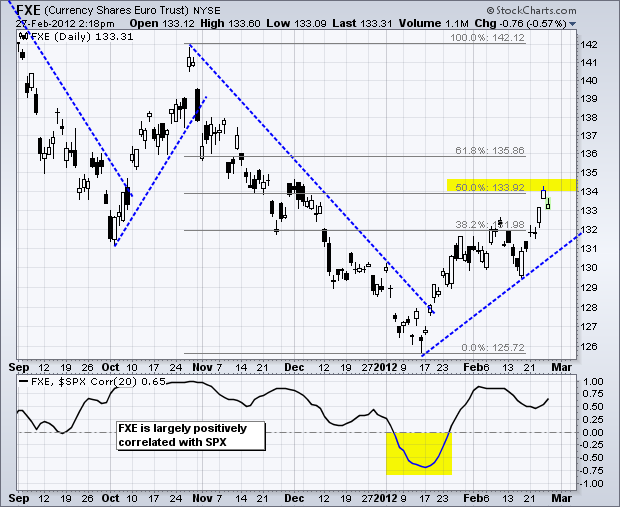
The rally in the Euro Currency Trust (FXE) has been rather sharp, but the ETF has still only recovered half the prior loss. Notice how FXE declined from 142 to 126 (16 points) and then advanced to 134 (8 points)... Read More
Don't Ignore This Chart! February 24, 2012 at 10:57 AM
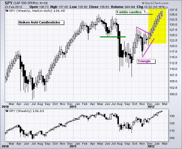
The chart below shows weekly Heikin-Ashi Candlesticks, which combine price action from two weeks to form a composite candlestick. As of this week, SPY formed nine white (hollow) Heikin-Ashi Candlesticks in a row and shows no weakness... Read More
Don't Ignore This Chart! February 23, 2012 at 06:15 PM
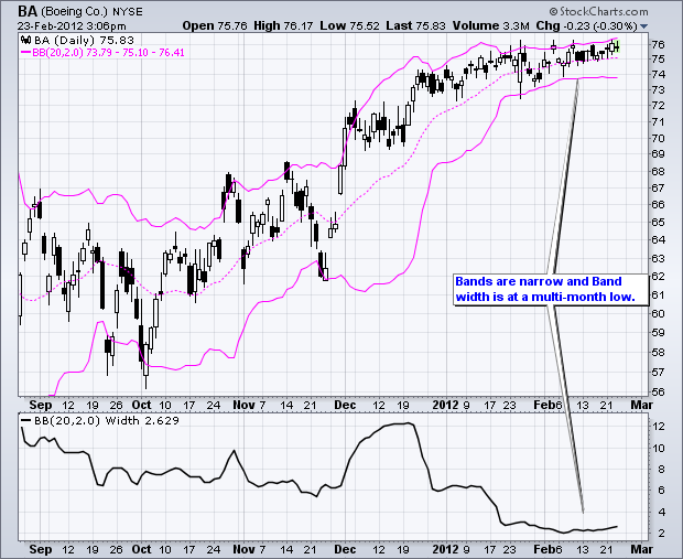
Boeing (BA) moved into a tight range the last 5-6 weeks and the Bollinger Bands contracted to their narrowest in over six months. This signals a volatility contraction, which in turn could foreshadow a volatility expansion... Read More
Don't Ignore This Chart! February 22, 2012 at 01:56 PM
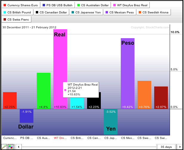
The PerfChart below shows the performance for ten currencies since January (year-to-date). The traditional safe-haven currencies are down (Dollar and Yen), while two emerging market currencies are up (Real and Peso)... Read More
Don't Ignore This Chart! February 21, 2012 at 06:48 PM
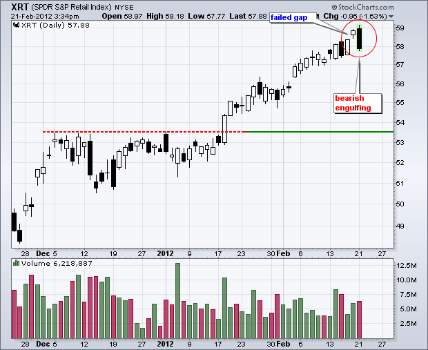
The Retail SPDR (XRT) hit a new high with a gap last week, but failed to hold this gap as a bearish engulfing pattern formed on Tuesday. Volume also perked up to its highest level in four days... Read More
Don't Ignore This Chart! February 17, 2012 at 11:10 AM
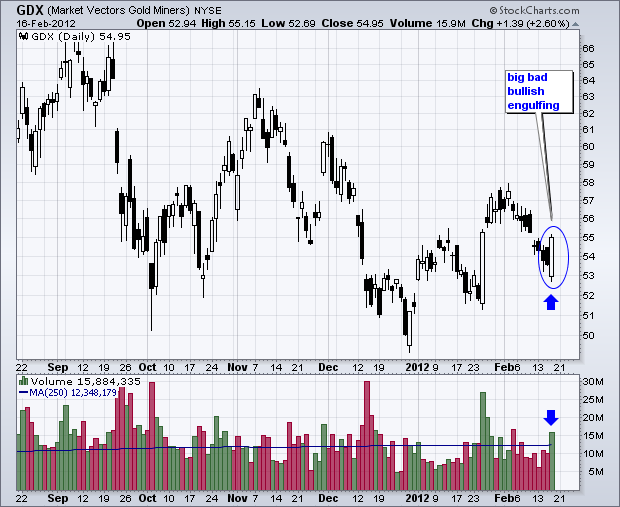
The Gold Miners ETF (GDX) opened weak with a print below 53, but then recovered with a high volume rally and close near 55. Overall, Thursday's long white candlestick engulfed the prior four candlesticks. At the very least, this establishes support with Thursday's low... Read More
Don't Ignore This Chart! February 16, 2012 at 01:32 PM
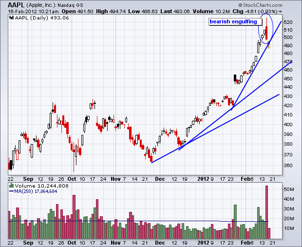
Apple is no doubt in a strong uptrend, but the recent move went parabolic as the trendline slope steepened for the third time. The latest surge from 420 to 520 was pretty much straight up... Read More
Don't Ignore This Chart! February 15, 2012 at 06:08 PM
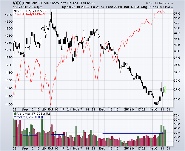
After a sharp move lower from late November to early February, the S&P 500 VIX ETN (VXX) bounced the last seven days with its biggest move since November. Volume also surged. It appears that traders are taking out a little insurance with the stock market so overbought... Read More
Don't Ignore This Chart! February 14, 2012 at 03:14 PM
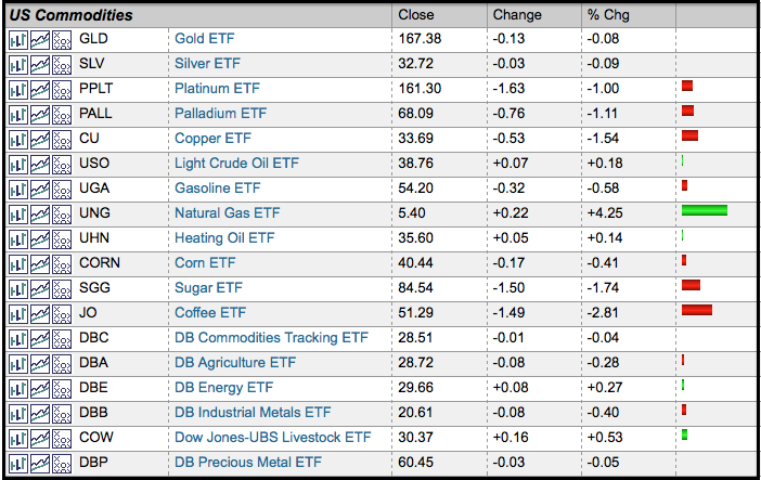
The ETF Market Summary shows commodity ETFs under pressure during the day Tuesday. The Coffee (JO) and Sugar (SGG) ETFs were leading the way down. The Copper ETF (CU) and Palladium (PALL) ETFs, which represent industrial metals, were also weak... Read More
Don't Ignore This Chart! February 13, 2012 at 04:14 PM
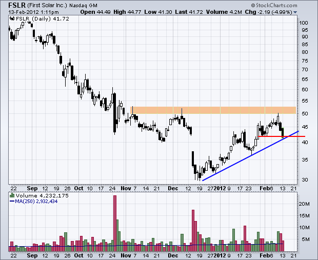
While the market moves higher on Monday, First Solar (FSLR) is moving lower with its second long black candlestick. Also notice that the stock failed at resistance near 50 for the second time in three months... Read More
Don't Ignore This Chart! February 10, 2012 at 10:52 AM
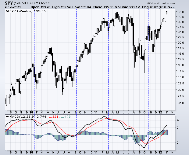
The chart below shows the S&P 500 ETF with weekly candles and weekly MACD (12,26,9). Even though some signals may seem late, this classic indicator combines trend following and momentum to keep players on the right side of trend... Read More
Don't Ignore This Chart! February 09, 2012 at 04:28 PM
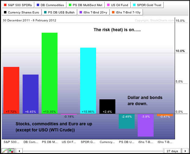
The PerfChart below shows a selection of intermarket related ETFs. Notice that the Commodity Index Fund (DBC), Base Metals ETF (DBB) and Gold SPDR (GLD) are up substantially year-to-date, as are stocks. In contrast, the Dollar and Treasury ETFs are down... Read More
Don't Ignore This Chart! February 08, 2012 at 01:00 PM
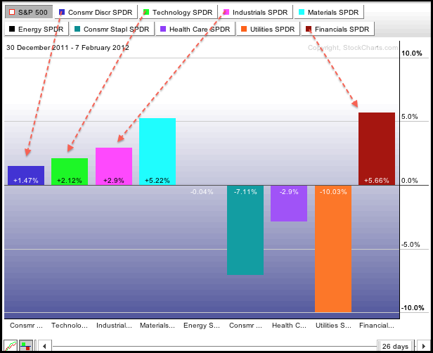
The stock market is clearly in rally mode this year with the offensive sectors leading the charge. Notice that the consumer discretionary, industrials, finance and technology sectors are outperforming the S&P 500... Read More
Don't Ignore This Chart! February 07, 2012 at 06:38 PM
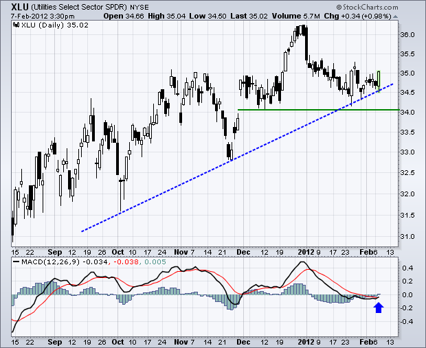
The Utilities SPDR (XLU) was relatively weak in January as it failed to partake in the broad market advance. More recently, the ETF surged in late January and again on Tuesday with moves that reinforce support in the 34-34.5 area... Read More
Don't Ignore This Chart! February 06, 2012 at 02:33 PM
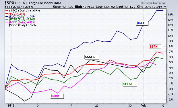
Despite all the "issues" surrounding Europe, the German DAX Index ($DAX) is going strong and outperforming the S&P 500. In fact, the DAX is outperforming the Shanghai Composite ($SSEC) and the Nikkei 225 ($NIKK) as well. The chart below shows that the DAX is up a whopping 14... Read More
Don't Ignore This Chart! February 03, 2012 at 03:19 PM
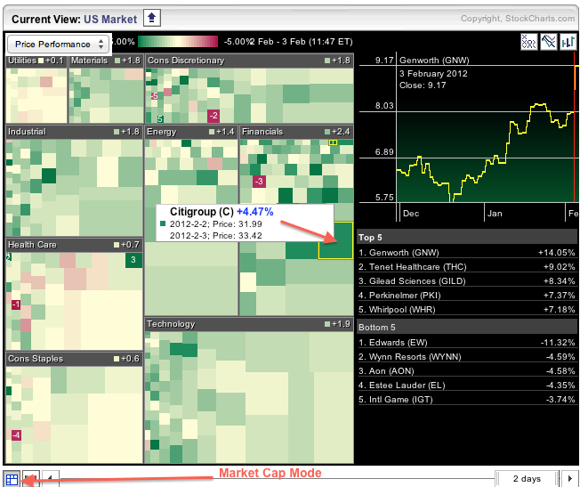
As the Sector Market Carpet shows, the finance sector has the biggest average gain (2.4%) thus far on Friday. Technology is second with the average stock gaining 1.9% on the day. Notice that the boxes are different sizes because of market cap mode... Read More
Don't Ignore This Chart! February 02, 2012 at 07:12 PM
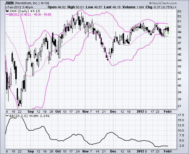
The stock market rallied in January, but Nordstrom (JWN) traded flat and shows relative weakness. Even though the stock has yet to break down, volatility is narrowing as the Bollinger Bands contract. Notice that Bollinger Band width is at its lowest in over six months... Read More
Don't Ignore This Chart! February 02, 2012 at 05:42 AM
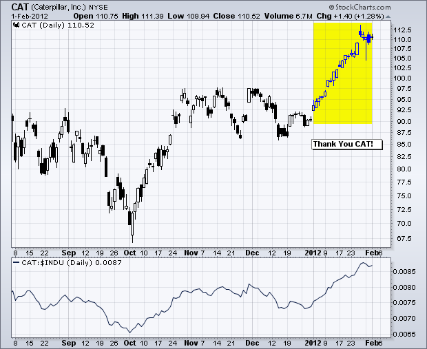
According to the Wall Street Journal, "Caterpillar's 20% stock surge this month contributed nearly 34% of the Dow Jones Industrial Average's 415-point advance." As a price weighted "average" the highest priced issues in the Dow carry the most weight... Read More