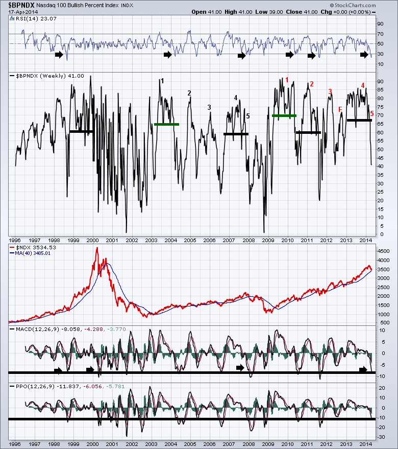
The Nasdaq data is the most interesting in terms of change in my chart lists currently. The $BPNDX is producing similar signals to the $NDXA200R. See today's Chartwatchers newsletter for more information on that. Here is the link. ChartWatchers. The Nasdaq seems to be much more sensitve to showing future market direction than the strong boat-anchor-sized $SPX. The sector mix in the $SPX is so diverse it behaves differently than the Nasdaq. So I find good clues in the Nasdaq data and also look across to the $NYA data for confirmation. Here is a $BPNYA article from earlier in the week. $BPNYA. That article also explains Bullish percent calculations.
Over the past 15 years, the two huge corrections have really helped define how indicators change. The two subsequent bull markets have also been excellent training tools for technicians.
I underlined six time frames where the market was in a period of bullish enthusiasm. All of them had a high Bullish percent average above 60-70 the majority of the time. The two marked with green were the new bull market thrusts. The other four are interesting. They marked the end of the 2000 run, the end of the 2007 run and the 2011 run before the 20% correction. There could be one in 2006 but the bullish percents were pretty low. You can see today, we have clearly demarcated the right hand side of the recent bull market period. What is compelling is that we are due for a bounce at the 40 level if history is our guide over the last year. Maybe the Ukraine is the next crisis and the charts are just starting to show it. Only 40% of the Nasdaq 100 are on a buy signal. We are 6 % off the highs.
You can see on both the MACD and the PPO we sit at pretty extreme levels. All 4 of the major tops had severe swings down to start the correction. You will notice the RSI dropped to 30 quite easily and sits there now.
I have also labeled a 5-move pattern from the 2003 to 2007 bull market run. You'll notice the same numbers on the 2009-2014 run.
The first area is the initial Zweig Thrust. From low bases, everything goes on a buy signal. The second surge is a lower thrust that is shorter in time. The third thrust has less enthusiasm. The final market top swing-for-the-fences rally is 4 and when the market can't get back above 75, it's a problem. However, I have one ‘F' in there in 2012. This was when the Fed and all the other global central banks applied more liquidity while the market was still at its highs but the bullish percent was topping out at a low level. Would there have been a different number 4 if the Fed had not moved?
Just standing back and looking at this chart, it appears that this entire 2009-2013 rally has been shifted up about 10 % on the lows and 5% on the highs.
At this point I am concerned and puzzled. While some sectors are weak in their bullish percents, none of the sectors are near the lows of August 2007, yes August 2007, before the final top. We need to see the market start to break down first in smaller areas and then accelerate to larger parts of the market if thats what is happening. Looking in 2000, we can see how whippy the market was as the Bullish Percent indexes raced back and forth chopping their way down to the extreme lows. The $SPX currently sits tucked up near the highs, nowhere near the 40 WMA. It does look like we have entered a period where trading will be a valuable tool rather than buy and holding.
The recent high stalling out near 75 is very bearish in my opinion. Again, the lows we are at are the lows that the market has bounced from through the last 4 years with the exception of the 2011 Eurozone crisis. To my way of thinking, something is coming that is bigger than we are expecting.
Happy Easter and enjoy your weekend.
Good trading,
Greg Schnell, CMT
We try to keep our articles informative and entertaining. Make sure you check out the other blog writer articles in Mailbag, Chartwatchers, Traders Journal, Decision Point and The Canadian Technician. All of these articles are free to subscribe to. The subscriber button is top right on most articles. One of the little known secrets of StockCharts is our Blog or Articles section. The Blog tab will bring up a view of some of the most recent articles. StockCharts.com Subscribers have two additional daily feature articles.
Lastly, Chartcon 2014 in Seattle is rapidly booking up. Click here for more information.

