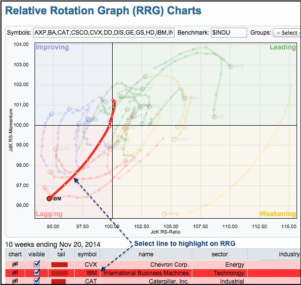
The S&P 500 is up over 7% the last five weeks, but IBM is down and flirting with new lows. The chart below shows the Relative Rotation Graph (RRG) with all thirty Dow stocks. With the Dow Industrials as the benchmark, we are seeing the relative performance rotations for all 30 stocks in this key average. The highlighted red line represents relative performance for IBM and it is pointing northeast, which is negative. Also notice that Chevron and Caterpillar are underperforming the senior average.
Click this image for a live chart.

About the author:
Arthur Hill, CMT, is the Chief Technical Strategist at TrendInvestorPro.com. Focusing predominantly on US equities and ETFs, his systematic approach of identifying trend, finding signals within the trend, and setting key price levels has made him an esteemed market technician. Arthur has written articles for numerous financial publications including Barrons and Stocks & Commodities Magazine. In addition to his Chartered Market Technician (CMT) designation, he holds an MBA from the Cass Business School at City University in London.
Learn More