I can be as wrong as the next guy when it comes to Bullish, Cautionary or Bearish, so I’ll lay out my thoughts and you can ponder them, discard them, laugh at them, whatever you choose. I do not own NVDA, so its a lot easier for me to say the interim top is close at hand. These are my thoughts, the market may have others. Trade it based on your thoughts. This is not a buy or sell recommendation.
Looking at the chart below, using the SCTR can be as difficult as other indicators. It is never easy with whipsaws and false signals. The continued testing of the 75 level through 2014-2015 always suggested NVDA was a solid company with good investor interest. When it finally locked in and took off, it was much easier. The pullback in February 2016 is clearly a whipsaw. The whole market was pulling back so investors were selling things generally. Momentum stocks get sold even faster. That would have been a decision moment for me. Even if you sold and got back in, it would be ok. The bottom line is the SCTR is still screaming strong. But let’s talk about other indicators because the SCTR does not drop quickly on a parabolic move.
The Relative Strength in purple is still rising. Recently we had a multi-month trend line break. (dotted orange line). When stocks go on these massive runs, the end is near when they start behaving in line or worse than the $SPX is what I have noticed. So I would not want the red line violated on the purple area chart for an interim top for short term traders.
Price is clearly parabolic. On the high in December, the stock was double its 200 DMA (Green line). The huge volume piling into the stock before the final push and blowoff volume on the second high on the MACD suggests caution to me. The much lower momentum low on either the MACD or the PPO is a warning flag. The PVO is very weak, considering the stock is testing all time highs. In December/ January of 2015 we saw the same kind of readings. The stock corrected all the way back to the 200 DMA.
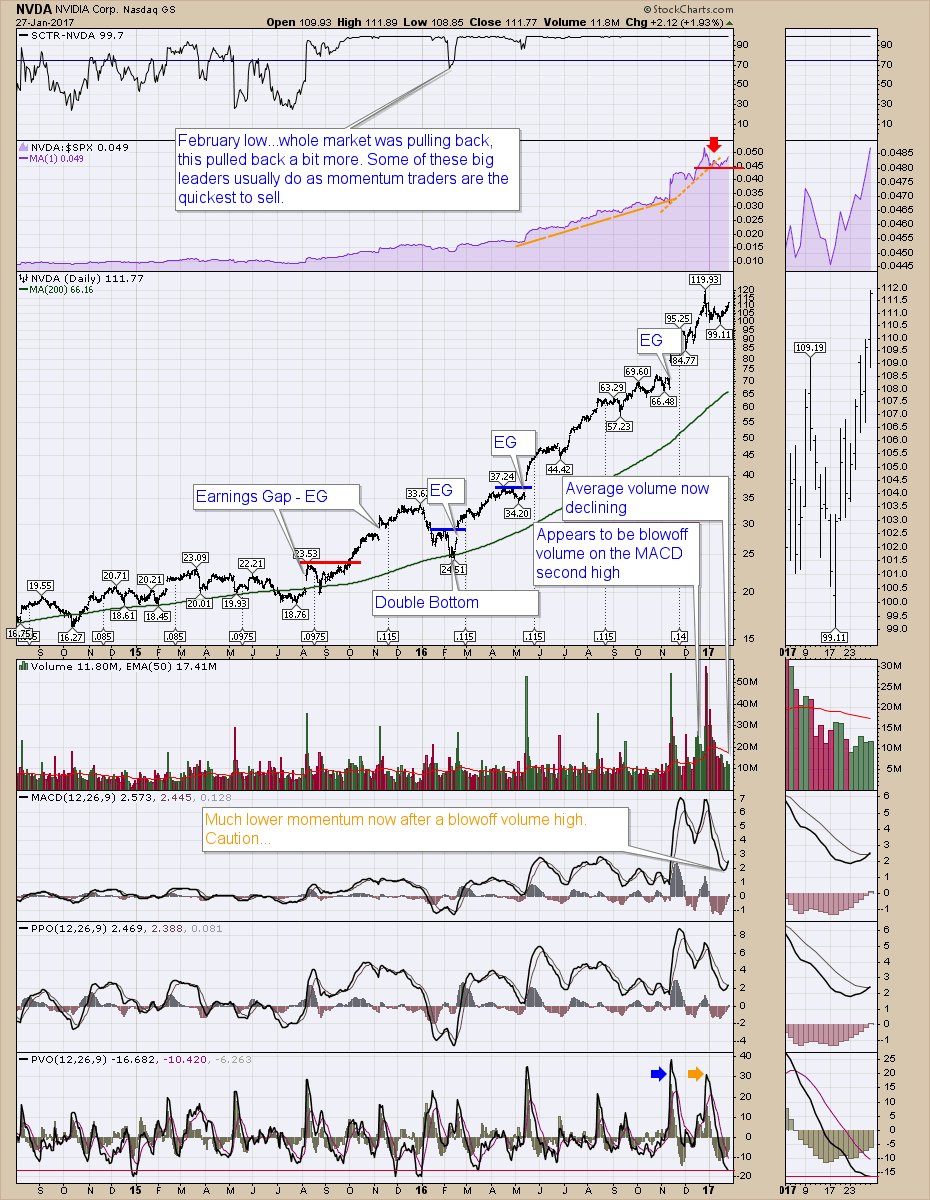
So let’s just say the daily chart is filled with lots of concerning signals, but we don’t want to sell our winners too quickly. With this parabolic move, the SCTR won’t break for a long time. Below are my thoughts on a weekly chart. Moving to a weekly chart is more suitable for big picture analysis.
Looking at the Purple RS on the chart, there is not usually a big divergence in RS on an interim or final high. They end with a spike look on parabolic moves. I have used uncorrected data on this chart (to analyze the volume), but you can see the 3 stock splits in 2000, 2006, 2007. This is done by using an underscore”_” in front of the ticker symbol. So "_NVDA" is in the symbol box.
The volume surge hit 171 Million for the last week of December, which is one of the top 10 volume spikes since the last stock split. All but three of those were on huge down moves in selloff runs. Normally, on most stocks, the last week of December is accompanied with low volume.
The PPO is at the blowoff level of January 2011. The PPO now has just crossed down through the signal line on this weekly chart at a high level as you can see on the zoom box on the right.
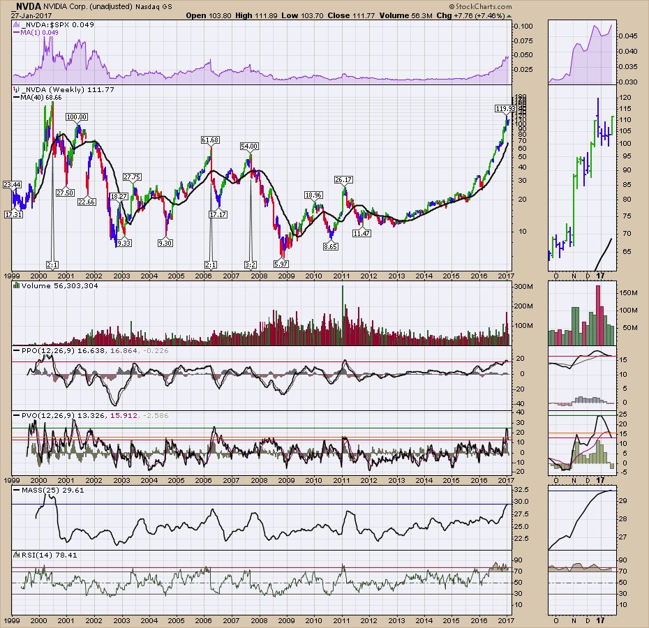 Stayng with the above chart, the percentage volume oscillator has three lines. The peak level recently in green, the signal line level (orange), and the current level (red) of the PVO. The PVO spike in 2006 was because of the stock split. I’ll put adjusted data (Adjusted for stock splits) on the next chart so you can compare. The PVO sitting at these heights and now already declining is an alarm bell. With the PPO at these heights, the PVO at these heights and the parabolic price action, they all suggest a massive amount of caution.
Still staying with the above chart, one of the rarer indicators is the MASS index. ChartSchool Article Here. It is a calculation created by Donald Dorsey. A reading above 27 on a daily chart kicks in a signal to start being cautious. Below is the weekly MASS index. A reading of 27 on a weekly chart is as rare a stock market creature as you will find. Like a 59 score in pro golf or the perfect game in bowling, it happens, but very rarely. The current reading is 29.61 which is off the charts. In the final tech blowoff in 2000, a group of stocks made it into this stratosphere, but imploded after. On the adjusted data chart below, NVDA lost 70% of its value in months back in 2000. It went from $13.65 to $4.26.
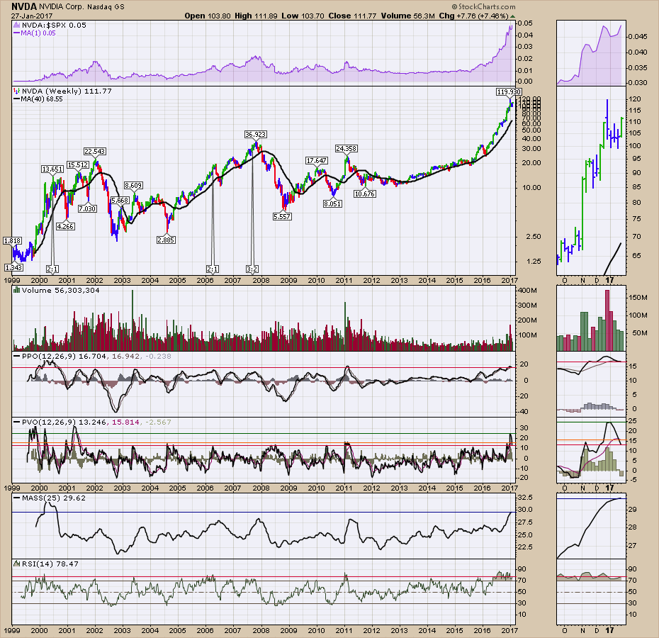
Here are the same indicators with corrected data for splits for NVDA. Notice I have removed the underscore"_" from the ticker symbol NVDA.
A great question is: How does this MASS Indicator compare with some of the greatest stocks in the last 20 years?
If I leave the current NVDA indicator levels on the charts marked as horizontal lines and then compare them to other great stocks, that could work. As an example the red line on the PPO for AAPL is the reference level where NVDA is currently. Because the PPO is a percentage oscillator, you can compare charts of different companies using the percentage oscillator. Members of our basic subscription service at StockCharts.com can click on the chart below, then go ahead and try changing the ticker symbol to INTC, AAPL, CMG, TASR, CROX, SBUX, MCD, WMT, CAT, AMZN, GOOGL, FB, NFLX to give you an idea of how significant these levels are on the MASS index and the others. AAPL got a MASS index above 28 four times. Click here for more information on becoming a subscriber.
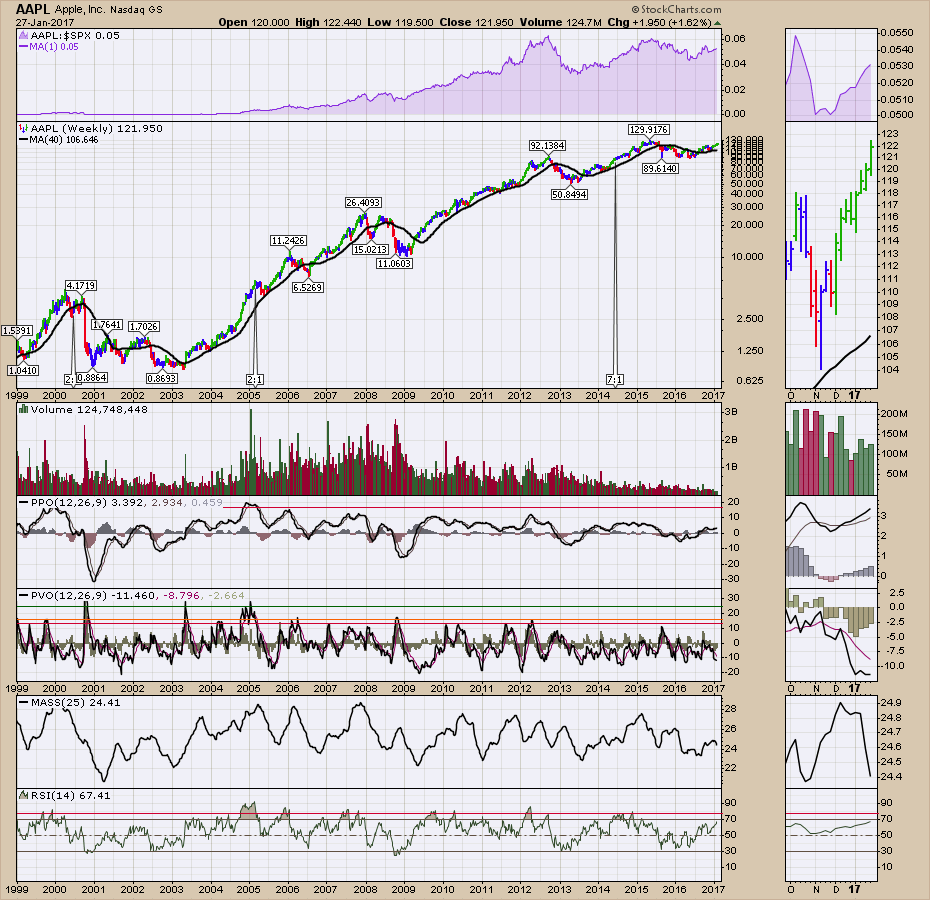 AAPL’s two highest MASS index peaks were in 2000 and 2007. The line at 29.61 where NVDA is currently at is not on the scale as Apple’s chart never got that high.
Just because NVDA’s level is rare doesn’t mean it can’t continue, but runs of multiple years are very rare without a big pullback. The weekly MASS index is almost flat now with an increase of 0.01 from last week to this week.
All that to say, it is as stretched as even the greatest ones get. TASR made it to 34, AMZN 31, etc. WMT, CMG, AAPL, GOOGL, FB never did beat 29.
I hope that explains how stunningly rare the move is and at the top it always looks set to continue. I think the hard part is finding the new marginal buyer here.
Hopefully I’ve laid out a coherent look at why I think the interim top is very close if the December high wasn’t it. It’s all so easy when I don’t own it. If you do own it, then you’ll have different perceptions of the indicator readings and that’s what makes a market. If you do own this beauty, you have really been part of an exceptional winner.
Good trading,
Greg Schnell, CMT, MFTA.
