 The yield curve has become a popular subject recently. Also, a few commentators on the site have mentioned the yield curve and its recent movements in their blogs recently. Read articles by Chief John, Greg Schnell, and Arthur Hill.
In my DITC contribution of 18 October, I showed how Relative Rotation Graphs can be used to monitor the (shape) of the yield curve. You can find a more detailed explanation of combining RRGs with the Dynamic Yield Curve tool in this RRG blog.
In this DITC I want to point, again, to the Dynamic Yield Curve tool that we have here on Stockcharts.
The chart above shows the change of the curve since 1 January of this year. you can re-create this chart by loading the DYC tool. It will load a plain yield curve updated to yesterdays close.
If you click somewhere in the yellow shaded S&P graph on the right you can use your left- and right- arrow keys to move the date on the yield curve. While you move the date you will see the yield curve changing accordingly. Once you reach 2 January you click the "snapshot" button which will fix the curve and the vertical line in the S&P chart on that date. Then scroll back to the most recent date and you will see the change of the curve over that period.
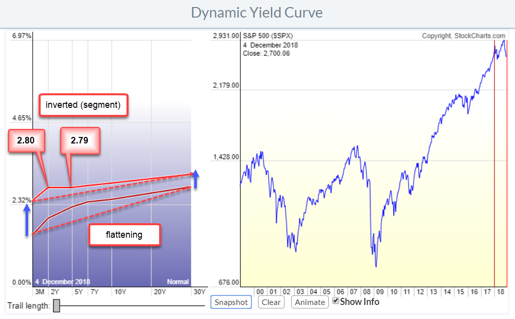
In a "normal" situation, the yields for the various maturities are stacked on top of each other. You will get a higher yield for lending money for 20 0r 30 years than you will get for lending only 3 months or 2 years. Connecting the yields for these various maturities creates the (yield) curve. An inverted, part of the, yield curve is therefore not "normal" and alerts market watchers.
In the annotated chart at the top of this article, you can see how the curve has "flattened" since the start of the year. Yields went up across the curve but the short end went up, much, more than the long end.
The situation that everybody is talking about and referring to is the segment between 2- and 5-years on the curve. 5-Year yield is now at 2.80% while 2-year yield is at 2.79% meaning an inversion. And that's "a thing".
In the economic-/business-cycle a flattening yield curve is associated with the "full recovery" phase while an inverted curve often happens during the "early recession" phase.
A very good reason to not ignore the Dynamic Yield Curve chart.
My regular blog is the RRG blog If you would like to receive a notification when a new article is published there, simply "Subscribe" with your email address using the form below.
Julius de Kempenaer | RRG Research
RRG, Relative Rotation Graphs, JdK RS-Ratio, and JdK RS-Momentum are registered TradeMarks ®; of RRG Research
Follow RRG Research on social media:
Feedback, comments or questions are welcome at Juliusdk@stockcharts.com. I cannot promise to respond to each and every message but I will certainly read them and where reasonably possible use the feedback and comments or answer questions.
If you want to discuss RRG with me on SCAN, please use my handle Julius_RRG so that I will get a notification.
