MailBag June 30, 2011 at 09:42 AM
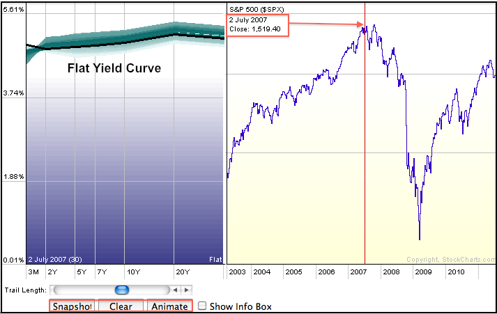
The Yield Curve can be measured two different ways at StockCharts.com. First, chartists can use the Dynamic Yield Curve tool see the current yield curve. Users can also animate the yield curve to see how it changes over time or click on the S&P 500 chart to see the yield curve at a specific point in time. The chart below shows a flat yield curve in early July 2007, four years ago. This flat yield curve preceded the 2007 and 2008 bear market. he yield curve typically reflects the difference between short-term interest rates and long-term interest rates. A normal yield curve has a Read More
MailBag June 24, 2011 at 09:35 AM
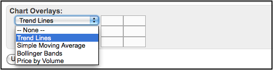
Stockcharts.com users can add four different chart overlays to their P&F charts. Using the Graphical P&F chart, which is the default, simply scroll to “Chart Overlays” section just below actual chart. Users can add up to three indicators (Trendlines, Bollinger Bands, Simple Moving Average and Price-by-Volume). Keep in mind that P&F indicators are calculated a little differently. For example, a 10 period simple moving average would be based on the average column length for the last 10 columns. Instead of a daily or weekly close, the mid point of each column is used to Read More
MailBag June 17, 2011 at 09:59 AM
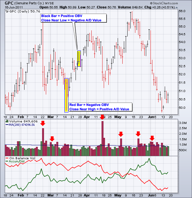
Both the Accumulation Distribution Line and On Balance Volume (OBV) are volume-based indicators designed to measure the balance of power between buying pressure and selling pressure. These indicators can move different ways because they are calculated differently. Let’s start with OBV, which is the simpler of the two. OBV is a cumulative indicator that adds a period’s volume when the close is higher and subtracts volume when the close is lower. On a daily basis, a down day on high volume will push OBV lower, while an up day on high volume will push OBV higher. The chart below shows Read More
MailBag June 10, 2011 at 08:09 AM
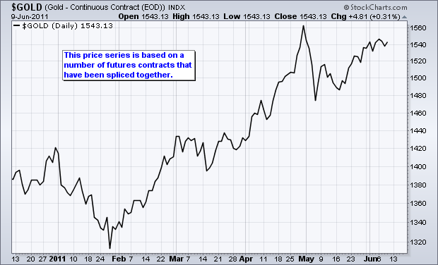
A continuous futures contract is not really a futures contract. Instead, it is several futures contracts that have been spliced together to create a long-term chart. There is often a data adjustment involved in this splicing to eliminate gaps and create a smooth price series. These gaps stem from the time premium between futures contracts. The June gold futures contract on the CME will expire on June 28th. At this time, the July contract will become the nearest month and the July contract will expire on July 27th, one month later. The next month will always have one more month time Read More
MailBag June 07, 2011 at 10:40 PM
Q: Why is the volume number for $NYA (the NYSE Composite Index) significantly higher than the value of $NYTV, the "NYSE Primary Market Volume" Index. By the way, the $NYTV appears to match the value for NYSE volume provided by the Wall Street Journal but I can't find the $NYA value anywhere. - Ira H. A: It turns out the term "NYSE" has two different meanings - something that many people are unaware of. Unfortunately, different publications and sources mix up the two meanings frequently which causes confusion. Here's the distinction: The term "New York Read More
MailBag June 06, 2011 at 12:19 PM
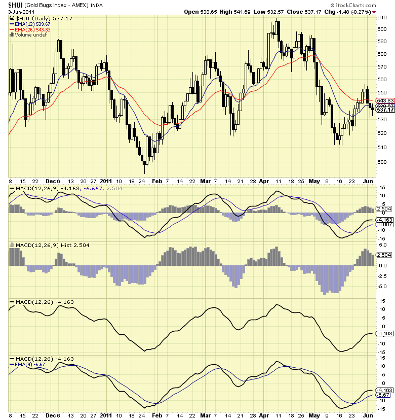
Q: Steve F. writes in: "Is there a way to separate the MACD lines form the histogram to get a clearer picture?" A: Yes there is. There are three things you can do depending on your needs: If you just want to see the histogram and not the other lines, choose "MACD Histogram" from the Indicators dropdown instead of MACD. If you just want to see the MACD Line, only enter 2 parameters in the Parameters box. Leave off the third one. If you are a member and you want both the MACD Line and the signal line, only enter 2 parameters in the Parameters box (like with #2) Read More
MailBag June 03, 2011 at 11:17 AM
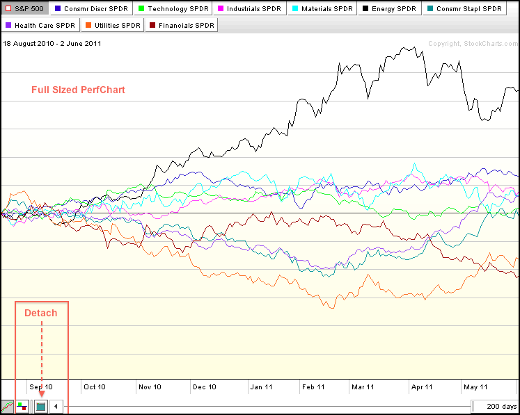
PerfCharts and Market Carpets can be resized by clicking the “detach” icon in the lower left corner. The PerfChart below is the full version that is attached to the main browser window. Click image for a live PerfChart. After detaching, users can move the mouse to the corners to resize. Click, hold the click and drag the corner when the “double arrow” icon appears. This chart can also be copied by pressing ALT key and PrtScn (print screen) key at the same time. Once copied, users can then paste it into a graphics program, MS Word or into an Email for sharing. Click image Read More