MailBag January 29, 2014 at 01:56 PM
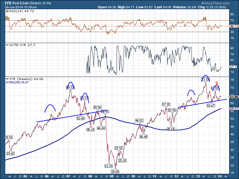
I received this chart from Jason M. It is a very timely look at Real Estate after the glowing year of 2013 in the media. The iShares IYR is an ETF tracking real estate. I have added the SCTR line so we can see how it ranks as an ETF. As we can see, a very clean trend line supports the ETF throughout 2012 and 2013. However, the ETF has dropped in relative strength as shown in the SCTR. At 27.2, it is barely above the 4th quartile of ETF's. What makes it a more compelling chart for me is when we add two more lines. Notice how the Read More
MailBag January 26, 2014 at 05:26 PM

Chip announced a new feature on the website yesterday. Let's look at it here in the Mailbag. The legends used to have two options - On and Off. What changed is a new option called Verbose. When the Chart has additional panels with price data in them, the verbose option will show the entire name of the stock, index, etf etc. rather than just the ticker symbol in all the price panels. To turn this feature on, you'll see it on the far right hand side of Chart Attributes. Here is how it changes the chart. Note the green arrows. This explains each ticker for readers of the Read More
MailBag January 24, 2014 at 08:48 AM
StockCharts uses dividend-adjusted data by default and this can create discrepancies between our data and that of other vendors. Fortunately, StockCharts users can choose between dividend adjusted data and unadjusted data. A normal symbol entry, such as "XLU" for the Utilities SPDR, will show dividend-adjusted data. Chartists can change this to unadjusted data by adding an underscore in front of the symbol (_XLU). Dividend adjustments are not that important for securities that do not pay dividends or that have very low dividend yields. Visible differences, however, do arise with Read More
MailBag January 21, 2014 at 09:09 PM
Joe Granville was a Technical Analyst legend. He passed away on September 7, 2013. I am sure most technicans checked the dates to see if they were not Fibonacci numbers or checked them against other Technical Analysis systems. While Joe was not an Elliott Wave man, he was a pioneer in Technical Analysis. His words could spike the market. One of his calls was for his newsletter readers to "Sell Everything" and he dropped the $SPX 2.4% that day.( Source-Bloomberg). You can read more from a nice obituary published on Bloomberg. Joe Granville . I'll let you read that Read More
MailBag January 17, 2014 at 07:31 AM
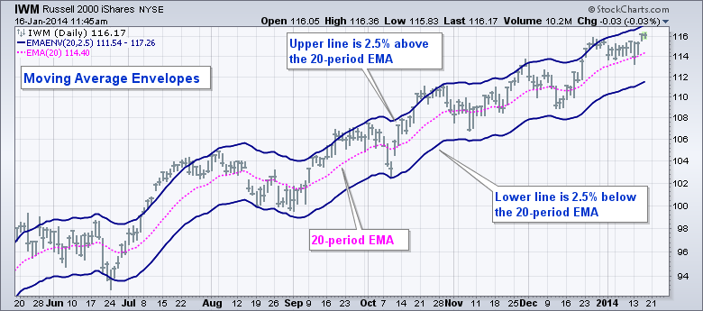
Moving Average Envelopes and Keltner Channels both start with a moving average to calculate their outer lines. The outer lines for Keltner Channels are based on the Average True Range (ATR), which is a volatility indicator. Moving Average Envelopes, on the other hand, are simply placed a set percentage above and below the moving average. Also note that Keltner Channels use an exponential moving average for the middle line. Chartists can choose between an exponential moving average or a simple moving average for Moving Average Envelopes. Let's look at the differences using a chart for the Read More
MailBag January 10, 2014 at 08:13 AM
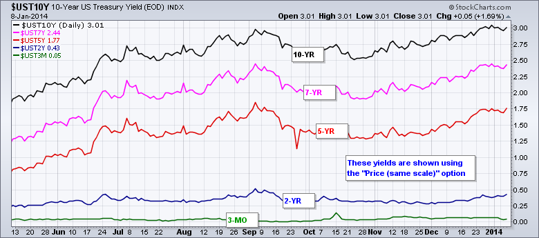
SharpCharts users can use the “Price (same scale)” option to chart several different symbols on one scale. Obviously, this works best for items with similar data ranges, such as Treasury yields or the Bullish Percent Indices. Treasury yields range from just above zero percent on the 3-month T-Bill to around four percent for the 30-Year T-Bond. Bullish Percent Indices range from zero to one hundred percent. When charting more than one, the same scale option makes it easy to compare the different plots. The chart below shows five different US treasury yields on the same scale, which ranges Read More
MailBag January 03, 2014 at 08:31 AM
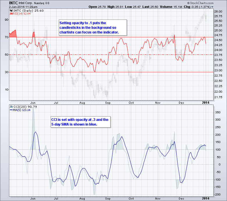
Chartists can adjust the transparency of a price plot using the opacity feature on SharpCharts. First, create a chart with bars or candlesticks. Second, go to “Opacity” in the “Chart Attributes” section. Setting opacity at 0 will make the price plot invisible. The price plot becomes more visible as the opacity is increased. The example below shows candlesticks for Intel with the opacity set at .1, which makes them very transparent. RSI has been placed as an indicator behind the price. Transparent candlesticks make it easier to focus on indicator signals. Chartists can also hide an Read More