MailBag June 01, 2014 at 02:27 PM
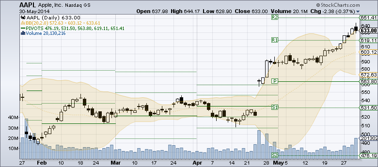
Q: It is Saturday afternoon. How do I see the Pivot Point levels for next week? Do I really have to wait until the market opens on Monday to see something that you could show me right now? A: Good question! You are correct in that as soon as the market closes on Friday, we are able to calculate the Pivot Point levels for next week. The only issue is where can we display them? There's no room on a regular "Fill the Chart" type chart. Here's an example of what I mean: As you can see, the only Pivot Point values Read More
MailBag May 29, 2014 at 09:42 AM
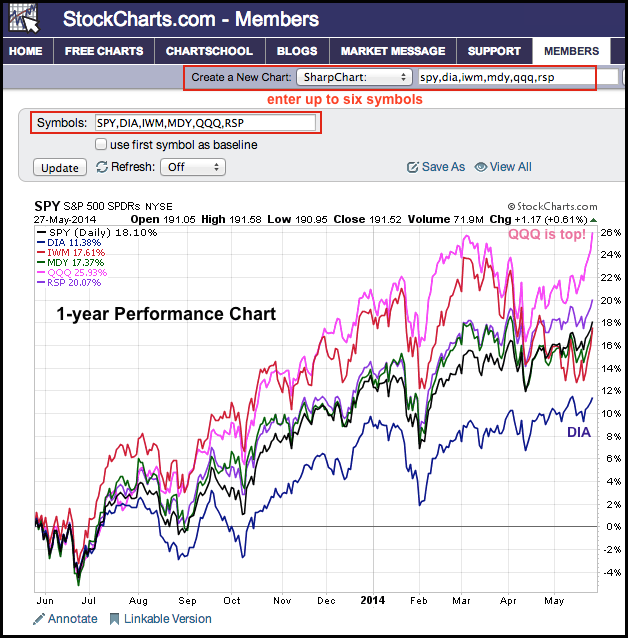
Chartists can quickly and easily create performance charts by entering up to six comma-separated symbols in any symbol entry box. There is a symbol entry box at the top of every webpage and above every SharpChart. The chart below shows one-year performance for six symbols over the past year. Note that QQQ is up around 26% and RSP is up around 20%. DIA is up only 11.38% and the laggard of the group. Chartists can also create a relative performance chart with just two mouse clicks. First, click the check box at the top to "use the first symbol as the Read More
MailBag May 21, 2014 at 12:02 PM
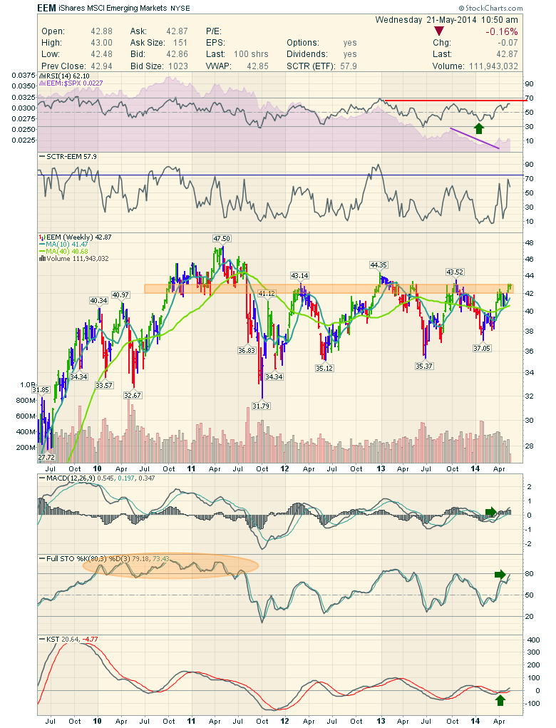
The Emerging Markets don't seem like they would be be great to me, but that is why we use charts. Looking at the Emerging Markets ETF (EEM), there is hope for the chart. It's definitely worth adding to the watchlist. I was chatting with a friend who asked what I thought of the EEM. Whether it is a long or a short, that is the question! Let's check it out, with another indicator today. First of all, the full quote box shows the SCTR at 57.9 which means it is outperforming 57.9% of the ETF's. That is just middle of the road performance. As you can also see, weekly liquidity (volume) is not Read More
MailBag May 16, 2014 at 12:13 PM
Q: How can I use the new "pseudo-symbols" to help understand what is going on with General Motors (GM) right now? A: Recalls, GM Recalls, GM Recalls, GM Recalls. The continuous news is bashing the stock. For those hurt by the situation, this is truly a terrible time. This is not an article to downgrade GM one more time. It is an article to help frame how much the recalls are affecting GM and how an investor can keep perspective on the situation through the charts. I want to discuss why understanding the industry and the sector are so important as well as how to put them on your charts Read More
MailBag May 16, 2014 at 05:51 AM
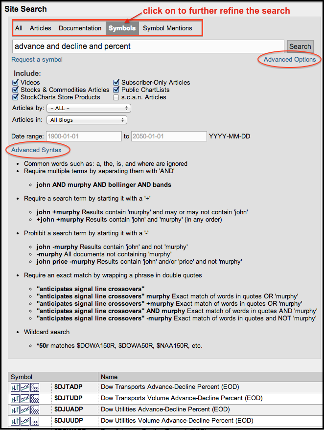
Chartists looking for a particular symbol or group of symbols can use advanced syntax to refine their search. The examples below show how to use the advanced syntax. Note that the quotes are not required, except in the last example, which requires quotation marks. Use "AND" to require multiple terms. Searching for "advance and decline and percent" will return results that have all three words in the name. This particular search will yield a list of breadth indicators based on AD Percent. Use "+" to require a term or terms. Searching for "ishares Read More
MailBag May 12, 2014 at 11:31 AM
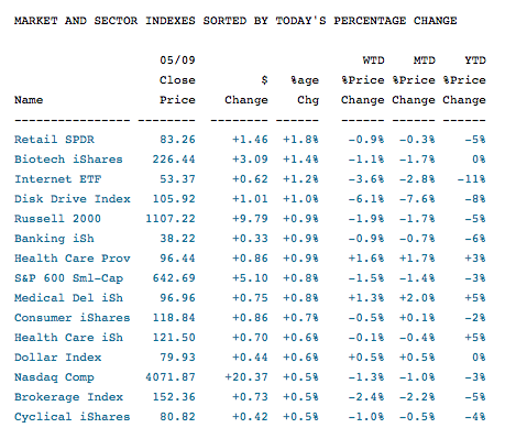
Last week Chip blogged about the new reports and market summary articles from the DecisionPoint Merger. Snooping through to see what was available was a very nice condensed list of different areas of the market. Friday's market had some interesting reversals which was just one brief part of these major reports. Out of this top 15 list, the Retail SPDR was the largest improvement. Up 1.8%. Notice the Consumer iShares and the Cyclicals iShares. The Brokerage Industry and the Bankers were both bouncing. Notice the Biotech iShares, Healthcare, Medical and Healthcare iShares are also part of Read More
MailBag May 09, 2014 at 04:42 AM
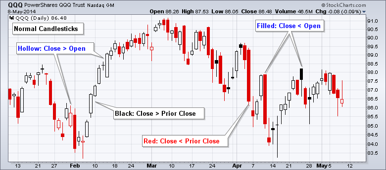
The color for normal filled candlesticks is based on the change from close to close, and the color for solid candlesticks is based change from open to close. The first chart shows normal candlesticks. A red candlestick means the close was lower than the prior close. A black candlestick indicates that the close was higher than the prior close. In short, candlesticks are black when the close is up and red when the close is down. Separately, a candlestick is hollow (white) when the close is above the open and filled when the close is below the open. Read More
MailBag May 05, 2014 at 12:14 PM
Q: My comment is about the Price Labels on SharpCharts. In many cases, it seems to be one day late for best buying time. For best selling time, it seems to be mostly correct. What do you think? Is it possible to mark the best buying time one day earlier so that we can put in buy order at the open next day? A: Price Labels are the little balloons with numbers in them that you can optionally add to any SharpChart. They appears above and below significant peaks and troughs on the chart and show you what the stock's value was at those points. You can enable/disable Price Read More
MailBag May 02, 2014 at 05:40 AM
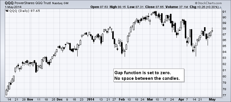
SharpCharts users can add varying degrees of space between price bars by using the gap function in SharpCharts. Note that this function is only available when "fill the chart" is selected for the date range. SharpCharts with a predefined range, such as six months or one year, will not have the option to add gaps. The gap setting ranges from zero to five. Zero means there will be no space between the price bars or candlesticks (first example below). Setting the gap to five will produce a chart with the maximum space between the price bars (second example below). The gap function can be Read More