MailBag December 26, 2014 at 03:43 AM
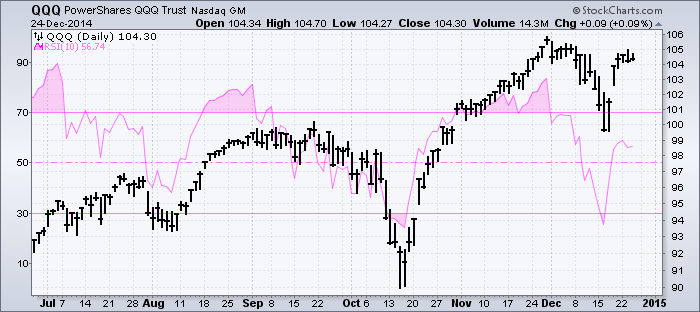
Chartists can position an indicator above the main window, below the main window or even in the main window, which puts it behind the price plot of the underlying security. It is easy to compare price movements with indicator movements when the indicator is placed right behind the price chart. The example below shows the Nasdaq 100 ETF (QQQ) with 10-day RSI behind the price plot. Chartists can also use the advanced indicator options to change the color and opacity settings. In this example, I am showing RSI in pink and setting opacity at 50% (0.5) Read More
MailBag December 19, 2014 at 05:32 AM
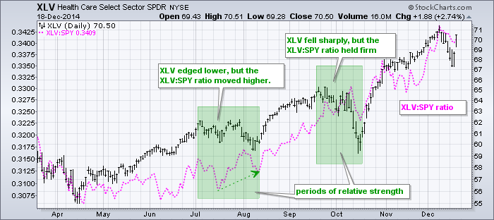
A member recently wrote in asking for different ways to measure relative performance. This is a great question because relative performance is a very important piece of the investment puzzle. In addition to looking for stocks and ETFs in uptrends, chartists can improve their odds by looking for stocks and ETFs showing relative strength. StockCharts offers at least three ways to measure relative performance. First, chartists can simply plot the price relative, which is a ratio chart that compares the performance of one symbol in terms of the other. The Read More
MailBag December 12, 2014 at 06:59 AM
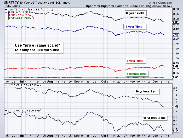
Chartists can view the difference in Treasury yields using a special overlay on SharpCharts. First, note that we have two symbols that capture the yield curve. $YC2YR captures the difference between the 10-year Treasury Yield and the 2-Year Yield. $YC3MO charts the difference between the 10-year yield and the 3-month yield. Chartists can also use the "price (same scale)" overlay to plot different yields in the same chart window. The chart below shows four different Treasury yields in the main window and the two yield curve indicators in the lower windows. The "price (same scale)" aligns Read More
MailBag December 05, 2014 at 05:09 AM
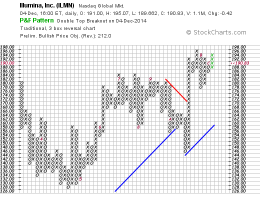
A Bullish Percent Index measures the percentage of stocks within a particular group that are on Point & Figure buy signals. A stock is either on a P&F sell signal or a P&F buy signal, there is no gray area here. A P&F sell signal is a Double Bottom Breakdown, which occurs when the current O-Column moves below the low of the prior O-Column. A P&F buy signal is a Double Top Breakout, which occurs when the current X-Column moves above the high of the prior X-Column. The first chart shows Illumina (ILMN) with a Double Top Breakout and the second chart shows Mattel (MAT) Read More