MailBag May 08, 2015 at 05:28 AM
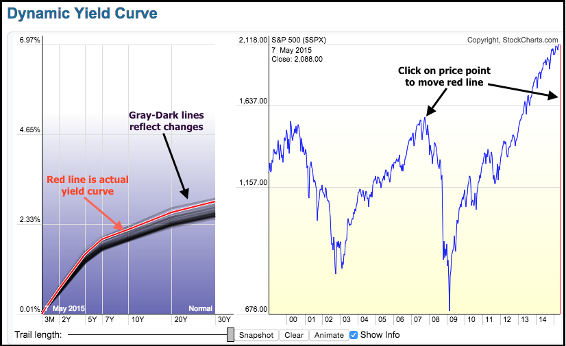
The yield curve is in the spotlight over the last few weeks as the 10-YR Treasury Yield ($TNX) surged back above 2%. Chartists can plot the yield curve on a SharpChart or with the Dynamic Yield Curve tool. The image below shows the Dynamic Yield Curve on the left and the S&P 500 on the right. The vertical red line on the S&P 500 chart marks the date for the current yield curve, which is shown as the red line on the left. Chartists can click on the S&P 500 chart to move the red line and see what the yield curve looked like at different price points (2007 high or 2002 low). The Read More